Samples around the SharePoint Framework client-side web parts to demonstrate different capabilities and possibilities on the framework. Each sample has it's own dedicated readme file to explain setup instructions and demonstrated capability.
Angular2 Web Part Prototype<br/>[angular2-prototype](https://github.com/SharePoint/sp-dev-fx-webparts/tree/master/samples/angular2-prototype)|Sample To Do Web Part built with Angular2. This sample illustrates how you can use Angular2 with the SharePoint Framework.|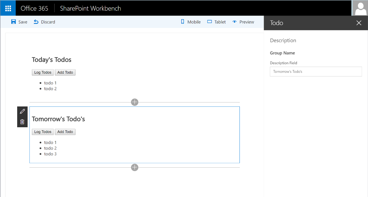|
Angular MS Graph Web Part Built with Angular v1.x<br/>[angular-msgraph](https://github.com/SharePoint/sp-dev-fx-webparts/tree/master/samples/angular-msgraph)|This is a sample MS Graph web part that connects to Microsoft Graph and pulls SharePoint information from yourtenant. It will first pull the root site collection (currently a limitation by Microsoft Graph), then it willdisplay all the lists associated with the site followed by all the items inside the list.||
Angular & ngOfficeUIFabric Client-Side Web Part<br/>[angular-ngofficeuifabric-todo](https://github.com/SharePoint/sp-dev-fx-webparts/tree/master/samples/angular-ngofficeuifabric-todo)|This s a sample web part that illustrates the use of Angular and ngOfficeUIFabric with the SharePoint Framework.You can find a video recording walk-through this sample from SharePoint PnP YouTube channel.||
Angular client-side web part<br/>[angular-todo](https://github.com/SharePoint/sp-dev-fx-webparts/tree/master/samples/angular-todo)|Sample Web Part illustrating using Angular with the SharePoint Framework.|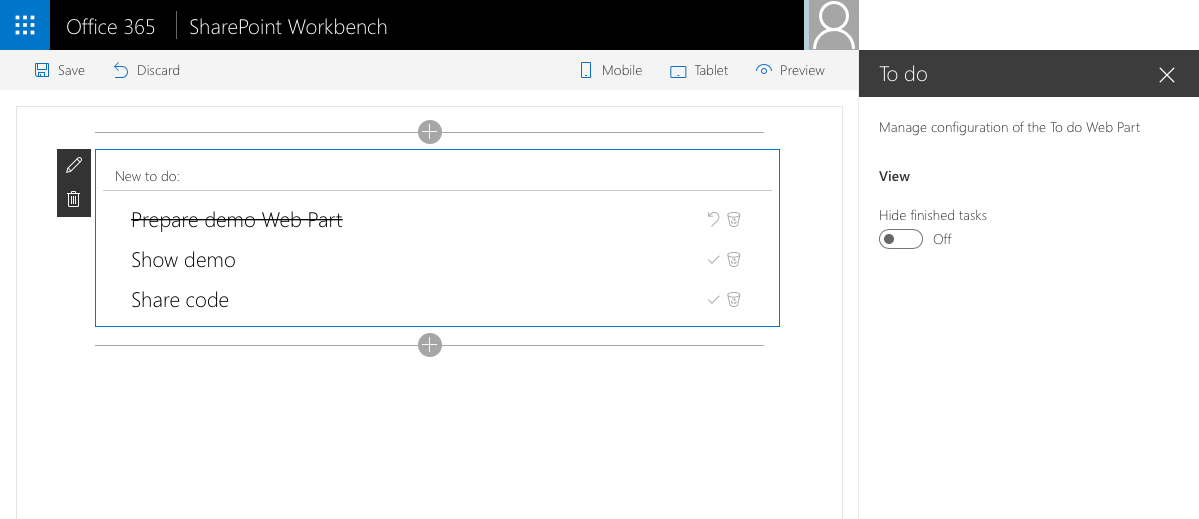|
Angular Elements in SharePoint Framework<br/>[angularelements-helloworld](https://github.com/SharePoint/sp-dev-fx-webparts/tree/master/samples/angularelements-helloworld)|Set of sample web parts illustrating how to use Angular Elements in the SharePoint Framework.||
Angular multi-page client-side web part<br/>[angular-multipage](https://github.com/SharePoint/sp-dev-fx-webparts/tree/master/samples/angular-multipage)|This is a sample SharePoint Framework client-side web part built using Angular, illustrating building multi-page web parts.||
Azure Active Directory implicit flow authentication samples<br/>[react-aad-implicitflow](https://github.com/SharePoint/sp-dev-fx-webparts/tree/master/samples/react-aad-implicitflow)|Sample SharePoint Framework web parts built using React illustrating different scenarios using implicit OAuth flow with Azure Active Directory.|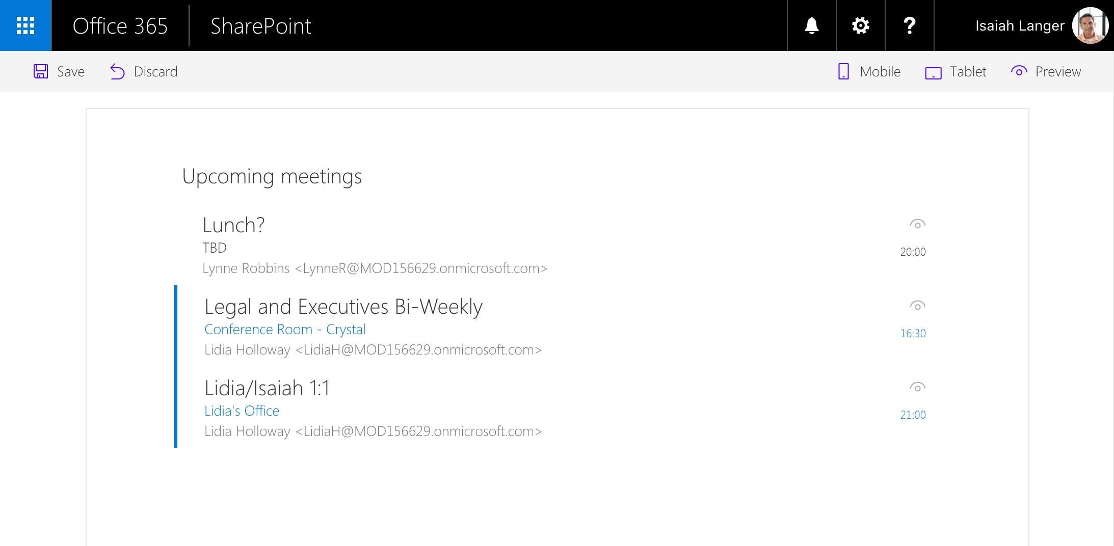|
Azure Active Directory invitation manager Graph API samples<br/>[react-invitation-manager](https://github.com/SharePoint/sp-dev-fx-webparts/tree/master/samples/react-invitation-manager)|Sample SharePoint Framework web parts built using React illustrating the possibility to use Graph API to invite external users into the Azure Active Directory.|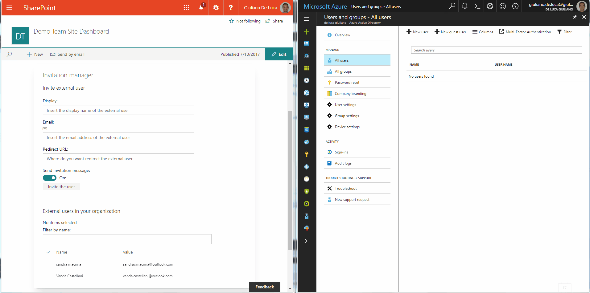|
Bootstrap Slider Built with jQueryr v1.x and Boostrap v3.x<br/>[bootstrap-slider](https://github.com/SharePoint/sp-dev-fx-webparts/tree/master/samples/bootstrap-slider)|Sample bootstrap slider which pulls the slides from a list inside the SharePoint site. The list is automatically deployed once the app is installed in the SharePoint site.||
Call custom APIs secured with Azure Active Directory without ADAL JS<br/>[aad-api-spo-cookie](https://github.com/SharePoint/sp-dev-fx-webparts/tree/master/samples/aad-api-spo-cookie)|Sample SharePoint Framework client-side web part showing how to access a custom API secured with Azure Active Directory (AAD) without using ADAL JS.||
Call custom Web API secured with AAD from SharePoint Framework client-side web part using Angular v1.x<br/>[angular-aad-webapi](https://github.com/SharePoint/sp-dev-fx-webparts/tree/master/samples/angular-aad-webapi)|Sample SharePoint Framework client-side web part illustrating communication with a custom Web API secured with Azue Active Directory using Angular v1.x|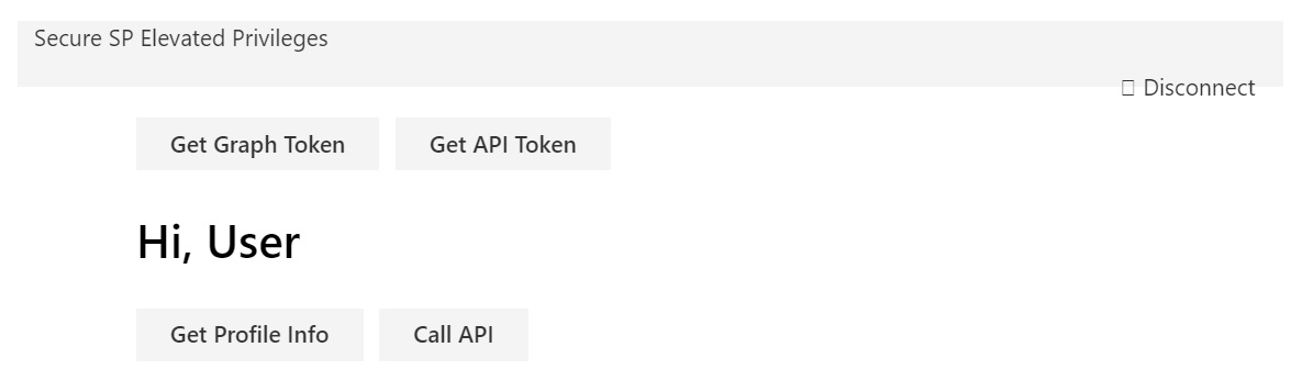|
Call custom Web API secured with AAD from SharePoint Framework client-side web part<br/>[react-aad-webapi](https://github.com/SharePoint/sp-dev-fx-webparts/tree/master/samples/react-aad-webapi)|Sample SharePoint Framework client-side web part illustrating communication with a custom Web API secured with Azure Active Directory.||
Code Splitting in SharePoint Framework<br/>[react-components-dynamicloading](https://github.com/SharePoint/sp-dev-fx-webparts/tree/master/samples/react-components-dynamicloading)|Load React components and third party packages on demand in SPFx|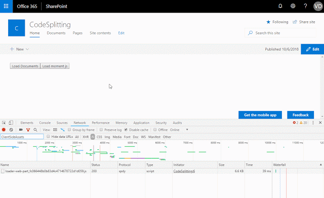|
Communicate using elevated privileges with SharePoint<br/>[react-sp-elevatedprivileges](https://github.com/SharePoint/sp-dev-fx-webparts/tree/master/samples/react-sp-elevatedprivileges)|Sample SharePoint Framework client-side web part illustrating communication with SharePoint using elevated privileges through a custom Web API.||
Consuming Third Party APIs secured with Azure Active Directory within SharePoint Framework<br/>[react-3rd-party-api](https://github.com/SharePoint/sp-dev-fx-webparts/tree/master/samples/react-3rd-party-api)|This sub folders contains a client-side project that shows how to consume a 3rd party API within SharePoint Framework.|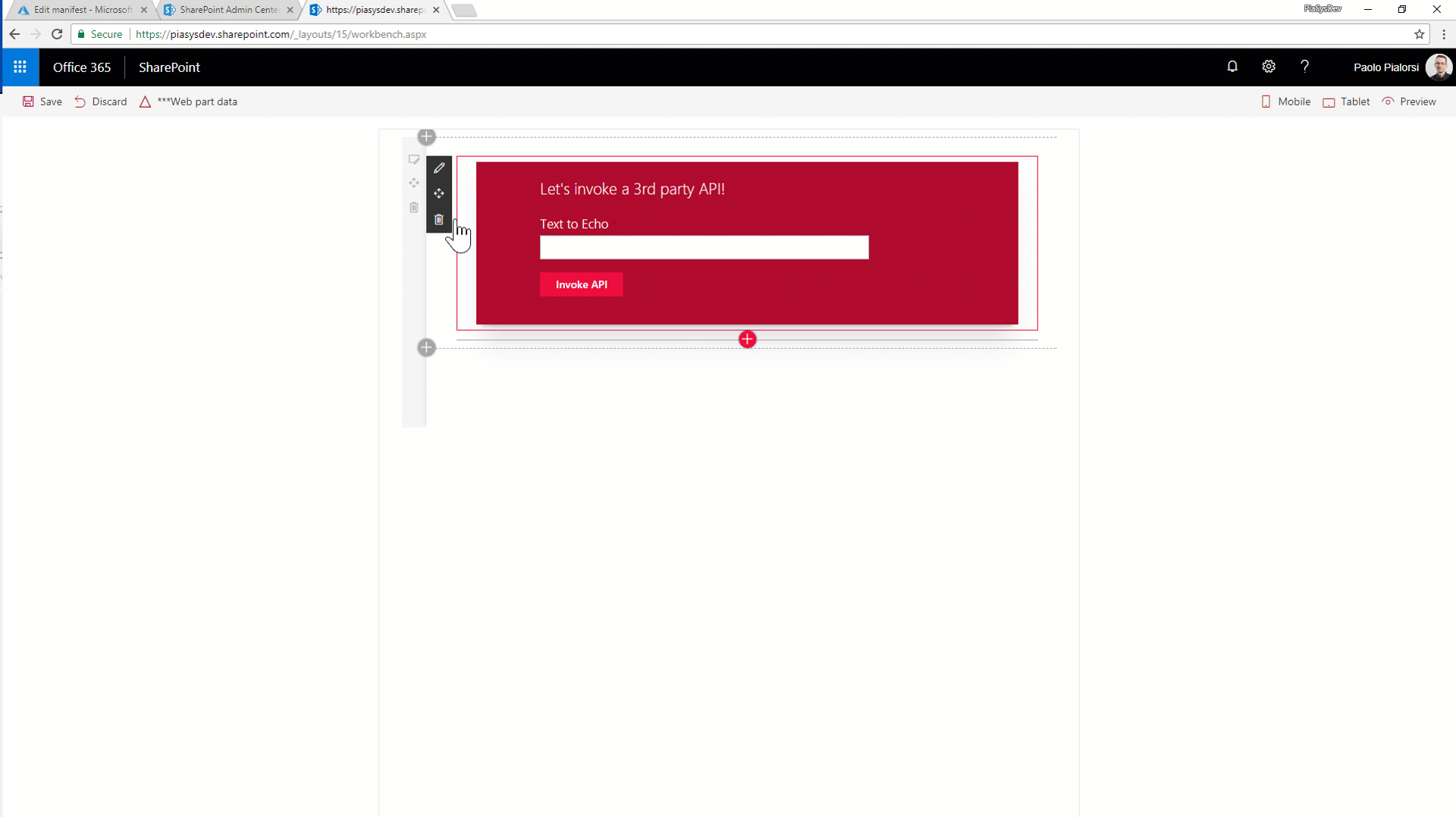|
Custom property pane controls built in React<br/>[react-custompropertypanecontrols](https://github.com/SharePoint/sp-dev-fx-webparts/tree/master/samples/react-custompropertypanecontrols)|Sample custom property pane controls built in React for use with SharePoint Framework client-side web parts.||
Deployment of SharePoint assets as part of SPFx package<br/>[react-feature-framework](https://github.com/SharePoint/sp-dev-fx-webparts/tree/master/samples/react-feature-framework)|Simplistic solution demonstrating how to provision SharePoint assets using Feature Framework elements when SharePoint Framework solution is being deployed to a SharePoint site.|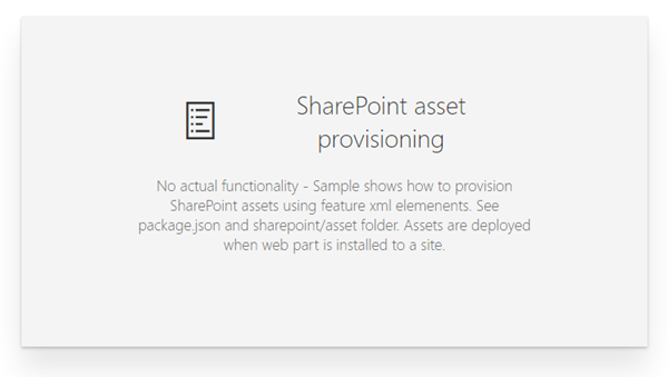|
Display Employee Spotlight JavaScript Client-Side Web Part<br/>[js-employee-spotlight](https://github.com/SharePoint/sp-dev-fx-webparts/tree/master/samples/js-employee-spotlight)|Simple Web Part that demonstrates the use of SharePoint Framework for show casing Employee Spotlight. The web part pulls data from a configured list and User Profile service.The properties pane for this web part has 5 canscading dropdowns.|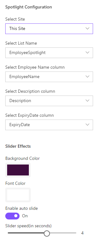|
Display List JavaScript Client-Side Web Part<br/>[js-display-list](https://github.com/SharePoint/sp-dev-fx-webparts/tree/master/samples/js-display-list)|This simplistic sample Web Part demonstrates the use of JavaScript in a SharePoint Framework web part. The properties pane for this web part display a drop down list of lists in the current web. Once the user selects one of the lists, the web part display the contents of the list.|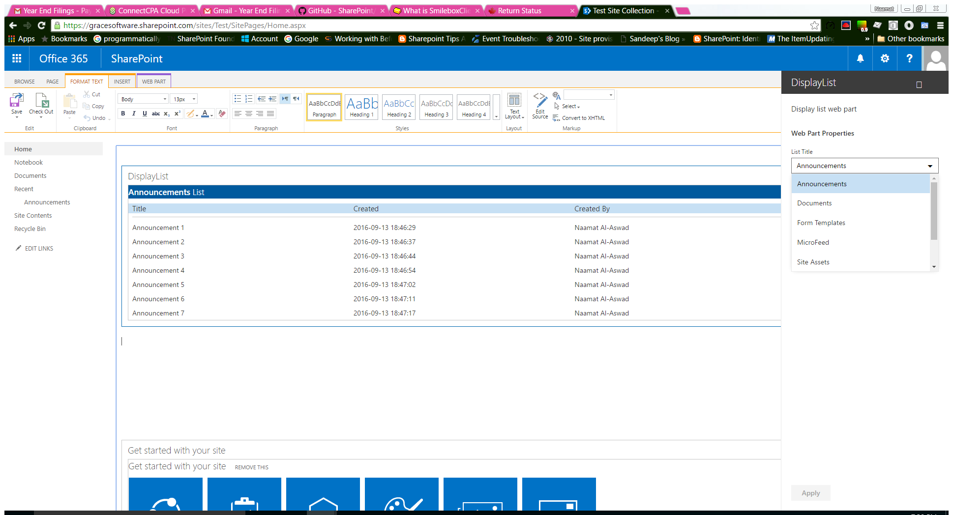|
Documents Web Part<br/>[react-documents-detailslist](https://github.com/SharePoint/sp-dev-fx-webparts/tree/master/samples/react-documents-detailslist)|This sample shows how to build web parts that display documents in accordance with the SharePoint Online modern experience. The code uses Office UI Fabric components on the top of SharePoint framework. The web parts implement filtering and sorting. Two data source approaches are demonstrated: items retrieved from the search index and real-time query to a document library.||
Embed a PowerBI report in a Client-Side Web Part<br/>[js-powerbi-embedded](https://github.com/SharePoint/sp-dev-fx-webparts/tree/master/samples/js-powerbi-embedded)|This sample SharePoint Framework client-side web part embedding a PowerBI report using PowerBI Embedded without any server-side code.|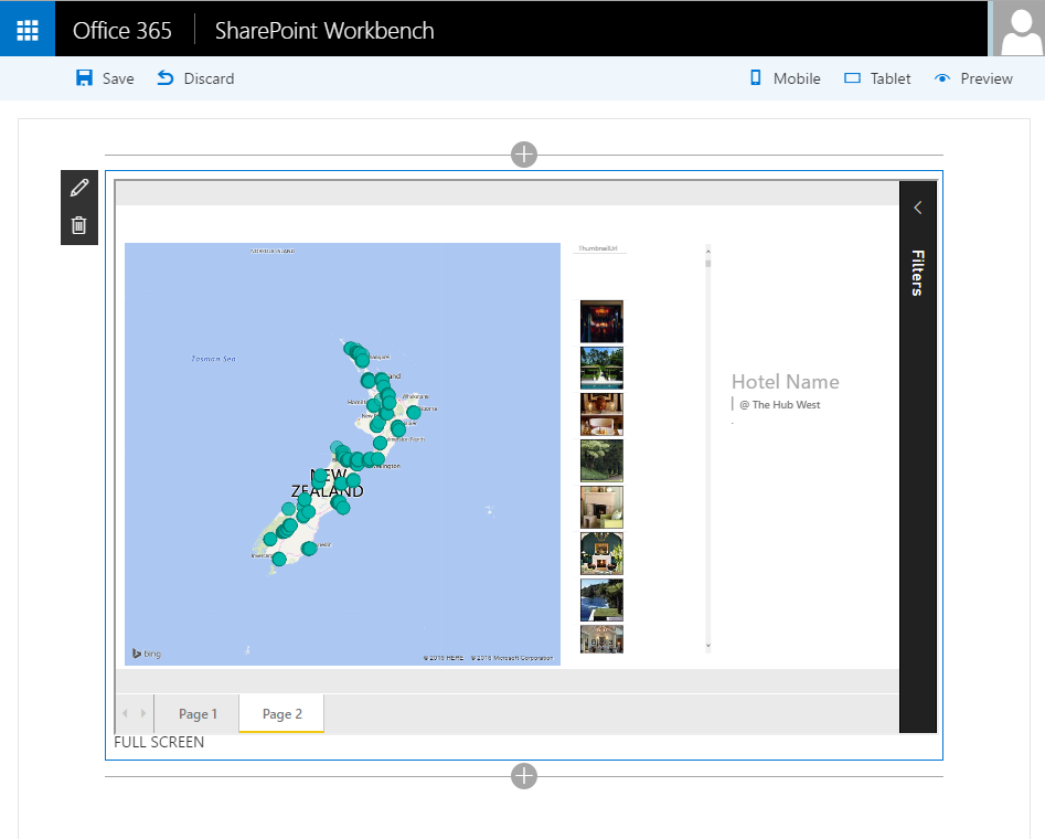|
Extending webpack in the SharePoint Framework toolchain<br/>[js-extend-webpack](https://github.com/SharePoint/sp-dev-fx-webparts/tree/master/samples/js-extend-webpack)|Webpack is a JavaScript module bundler that takes your JavaScript files and its dependencies and generates one or more JavaScript bundles so you can load different bundles for different scenarios.||
Handling Multiple Editions of SPFx Solution<br/>[js-solution-editions](https://github.com/SharePoint/sp-dev-fx-webparts/tree/master/samples/js-solution-editions)|This sample shows possible approach of handling multiple editions (e.g. trial, lite, full) of SharePoint Framework solution.||
Image Gallery Web Part Built with Adaptive Cards<br/>[react-adaptive-cards-image-gallery](https://github.com/SharePoint/sp-dev-fx-webparts/tree/master/samples/react-adaptive-cards-image-gallery)|This sample demonstrates the capability of using [Adaptive Cards] (https://adaptivecards.io/) with SharePoint Framework. Adaptive cards are great fit for Bot, however they can be effectively used with SPFx to render the content. This web part helps to display the image gallery from SharePoint list.|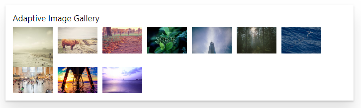|
Image Magnifier<br/>[react-image-magnifier](https://github.com/SharePoint/sp-dev-fx-webparts/tree/master/samples/react-image-magnifier)|This web part allow to magnify an image, displaying a resolution more detailed through a lens.|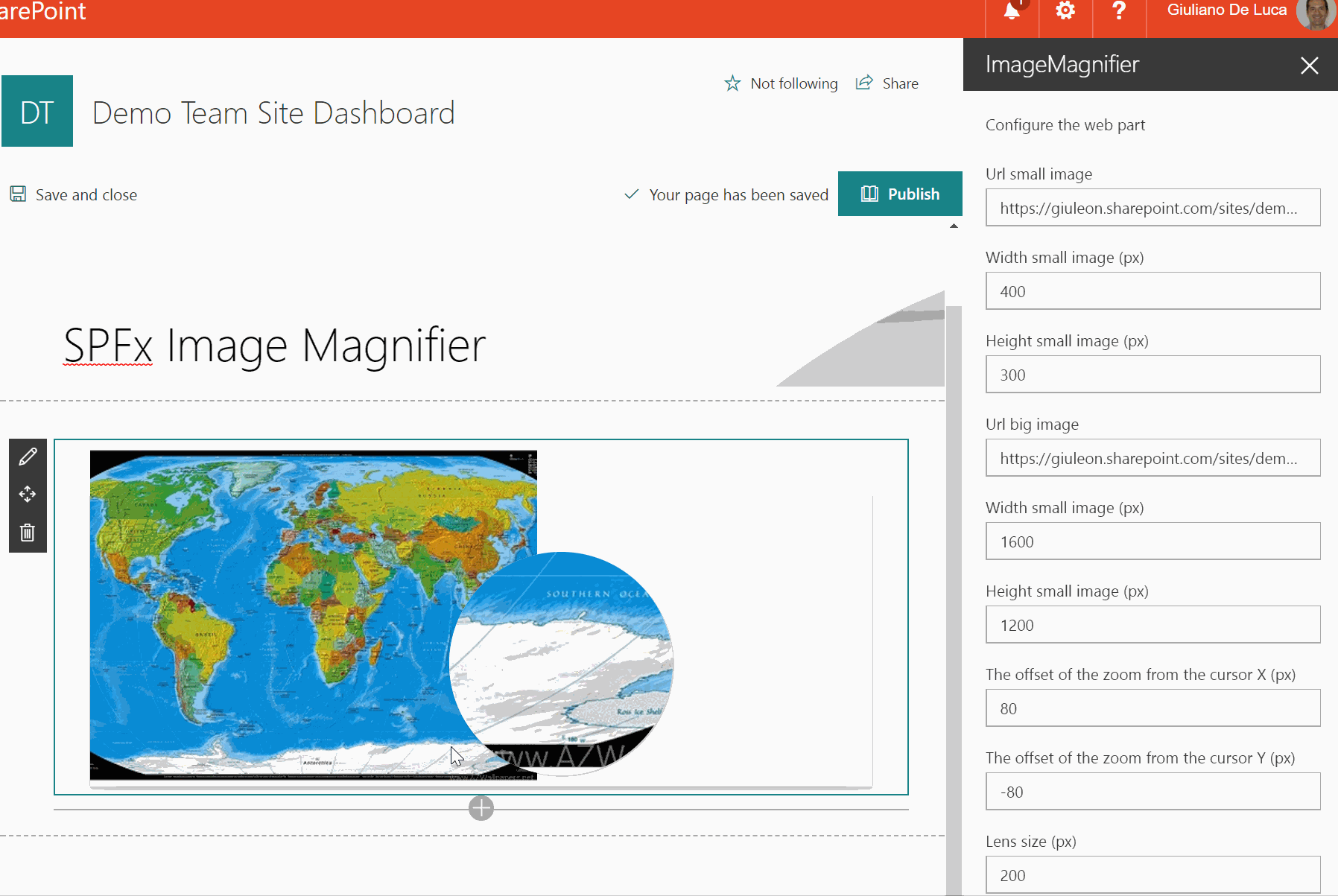|
Integrating custom gulp tasks to SharePoint Framwork toolchain<br/>[js-extend-gulp](https://github.com/SharePoint/sp-dev-fx-webparts/tree/master/samples/js-extend-gulp)|SharePoint client-side development tools use gulp as the build process task runner to:||
JavaScript Skype Status WebPart<br/>[js-skype-status](https://github.com/SharePoint/sp-dev-fx-webparts/tree/master/samples/js-skype-status)|This sample demonstrates how to use the UCWA JS Sdk for skype in the SharePoint Framework. It shows how to subscribe to status change of the different people of the organization but you can get much more information, checkout the documentationThe goal is to demonstrate how you can leverage the SDK and to have the simplest approach, hence the usage of JQuery. No Framework (React, Angular, Knockout...) is used here but you can use that SDK in conjuction with any framwork.No branding has been applied to keep it simple but you could perfectly leverage Office Ui Fabric to display persona cards.|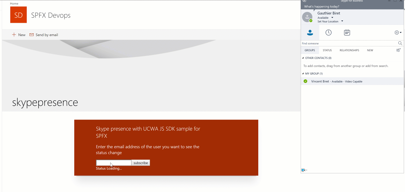|
JQuery, Photopile.JS & Office UI Fabric Client-Side Web Part<br/>[jquery-photopile](https://github.com/SharePoint/sp-dev-fx-webparts/tree/master/samples/jquery-photopile)|This is a sample web part that illustrated the use of JQuery and Photopile.Jswith the SharePoint Framework.||
JS Property Controls SVG<br/>[js-propertycontrols-svg](https://github.com/SharePoint/sp-dev-fx-webparts/tree/master/samples/js-propertycontrols-svg)|An SPFx webpart that displays a Scalable Vector Graphics (SVG) image using properties to customize how it is rendered. The webpart utilizes the PnP SPFx Property Controls package (specifially the SpinButton and ColorPicker) to set these properties.||
List RiotJS Client-Side Web Part<br/>[riot-list](https://github.com/SharePoint/sp-dev-fx-webparts/tree/master/samples/riot-list)|Simplistic sample Web Part that demonstrates the use of RiotJS in creating a SharePoint Framework web part. The properties pane for this web part display a drop down list of lists in the current web. Once the user selects one of the lists, the web part display the contents of the list.||
List subscription<br/>[react-realtime-documents](https://github.com/SharePoint/sp-dev-fx-webparts/tree/master/samples/react-realtime-documents)|Used SharePoint Framework Version||
Local Azure Function and SPFx Web Part Development to consume third party APIs<br/>[react-azfunc-vimeo](https://github.com/SharePoint/sp-dev-fx-webparts/tree/master/samples/react-azfunc-vimeo)|This sample shows how to consume third-party APIs through an Azure Functions by a Web Part. In this scenario, Vimeo is the representative third party API.||
Microsoft Authentication Library (MSAL JS) authentication sample<br/>[react-msal-msgraph](https://github.com/SharePoint/sp-dev-fx-webparts/tree/master/samples/react-msal-msgraph)|Sample SharePoint Framework web part which makes use of the Microsoft Authentication Library (MSAL JS) to call the Microsoft Graph.|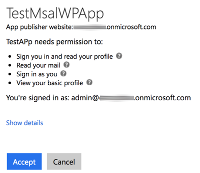|
Microsoft Bot Framework Web Chat<br/>[react-bot-framework](https://github.com/SharePoint/sp-dev-fx-webparts/tree/master/samples/react-bot-framework)|A web part that acts as a web chat component for bot's built on the Microsoft Bot Framework using the Direct Line API. When sending messagesthe web part uses the username of the currently logged in user. The web part has settings for color for branding purposes.|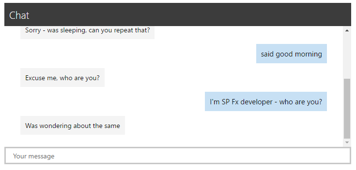|
Migrating existing Angular applications to SharePoint Framework sample<br/>[angular-migration](https://github.com/SharePoint/sp-dev-fx-webparts/tree/master/samples/angular-migration)|This is a sample Angular application before and after it has been migrated to a SharePoint Framework client-side web part.|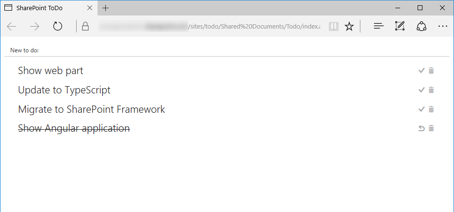|
Modern Calendar<br/>[js-modern-calendar](https://github.com/SharePoint/sp-dev-fx-webparts/tree/master/samples/js-modern-calendar)|This is a modern webpart built on the GA version of the SharePoint Framework demonstrating how to build a custom web part with a calendar capabilities in it.||
Modern Charts<br/>[react-modern-charts](https://github.com/SharePoint/sp-dev-fx-webparts/tree/master/samples/react-modern-charts)|This webpart uses the Chart.js library to visualize SharePoint list data.||
Offline First React Webpart built using LocalForage, Whatwg-Fetch, ES6-Promise<br/>[react-offline-first](https://github.com/SharePoint/sp-dev-fx-webparts/tree/master/samples/react-offline-first)|Sample Webpart that demonstrates how to use offline storage in a way that is moreoffline first.||
Organisation Chart<br/>[react-organisationchart](https://github.com/SharePoint/sp-dev-fx-webparts/tree/master/samples/react-organisationchart)|A simple Organisation Chart webpart using Office UI Fabric, React, REST API batching and ServiceScope plumbing.|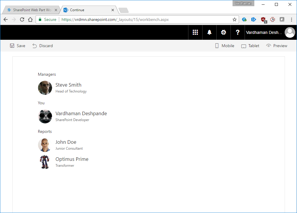|
Page Contributors Web Part<br/>[react-pagecontributors](https://github.com/SharePoint/sp-dev-fx-webparts/tree/master/samples/react-pagecontributors)|Displays page contributors in reverse chronological order.||
People Picker (React)<br/>[react-peoplepicker](https://github.com/SharePoint/sp-dev-fx-webparts/tree/master/samples/react-peoplepicker)|SharePoint Framework solution with the Office UI Fabric People Picker, the client web part across the SharePoint Rest API is able to retrieve people and groups.|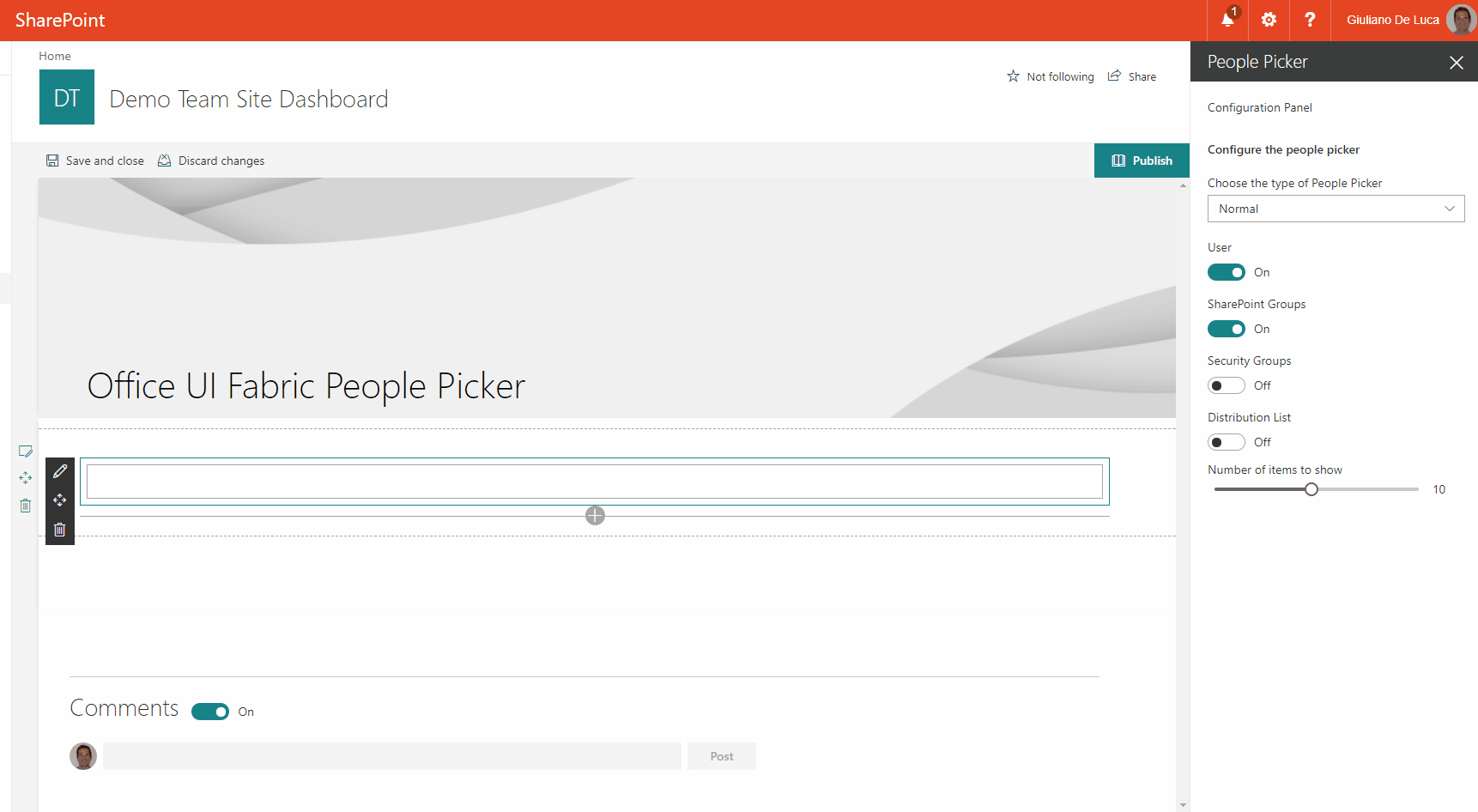|
Personal e-mail<br/>[react-graph-personalemail](https://github.com/SharePoint/sp-dev-fx-webparts/tree/master/samples/react-graph-personalemail)|Sample React web part showing how to retrieve and display personal e-mail retrieved using the Microsoft Graph.|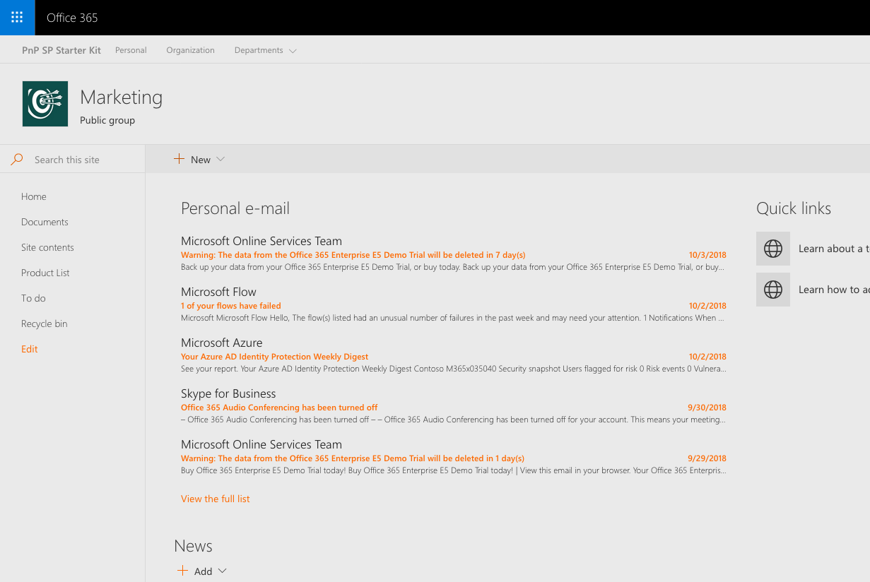|
PnPJS with MS Graph<br/>[react-graph-pnpjs](https://github.com/SharePoint/sp-dev-fx-webparts/tree/master/samples/react-graph-pnpjs)|Sample React webpart showing PnPJS with MS Graph integration||
Property Bag Navigation Webparts<br/>[react-property-bag-editor](https://github.com/SharePoint/sp-dev-fx-webparts/tree/master/samples/react-property-bag-editor)|A set of webparts that lets you set property bag settings on site collections and enable navigation using those properties.||
Provision SharePoint Assets with the SPFx solution package<br/>[react-provision-assets](https://github.com/SharePoint/sp-dev-fx-webparts/tree/master/samples/react-provision-assets)|This sample shows how we can provision Document Library, Custom List, Web and List PropertyBag properties, Site Columns, Content Types, Images, Site Page with the SFPx Client side webpart and even prepopulated list and library items along with the SPFx solution package. All of the components can be deployed at once with the SPFx webpart when the app is added to a SharePoint site. It also contains custom list and document library xml schemas.||
React & Office Graph Web Part samples<br/>[react-officegraph](https://github.com/SharePoint/sp-dev-fx-webparts/tree/master/samples/react-officegraph)|Sample SharePoint Framework Client-Side Web Parts built using React showing interacting with the Office Graph.||
React Aggregated Calendar Webpart<br/>[react-aggregated-calendar](https://github.com/SharePoint/sp-dev-fx-webparts/tree/master/samples/react-aggregated-calendar)|This is a sample webpart developed using React Framework to gather the aggregated events from the multiple calendars from multiple sites using Full Calendar from fullcalendar.io|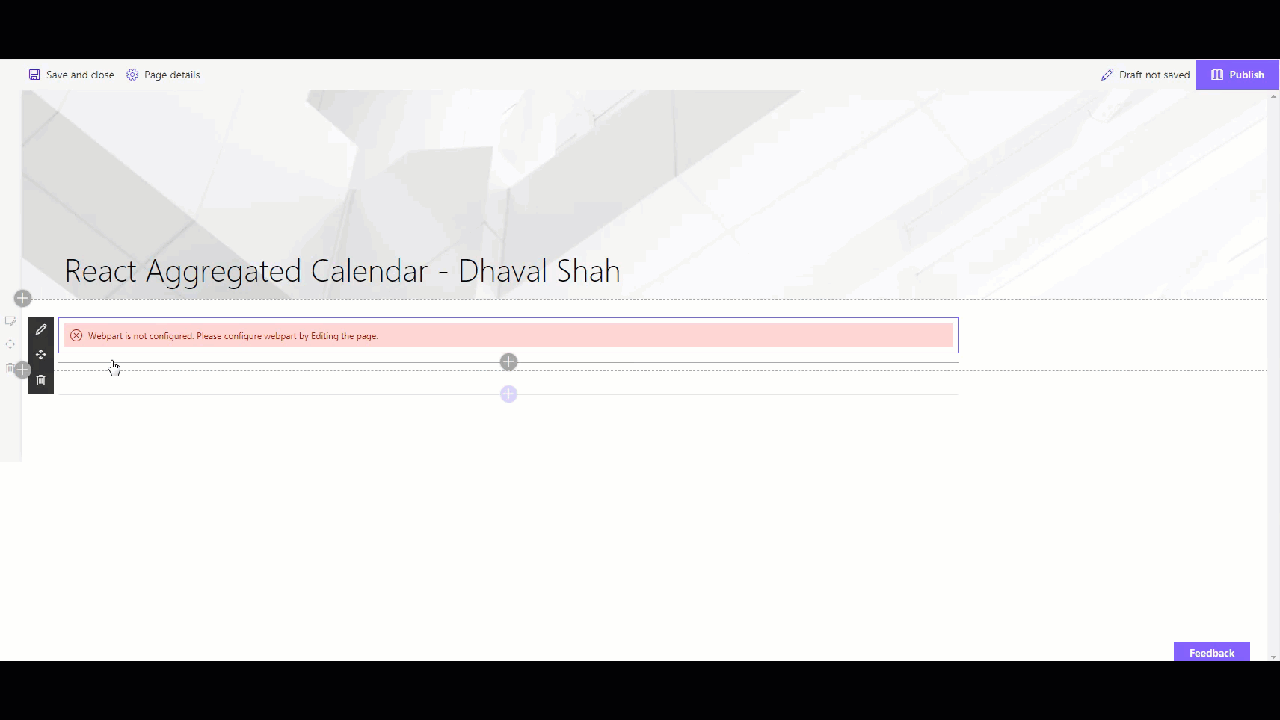|
React Birthdays Web Part<br/>[react-birthdays](https://github.com/SharePoint/sp-dev-fx-webparts/tree/master/samples/react-birthdays)|The Web Part Birthdays shows the upcoming birthdays in the company, the web part reads birthdays from a list located on the tenant's home site with title "Birthdays."||
React Calendar Feed Web Part<br/>[react-calendar-feed](https://github.com/SharePoint/sp-dev-fx-webparts/tree/master/samples/react-calendar-feed)|This web part uses RSS event feeds, iCal feeds, or WordPress calendar feeds and renders events using a look and feel that is consistent with the SharePoint out-of-the-box Group calendar/events web part.|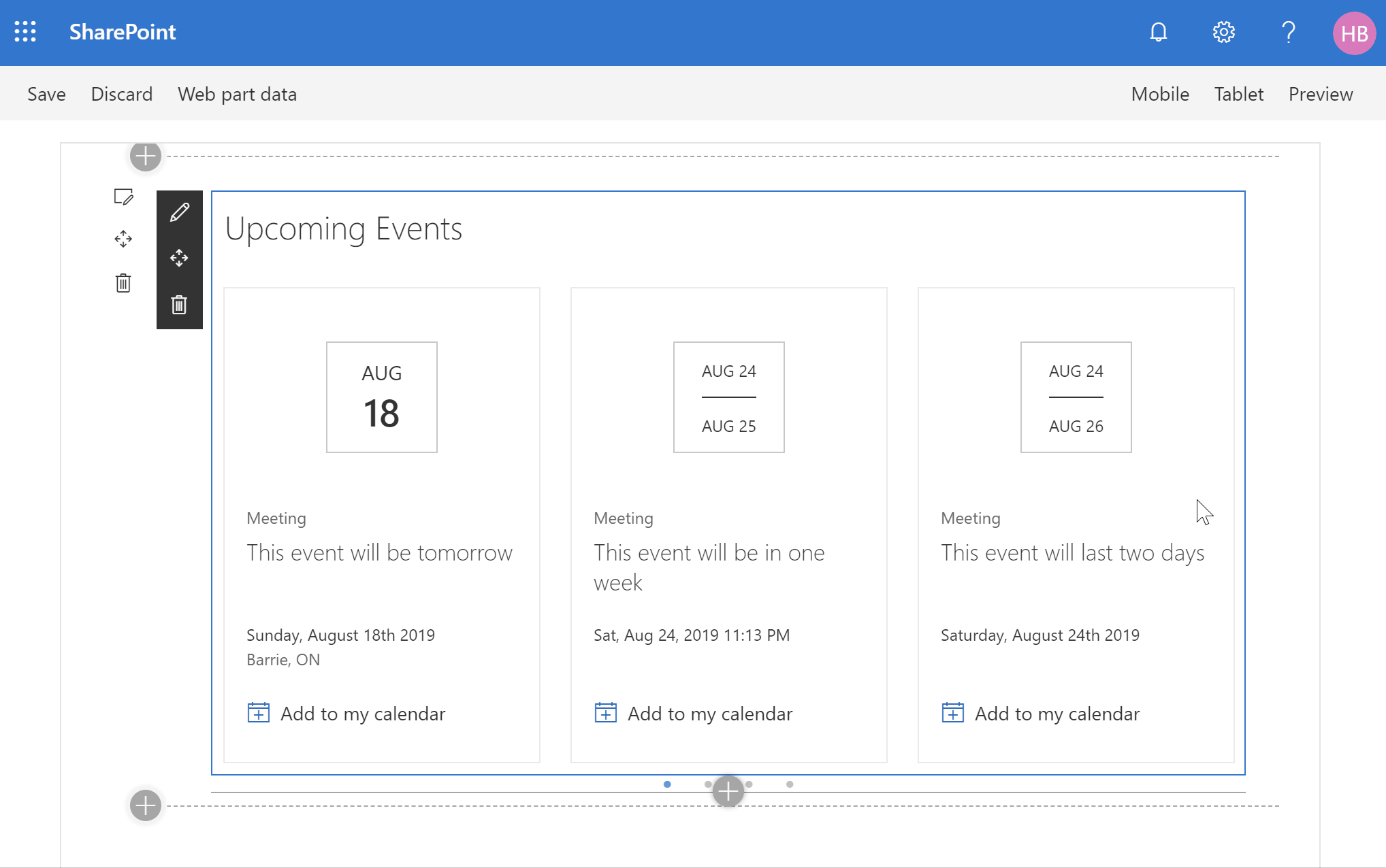|
React Chart Control<br/>[react-chartcontrol](https://github.com/SharePoint/sp-dev-fx-webparts/tree/master/samples/react-chartcontrol)|This sample contains several web parts that demonstrate how to use the ChartControl from @pnp/spfx-controls-react.||
React Comparer<br/>[react-comparer](https://github.com/SharePoint/sp-dev-fx-webparts/tree/master/samples/react-comparer)|Allows users to compare Before and After pictures, with a drag-and-drop slider. Implements a custom file picker.||
React Content Query WebPart<br/>[react-content-query-webpart](https://github.com/SharePoint/sp-dev-fx-webparts/tree/master/samples/react-content-query-webpart)|The React Content Query WebPart is a modern version of the good old Content by Query WebPart that was introduced in SharePoint 2007. Built for SharePoint 2016 and Office 365, this modern version is built against the new SharePoint Framework (SPFx) and uses the latest Web Stack practices. While the original WebPart was based on a XSLT templating engine, this React WebPart is based on the well known Handlebars templating engine, which empowers users to create simple, yet powerfull HTML templates for rendering the queried content. This new version also lets the user query any site collections which resides on the same domain url, add unlimited filters, query DateTime fields to the nearest minute rather than being limited to a day, and much more.||
React File Upload WebPart<br/>[react-file-upload](https://github.com/SharePoint/sp-dev-fx-webparts/tree/master/samples/react-file-upload)|The file upload web part allowing users to upload multiple files to a document library or as item attachments.||
React Kanban Board Webpart<br/>[react-kanban-board](react-kanban-board)|This webpart shows a kanban board with the information from a Tasks list. When a task in the kanban board is moved between columns, the status of the items in the Tasks list are updated.||
React List Form WebPart<br/>[react-list-form](https://github.com/SharePoint/sp-dev-fx-webparts/tree/master/samples/react-list-form)|The React List Form web part is a web part for adding a list form to any page. It provides a working example of implementing generic SharePoint list forms using the SharePoint Framework (SPFx) and the React and Office UI Fabric libraries.||
React multi-page client-side web part<br/>[react-multipage](https://github.com/SharePoint/sp-dev-fx-webparts/tree/master/samples/react-multipage)|Sample SharePoint Framework client-side web parts built using React illustrating building multi-page web parts.||
React Project Online<br/>[react-project-online](https://github.com/SharePoint/sp-dev-fx-webparts/tree/master/samples/react-project-online)|This sample shows how to use SPFx to consume data from the Project Online REST API. The code uses Placeholder and ListView reusable controls to create a better experience to the end user.The web part is intended to be used on a project site within PWA site collection, as the web url used for the rest calls is being taken from the web part context object. To use this web part outside of the PWA site collection, just add a new property to the web part to allow the PWA site collection url to be configured (or when provisioning through a provisioning mechanist).The web part is currently returning project tasks as a simple proof of concept.||
React sample showing the use of @pnp/js with Async / Await<br/>[react-async-await-sp-pnp-js](https://github.com/SharePoint/sp-dev-fx-webparts/tree/master/samples/react-async-await-sp-pnp-js)|This webpart demonstrates how to use PnPJS with Async functions into the SharePoint Framework as well as integrating PnP JS and SPFx Logging systems. Real example querying SharePoint library to show document sizes.|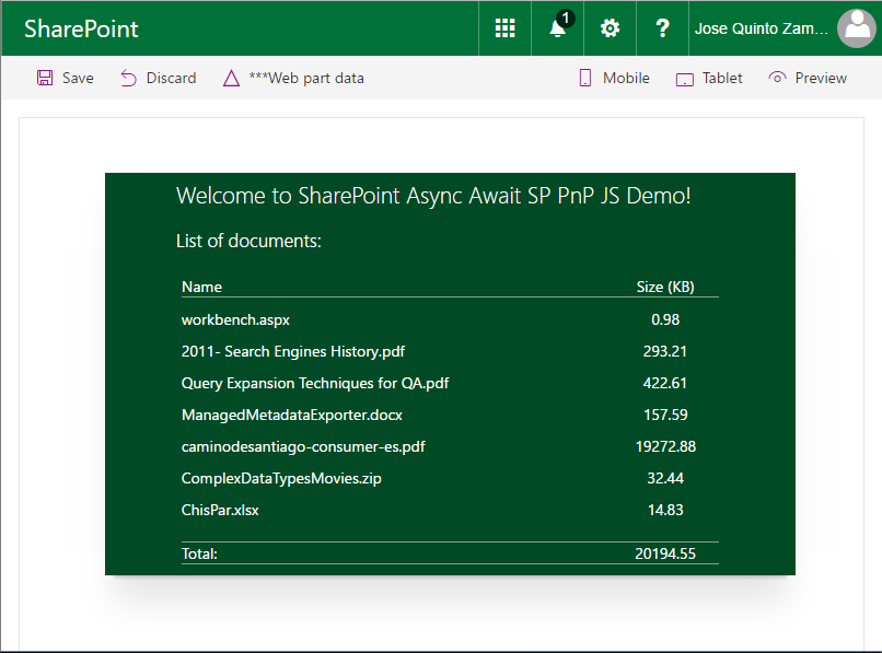|
React sample showing the use of PnP JS Core custom objects with @select and @expand decorators<br/>[react-sp-pnp-js-property-decorators](https://github.com/SharePoint/sp-dev-fx-webparts/tree/master/samples/react-sp-pnp-js-property-decorators)|This webpart demonstrates how to use PnP JS Core Custom Objects with @select and @expand TypeScript decorators.If you are going to use PnP JS Core library and you've plans for extending it with Custom Business Objects, then this project will show you some best practices.You can also find more information in the blog series about working with Custom Business Objects, Parsers and TypeScript Decorators in PnP JS Core||
React Side Panel Client-Side Web Part<br/>[react-side-panel](https://github.com/SharePoint/sp-dev-fx-webparts/tree/master/samples/react-side-panel)|The web part illustrates creation and usage of Side Panel (Sidebar) control.||
React Skype Status WebPart<br/>[react-skype-status](https://github.com/SharePoint/sp-dev-fx-webparts/tree/master/samples/react-skype-status)|This sample demonstrates how to use the UCWA JS SDK for skype with the SharePoint Framework. It shows how to subscribe to status change of the different people of the organization but you can get much more information, checkout the documentationIt allows leverages the Office UI Fabric Persona card to display comprehensive information about the user.|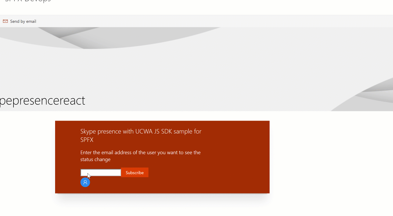|
React Teams Creator Web Part<br/>[react-team-creator](https://github.com/SharePoint/sp-dev-fx-webparts/tree/master/samples/react-team-creator)|The web part illustrates usage of MS Graph beta APIs to work with Teams:|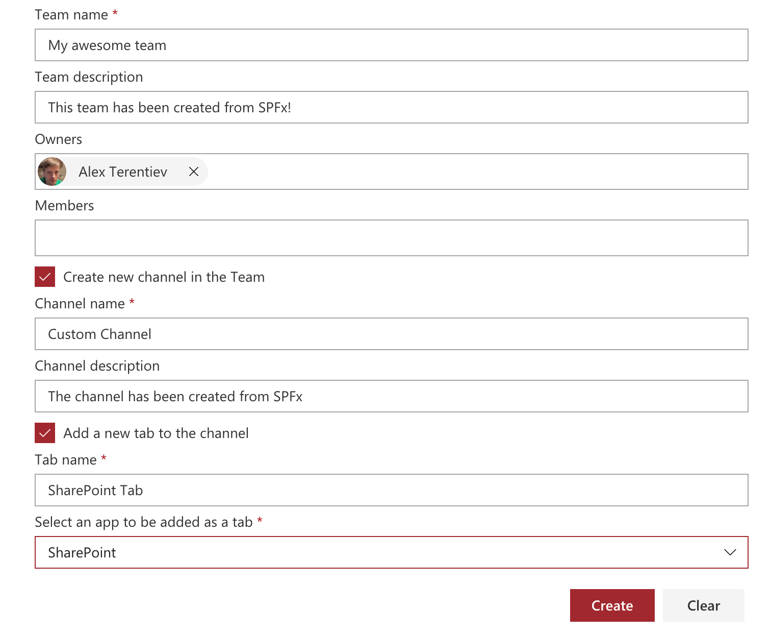|
React TinyMCE Editor WebPart Integration with SharePoint<br/>[react-tinymce](https://github.com/SharePoint/sp-dev-fx-webparts/tree/master/samples/react-tinymce)|React TinyMCE is one of the worlds most popular editors for the web.It has many features out of the box and many more plugins that can beadded when needed. You can create your own plugins if you want, theeditor is powered by the communitiy.||
React Video Library<br/>[react-videolibrary](https://github.com/SharePoint/sp-dev-fx-webparts/tree/master/samples/react-videolibrary)|A set of 3 SPFX webparts that use different open-source carousels (react-3d-carousel, reactjs-coverface, and react-slick)to display videos stored on an Office 365 Video Channel. The idea being to display a carousel of the thumbnail images, and thenwhen a user clicks on one of the thumbnails, replace the tumbnail with a video player, or an Iframe playing the video.|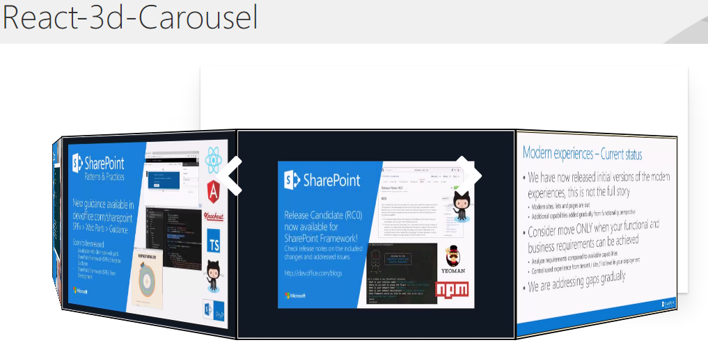|
React Visio Embed<br/>[react-visio](https://github.com/SharePoint/sp-dev-fx-webparts/tree/master/samples/react-visio)|This sample shows how the Visio JavaScript APIs can be used within a web part. For sample purposes, this web part will display the name and the hyperlinks of a Visio shape when the user selects it.||
react-item-history<br/>[react-item-History](https://github.com/SharePoint/sp-dev-fx-webparts/tree/master/samples/react-item-History)|This listview command is used to show the past versions of the selected list item in a grid.|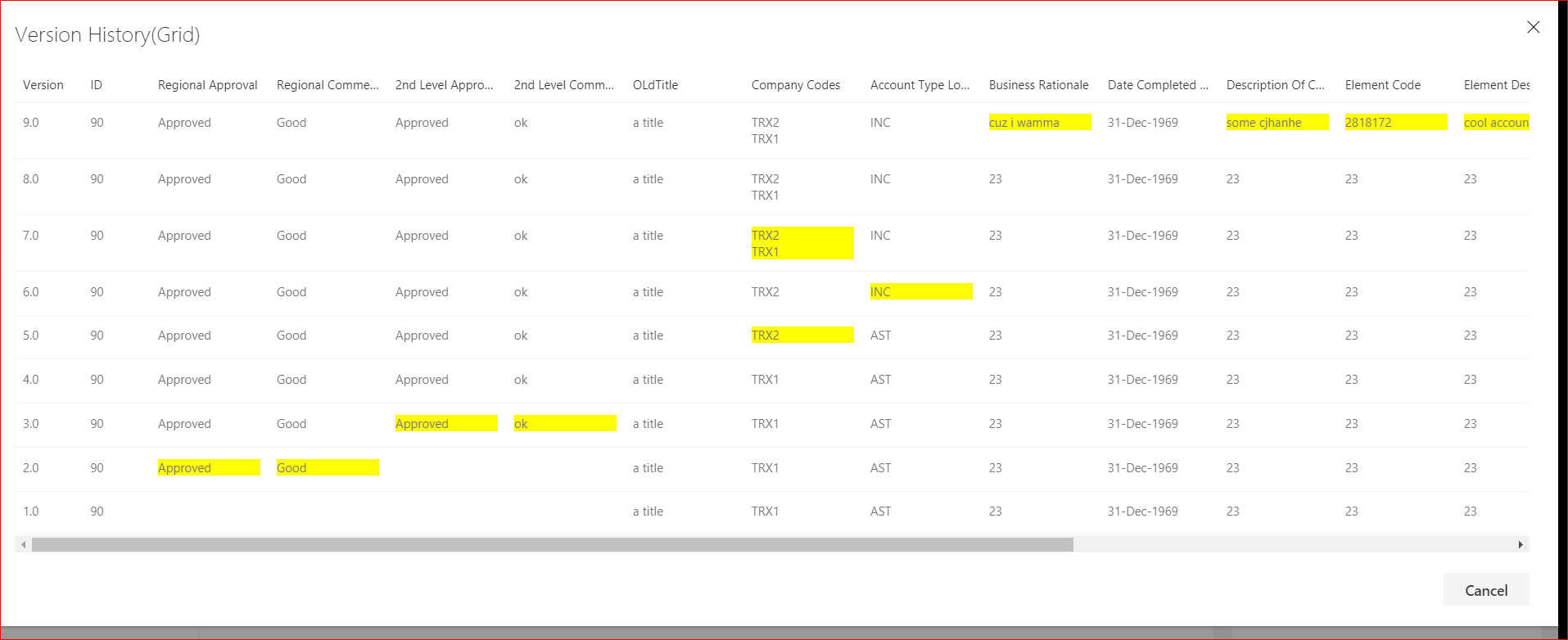|
react-related-items<br/>[react-related-items](https://github.com/SharePoint/sp-dev-fx-webparts/tree/master/samples/react-related-items)|This is where you include your WebPart documentation.||
react-relay-service<br/>[react-RelayService](https://github.com/SharePoint/sp-dev-fx-webparts/tree/master/samples/react-RelayService)|This is where you include your WebPart documentation.||
react-sitepages-metadata<br/>[react-sitepages-metadata](https://github.com/SharePoint/sp-dev-fx-webparts/tree/master/samples/react-sitepages-metadata)|Solution provides an enhancement to SitePages library that enables updating existing items with metadata, and a rollup WebPart to display them.||
Real Time News Feed using Azure Logic Apps, Node.js and socket.io<br/>[react-real-time](https://github.com/SharePoint/sp-dev-fx-webparts/tree/master/samples/react-real-time)|This sample shows you how to implement real time web parts using the SPFx, Azure Logic Apps, Node.js and socket.io.|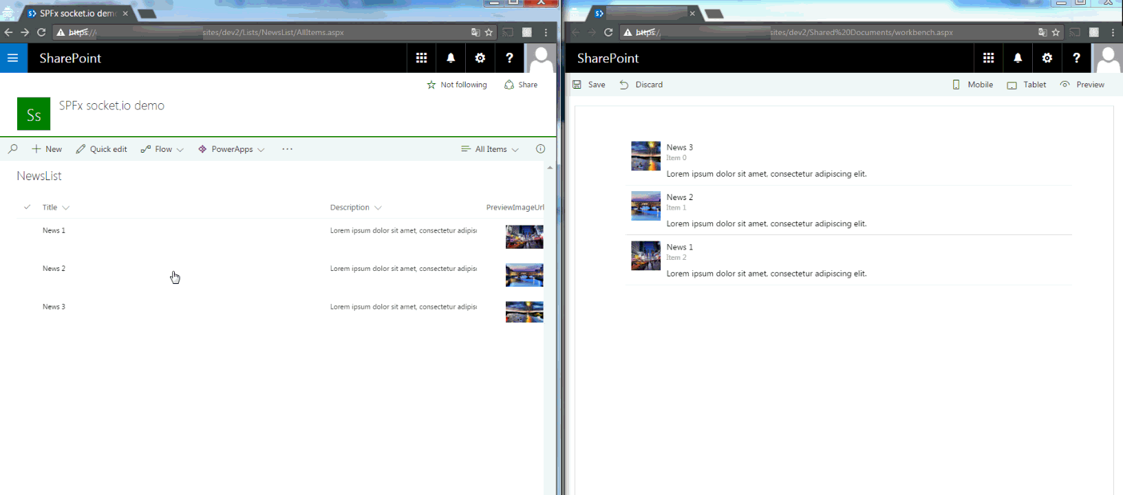|
Sample showing the use of @pnp/sp library with Knockoutjs<br/>[knockout-sp-pnp-js](https://github.com/SharePoint/sp-dev-fx-webparts/tree/master/samples/knockout-sp-pnp-js)|This webpart demonstrates how to integrate the @pnp/sp library into the SharePoint Framework as well as including mock data and simple list I/O.||
Script editor web part for modern pages built in React<br/>[react-script-editor](https://github.com/SharePoint/sp-dev-fx-webparts/tree/master/samples/react-script-editor)|Coming from old classic SharePoint pages you might have existing script solutions you want to re-use on a modern pagewithout having to repackage it as a new SharePoint Framework web part. This web part is similar to the classicScript Editor Web Part, and allows you do drop arbitrary script or html on a modern page.||
Search Client-Side Web Part Built with Angular v1.x<br/>[angular-search](https://github.com/SharePoint/sp-dev-fx-webparts/tree/master/samples/angular-search)|This is a sample search web part that illustrates how you can use Angular within the new SharePoint Framework|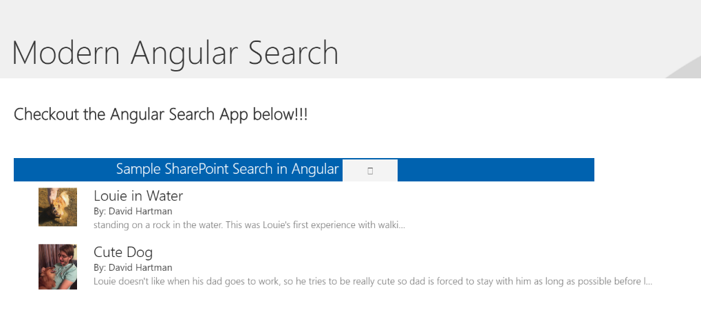|
Search Client-Side Web Part built with React and Flux<br/>[react-search](https://github.com/SharePoint/sp-dev-fx-webparts/tree/master/samples/react-search)|Sample Search Web Part with internal and external template support. This sample illustrates how you can use React and Flux within the SharePoint Framework.|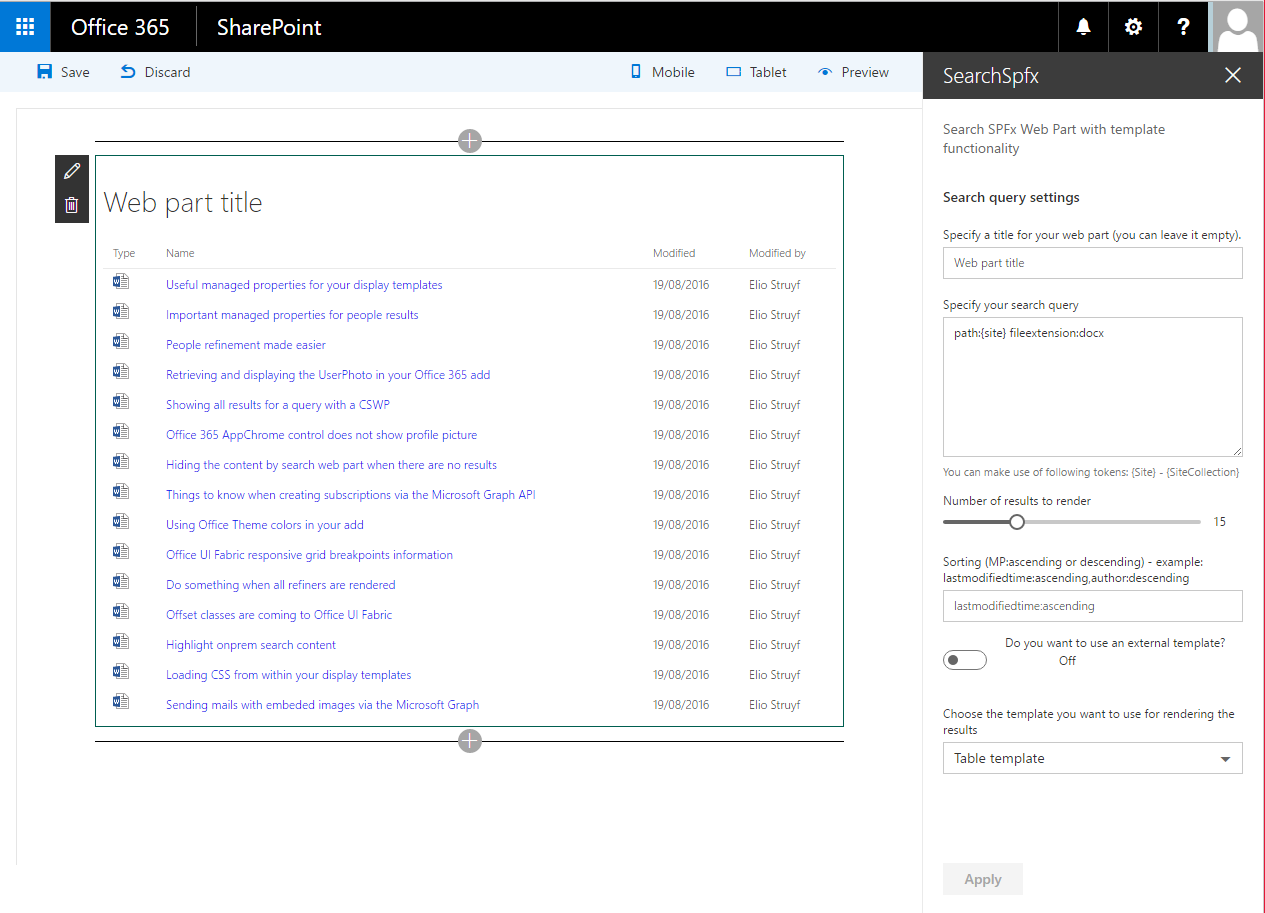|
SharePoint CRUD operations<br/>[sharepoint-crud](https://github.com/SharePoint/sp-dev-fx-webparts/tree/master/samples/sharepoint-crud)|Sample Web Parts illustrating performing SharePoint CRUD operations in React, Angular, JavaScript without any framework and using the @pnp/sp library.|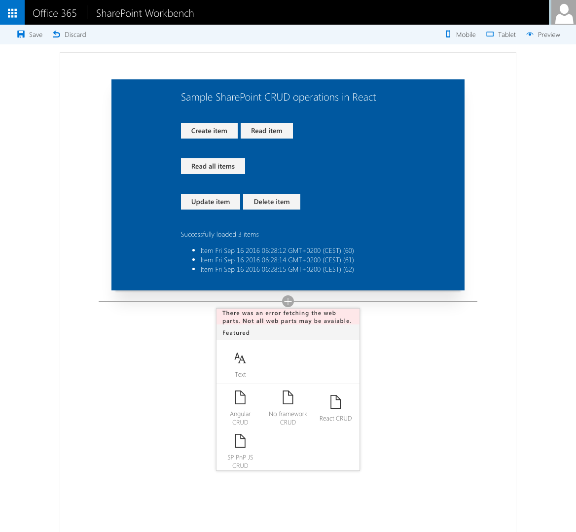|
SharePoint Framework Facebook Page Social Plugin web part sample<br/>[react-facebook-plugin](https://github.com/SharePoint/sp-dev-fx-webparts/tree/master/samples/react-facebook-plugin)|This sample shows how to implement iFrame-based web parts with a dynamic responsive behavior on the example of Facebook Page Social Plugin.|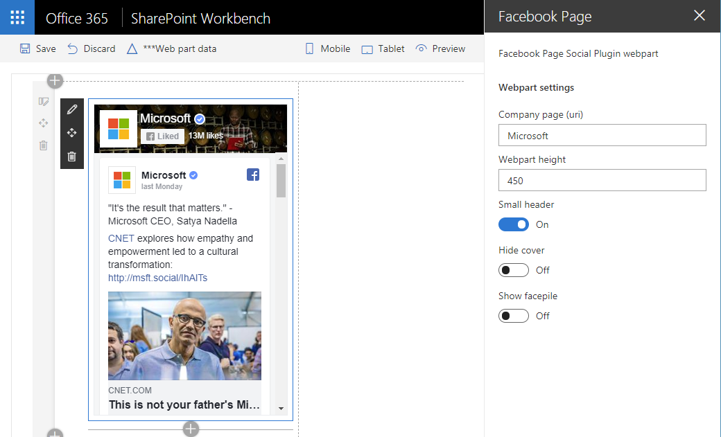|
SharePoint Framework PnP Controls Sample<br/>[pnp-controls](https://github.com/SharePoint/sp-dev-fx-webparts/tree/master/samples/pnp-controls)|This is a sample project that contains a web part which makes use of the PnP SPFx Controls:||
SharePoint Framework React Jest Testing sample<br/>[react-jest-testing](https://github.com/SharePoint/sp-dev-fx-webparts/tree/master/samples/react-jest-testing)|This sample uses the popular Jest Testing Framework with a SPFx client side solution. It is a SPFx-Jest-Enzyme-Sinon starter kit so you can start writing and debugging unit tests in typescript for your SPFx solution.The setup includes unit tests examples, code coverage reports in different formats, visual studio code unit test debug configurations for typescript, setting a coverage threshold (gates) for continuous integration and continuous deployment scenarios.|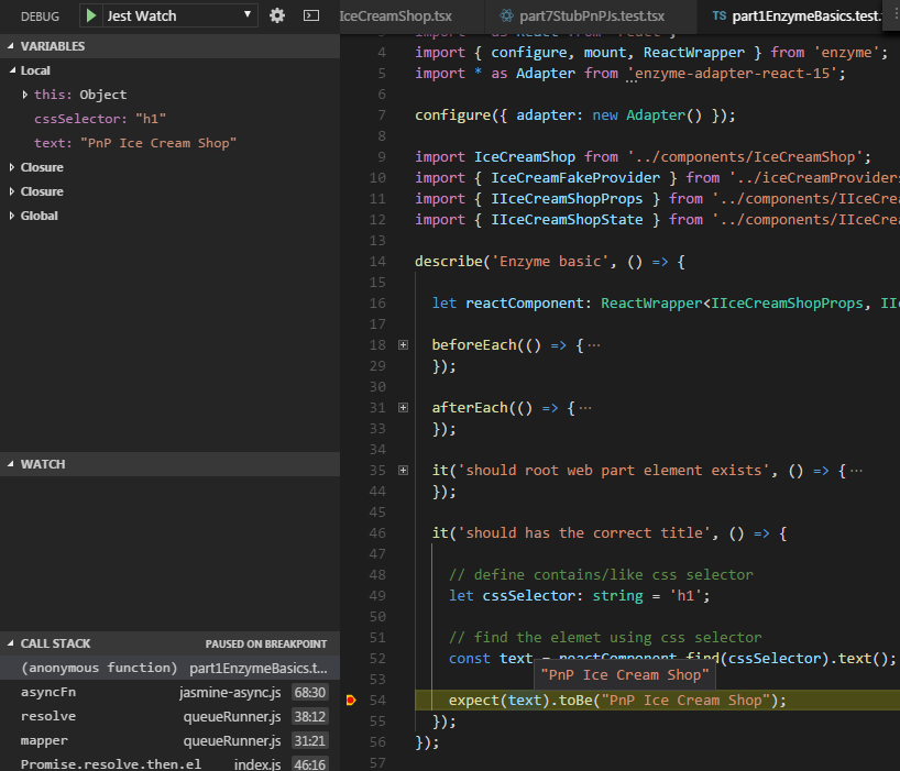|
SharePoint Framework RSS Reader<br/>[react-rss-reader](https://github.com/SharePoint/sp-dev-fx-webparts/tree/master/samples/react-rss-reader)|A RSS Reader original based on work completed by Olivier Carpentier's from: https://github.com/OlivierCC/spfx-40-fantastics/tree/master/src/webparts/rssReader Root project: https://github.com/OlivierCC/spfx-40-fantastics|  |
SharePoint Framework search with search box, refiners and paging sample<br/>[react-search-refiners](https://github.com/SharePoint/sp-dev-fx-webparts/tree/master/samples/react-search-refiners)|This sample shows you how to build user friendly SharePoint search experiences using SPFx in the modern interface. The main features include:||
SharePoint Framework webpart sample using React, Redux and ImmutableJS<br/>[react-redux-async-immutablejs](https://github.com/SharePoint/sp-dev-fx-webparts/tree/master/samples/react-redux-async-immutablejs)|SharePoint Framework webpart which uses Redux to maintain a single state for the entire application and ImmutableJS to create performant state trees.||
SharePoint Themes Client Side Web Part<br/>[react-themes](https://github.com/SharePoint/sp-dev-fx-webparts/tree/master/samples/react-themes)|This web part illustrates how to use SharePoint Theme variables in custom web parts.|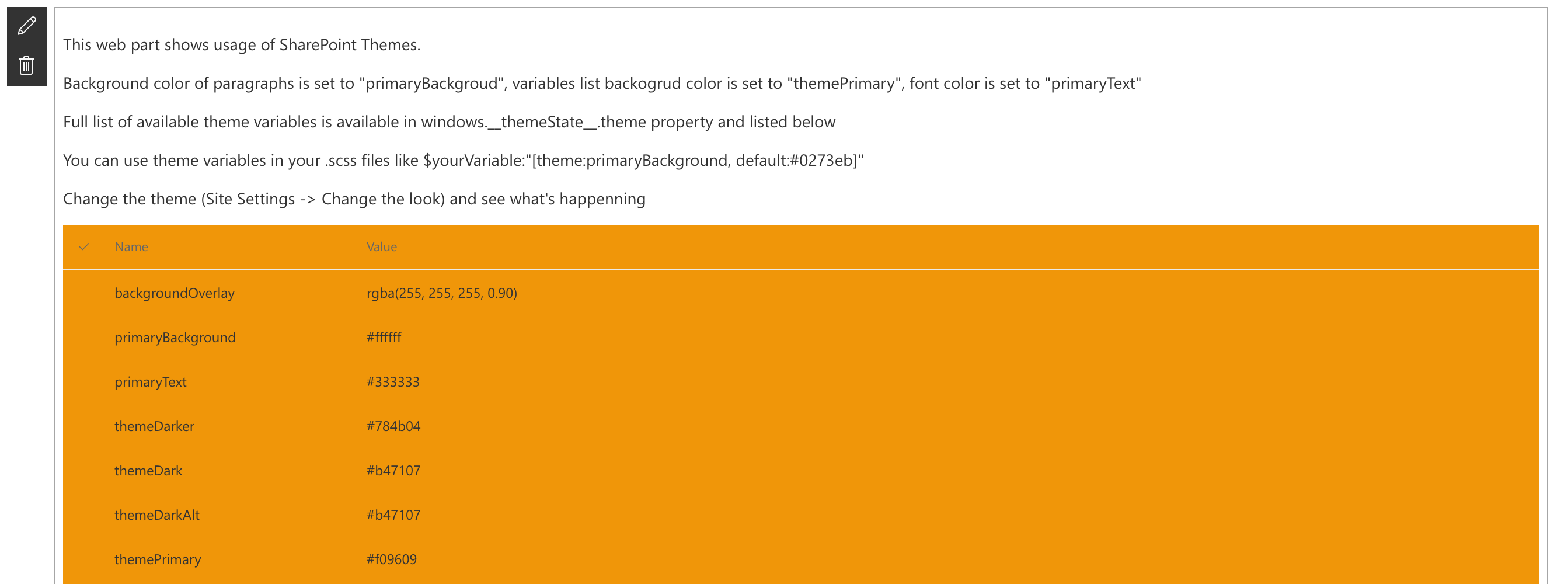|
SPFx Event Aggregator Sample<br/>[react-events-aggregator](https://github.com/SharePoint/sp-dev-fx-webparts/tree/master/samples/react-events-aggregator)|This sample shows how we can use the SPFx Event Aggregator to communicate between web parts through broadcasting events utilizing the Publish–subscribe pattern. It enables a webpart or component to raise event (broadcast message) through the SPFx event aggregator and that event is received by other web parts or components that have been subscribed to receive it.||
SPFx React app settings webpart<br/>[react-app-settings](https://github.com/SharePoint/sp-dev-fx-webparts/tree/master/samples/react-app-settings)|This sample shows how appSettings.json file can be added and used within SharePoint Framewrok webparts similar to the Web.config / App.config key value app settings in .NET Framework projects.That allows better DevOps and Continious Integration automation. Typescript module appSettings.d.ts is also added so it allows the json app settings to be imported to any webpart or react component with intellisense support.|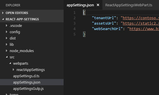|
SPFX React Grid<br/>[react-multilist-grid](https://github.com/SharePoint/sp-dev-fx-webparts/tree/master/samples/react-multilist-grid)|React-multilist-grid is an SPFX webpart that uses React, Office-UI-Fabric, and Redux to let users edit list data from lists that reside in multiple webs and multiple sites in a single grid, similar to Quick Edit mode. The lists do not to be of the same type – you just need to create column mappings to tell the webpart which fields to show in which columns of the grid.|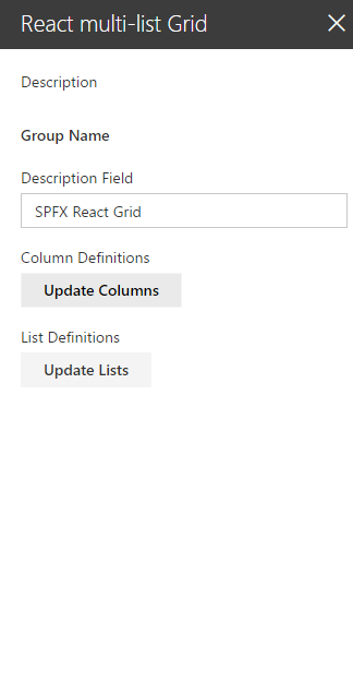|
SPFX React Grid<br/>[react-securitygrid](https://github.com/SharePoint/sp-dev-fx-webparts/tree/master/samples/react-securitygrid)|React-securitygrid is an SPFX webpart that uses React and Office-UI-Fabric to render a grid showing which users have access to which lists/libraries/folders/files on a Web as shown here:|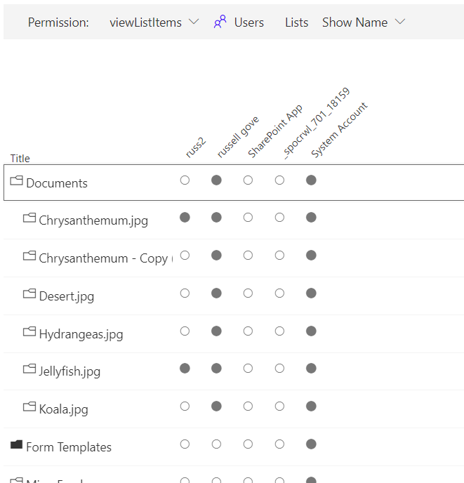|
SPFx React Slide Swiper<br/>[react-slide-swiper](https://github.com/SharePoint/sp-dev-fx-webparts/tree/master/samples/react-slide-swiper)|This SPFx React web part sample demonstrates mobile touch slide swiper. By default the swiper web part is responsive, has cross device and browser touch support and uses paging, but additional features like navigation, autoplay, loop of the slides and more can be enabled from the web part properties panel. The swiper web part can be used as carousel as well. The slides or cards template can easily be customized. The SPFx React swiper client side solution can easly be extended with more swiper, carousel like features because it is based on a popular feature rich JavaScript library called Swiper.||
SPFx ReactiveX (RxJs) Event Emitter Sample<br/>[react-rxjs-event-emitter](https://github.com/SharePoint/sp-dev-fx-webparts/tree/master/samples/react-rxjs-event-emitter)|This sample shows how we can use the ReactiveX (RxJs) library with the SharePoint Framework to communicate between web parts through broadcasting events utilizing the Publish–subscribe pattern. It enables a webpart or component to emit event (broadcast message) and that event is received by other web parts or components that have been subscribed to receive it. Please note this is custom implementation of the Publish–subscribe pattern by using the ReactiveX (RxJs) library. The SPFx will nativelly support this in future without the need of custom implementation through new SPFx api called Event Aggregator, but it is still in Alpha.||
SPFx Sample with Handlebars.js<br/>[handlebarsjs-webpack-loader](https://github.com/SharePoint/sp-dev-fx-webparts/tree/master/samples/handlebarsjs-webpack-loader)|This sample demonstrate how to set up SPFX to use Handlebars through webpack loader.||
Spfx Webpart / Teams tab Group members suggestion<br/>[react-teams-tab-suggested-members](https://github.com/SharePoint/sp-dev-fx-webparts/tree/master/samples/react-teams-tab-suggested-members)|This webpart uses Graph API to suggest you members to add to a group (based on People endpoint), so you can easily add those members to the Group / Teams. It can be used as a SharePoint webpart or Teams tab|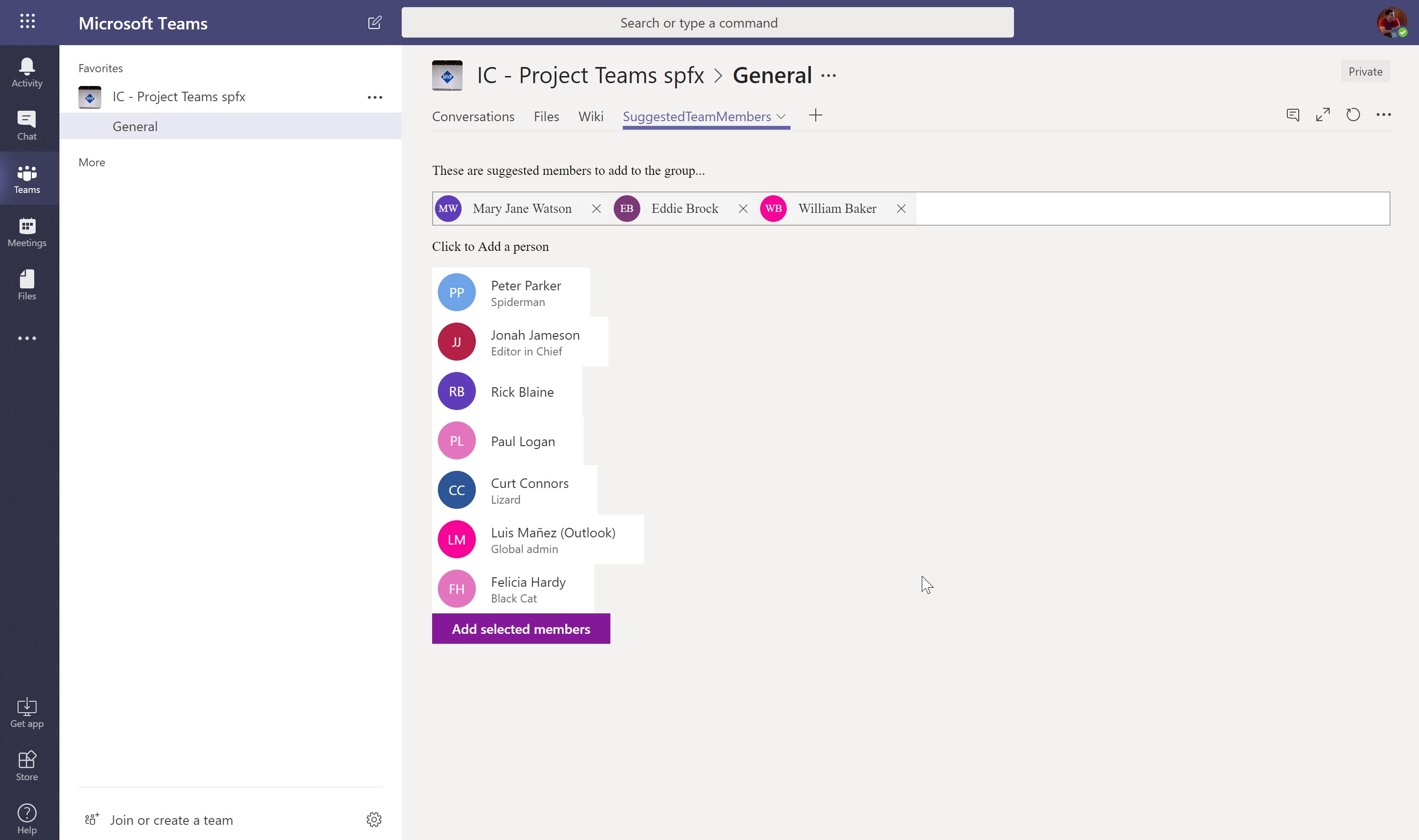|
Spfx Webpart read / update MS Graph Custom Schema Extensions<br/>[react-graph-schema-extensions](https://github.com/SharePoint/sp-dev-fx-webparts/tree/master/samples/react-graph-schema-extensions)|This sample shows how read and update a custom Schema extension in MS Graph. It shows how to create acustom Schema extension in Graph to store custom data related to an Office 365 Group, and how we can read and updatethat data using an spfx webpart.|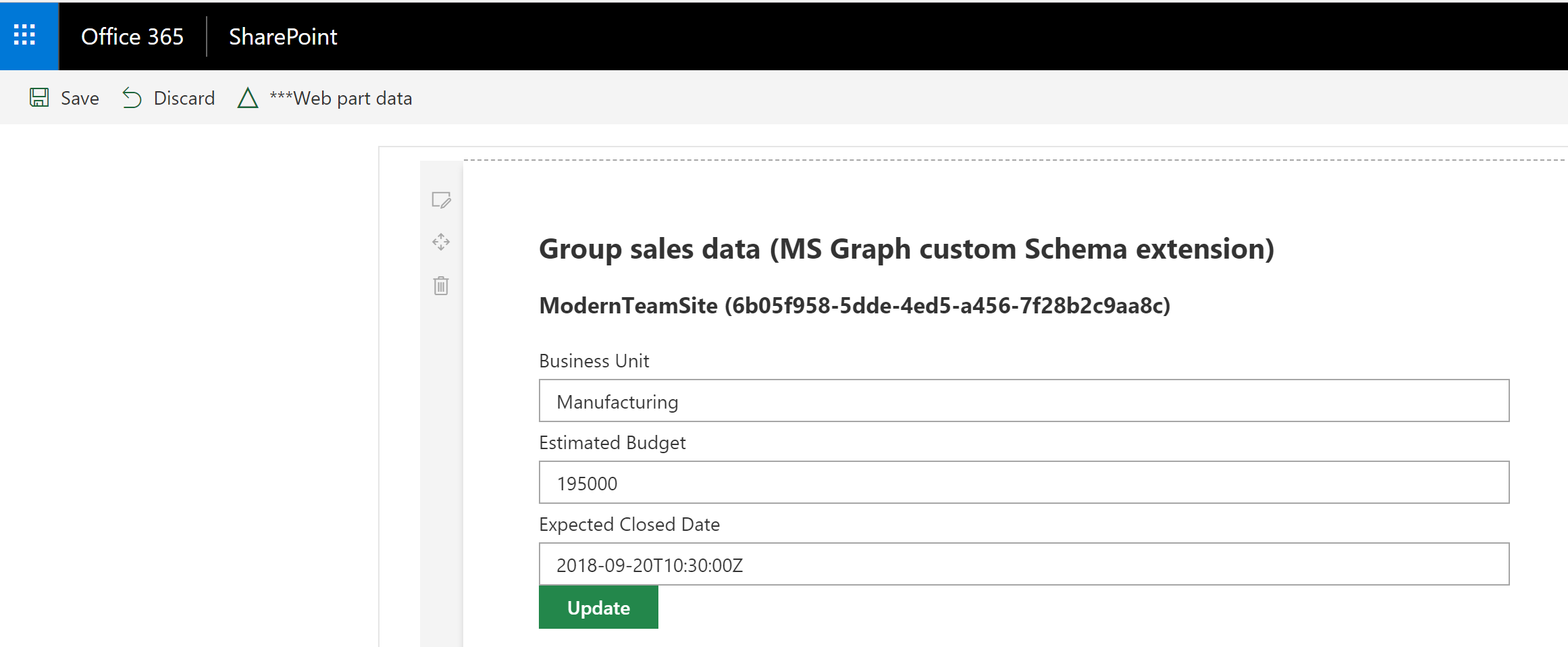|
SPFx webpart using Redux-Form library and React<br/>[react-reduxform](https://github.com/SharePoint/sp-dev-fx-webparts/tree/master/samples/react-reduxform)|Sample webpart to demonstrate the use of Redux-Form library with SPFx, React and Typescript. Demonstrates how to easily build a dynamic grid using redux-form.||
SPFx webpart with Taxonomy picker Office UI Fabric Panel.<br/>[react-taxonomypicker-panel](https://github.com/SharePoint/sp-dev-fx-webparts/tree/master/samples/react-taxonomypicker-panel)|Sample webpart with Single and Multi-select taxonomy pickers using Office UI Fabric panel. The webpart uses the Taxonomy API support available in the @pnp/taxonomy.||
Spfx Webpart: File Upload using AngularJs<br/>[angular-ngofficeuifabric-file-upload](https://github.com/SharePoint/sp-dev-fx-webparts/tree/master/samples/angular-ngofficeuifabric-file-upload)|File Update/Delete webpart using AngularJs and ngOfficeUIFabric with the SharePoint Framework.||
Summary<br/>[react-todo-basic](https://github.com/SharePoint/sp-dev-fx-webparts/tree/master/samples/react-todo-basic)|A simple todo web part built using react to showcase some of the SharePoint Framework developer features, utilities and best practices in building react based web parts.||
Taxonomy Picker (React)<br/>[react-taxonomypicker](https://github.com/SharePoint/sp-dev-fx-webparts/tree/master/samples/react-taxonomypicker)|A Taxonomy Picker control built with React based on react-taxonomypicker for use with SharePoint Framework client-side web parts (SPFx).|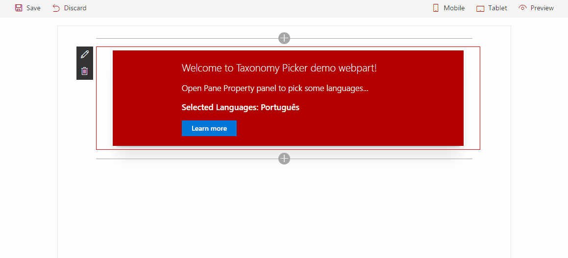|
Taxonomy Web Part<br/>[knockout-taxonomy](https://github.com/SharePoint/sp-dev-fx-webparts/tree/master/samples/knockout-taxonomy)|Sample Web Part illustrating<ul><li>Reading taxonomy term stores' hierarchy from SharePoint<li>Loading JavaScript Object Model scripts<li>creating Knockout components</ul>|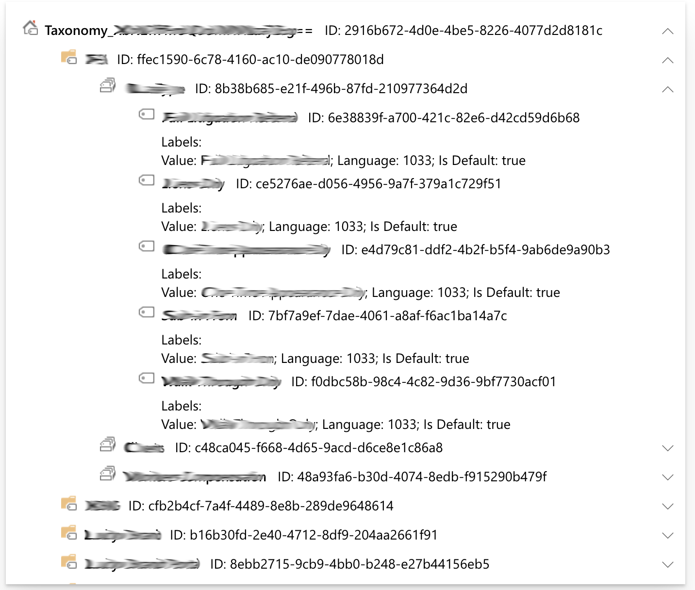|
title of the sample<br/>[js-dynamic-bundling-libraries](https://github.com/SharePoint/sp-dev-fx-webparts/tree/master/samples/js-dynamic-bundling-libraries)|This sample illustrates how SPFx functionality and packages can be bundled in multiple '.js' files then be dynamically & asynchronously loaded into the page at execution time, such as with a button click.|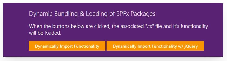|
title of the sample<br/>[knockout-dependent-properties](https://github.com/SharePoint/sp-dev-fx-webparts/tree/master/samples/knockout-dependent-properties)|Sample Web Part illustrating<ul><li>requesting Lists and Views data from SharePoint REST API<li>creating Knockout dropdown custom component with Fabric UI styling<li>creating dependent properties (dropdowns) in Client-Side Web Part Property Pane</ul>|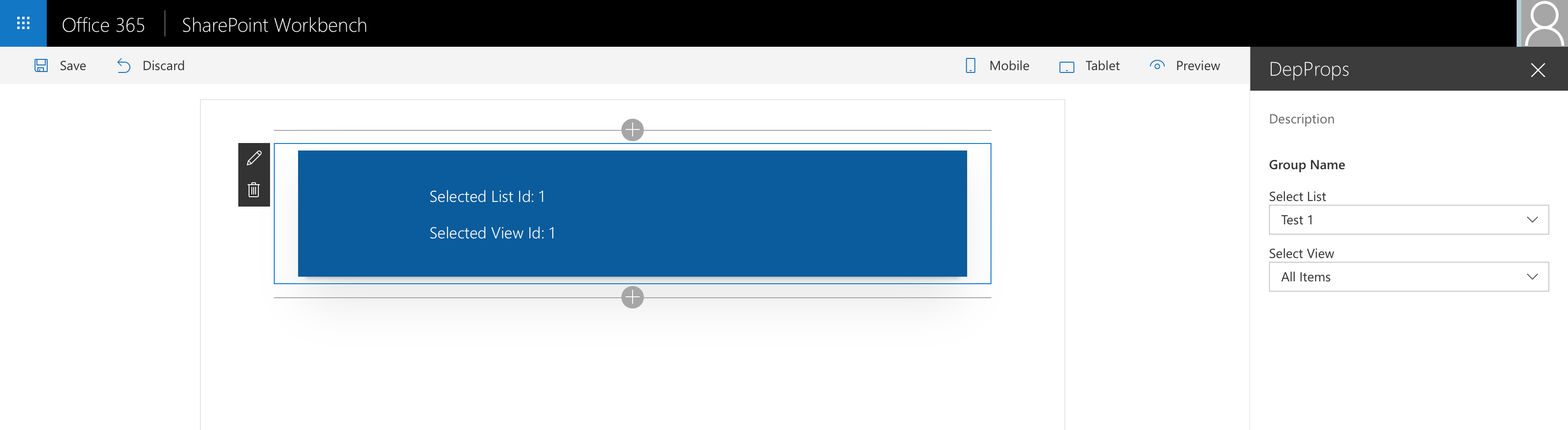|
Todo Client Web Part built with Vue.js and Vue's single-file components<br/>[vuejs-todo-single-file-component](https://github.com/SharePoint/sp-dev-fx-webparts/tree/master/samples/vuejs-todo-single-file-component)|Sample Todo web part demonstrating how you can utilize Vue (a progressive framework for building user interfaces) with SharePoint Framework using handy single-file components approach.||
<EFBFBD>Using jQuery loaded from CDN<br/>[jquery-cdn](https://github.com/SharePoint/sp-dev-fx-webparts/tree/master/samples/jquery-cdn)|This is a sample web Part that illustrates the use of jQuery and its plugins loaded from CDN for building SharePoint Framework client-side web parts.|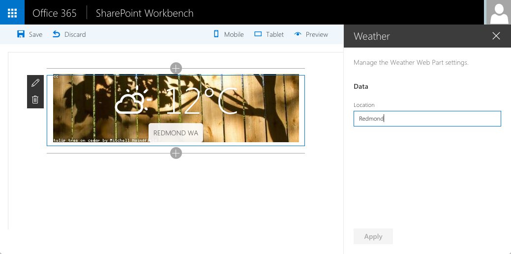|
Using React Accordion plugin with SPFx<br/>[react-accordion](https://github.com/SharePoint/sp-dev-fx-webparts/tree/master/samples/react-accordion)|This is a sample web Part that illustrates the use of React Accessible Accordion plugin for building SharePoint Framework client-side web parts to show SharePoint list data in Accordion format.||
Web part displaying hierarchical information from SharePoint list<br/>[react-display-hierarchy](https://github.com/SharePoint/sp-dev-fx-webparts/tree/master/samples/react-display-hierarchy)|At the time of developing this sample, the Office 365 UI fabric does not have any control for displaying hierarchical information. This web part helps to display the hierarchical information from SharePoint list.|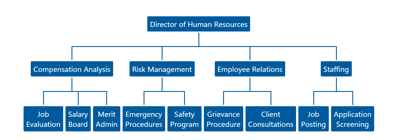|
Webhooks Realtime<br/>[react-webhooks-realtime](https://github.com/SharePoint/sp-dev-fx-webparts/tree/master/samples/react-webhooks-realtime)|This web part demonstrates how to leverage the capabilities of SharePoint Webhooks.The libraries used by this web part are Socket.io, sp pnp js, moment.|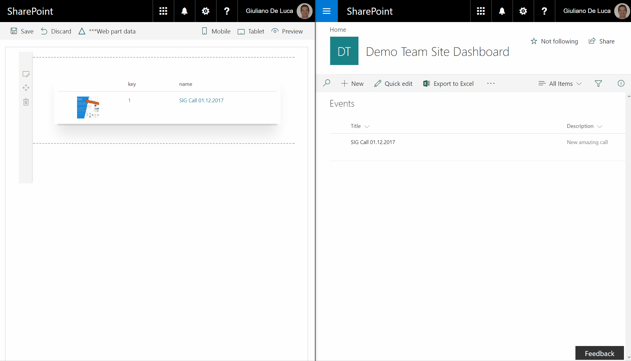|
Webpart showing Url validation for SharePoint using Office Graph<br/>[react-graph-evalurl](https://github.com/SharePoint/sp-dev-fx-webparts/tree/master/samples/react-graph-evalurl)|This sample contains a class that evaluates the url input of a text field against the Microsoft Graph. It is possible to evalute the existance of the following three SharePoint Elements:|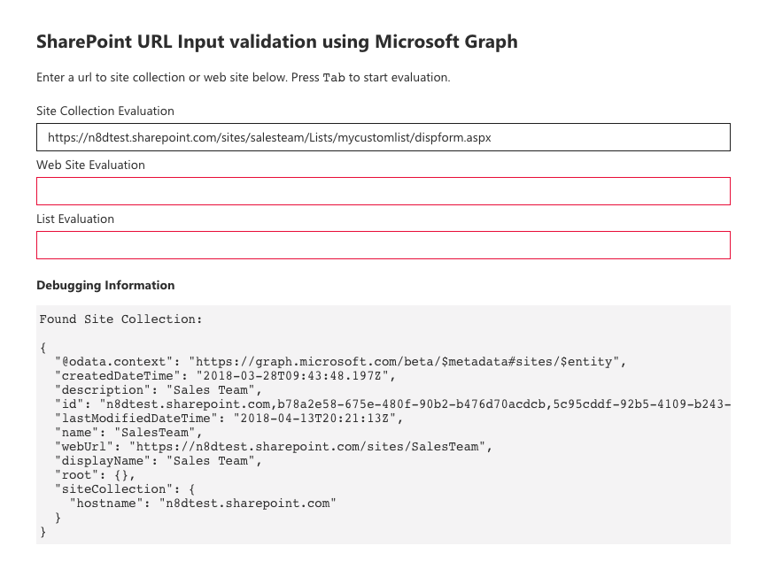|
Webpart with React and Mobx<br/>[react-mobx](https://github.com/SharePoint/sp-dev-fx-webparts/tree/master/samples/react-mobx)|Sample webpart implementation that uses Mobx to keep track of its state.||
Webpart with React and Mobx (multiple stores)<br/> [react-mobx-multiple-stores](https://github.com/SharePoint/sp-dev-fx-webparts/tree/master/samples/react-mobx-multiple-stores)|A sample webpart that uses the [Mobx](https://mobx.js.org/) library with multiple stores to keep track of the applications state.||
Webpart with React and Redux<br/>[react-redux](https://github.com/SharePoint/sp-dev-fx-webparts/tree/master/samples/react-redux)|Sample webpart implementation that uses Redux to keep track of its state.||
Yammer REST API SPFx webpart<br/>[react-yammer-api](https://github.com/SharePoint/sp-dev-fx-webparts/tree/master/samples/react-yammer-api)|This sample shows how Yammer REST APIs can be consumed by using SharePoint Framework React webpart and the Yammer JavaScript SDK. The SPFx webpart contains wrapper around the Yammer JavaScript SDK that can be extended for fluent typescript api experience.|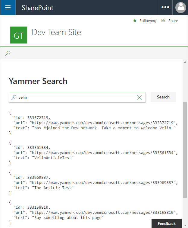|
Youtube Web Part<br/>[react-youtube](https://github.com/SharePoint/sp-dev-fx-webparts/tree/master/samples/react-youtube)|This web part allows to search and view the Youtube videos, across the Youtube API, directly on a SharePoint page, furthermore the property panel offers the possibility to specify the api key, the number of items to display and it is also possible specify a Youtube Channel Id.|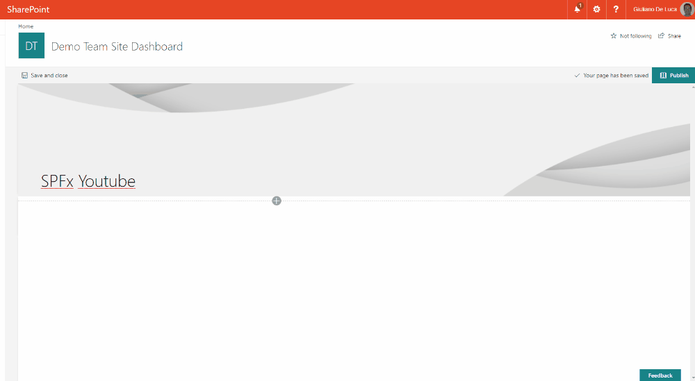|