|
|
||
|---|---|---|
| .. | ||
| .vscode | ||
| assets | ||
| config | ||
| src | ||
| teams | ||
| tools | ||
| .editorconfig | ||
| .gitignore | ||
| .yo-rc.json | ||
| README.md | ||
| gulpfile.js | ||
| package-lock.json | ||
| package.json | ||
| tsconfig.json | ||
| tslint.json | ||
| yarn.lock | ||
README.md
react-personal-greeting
Summary
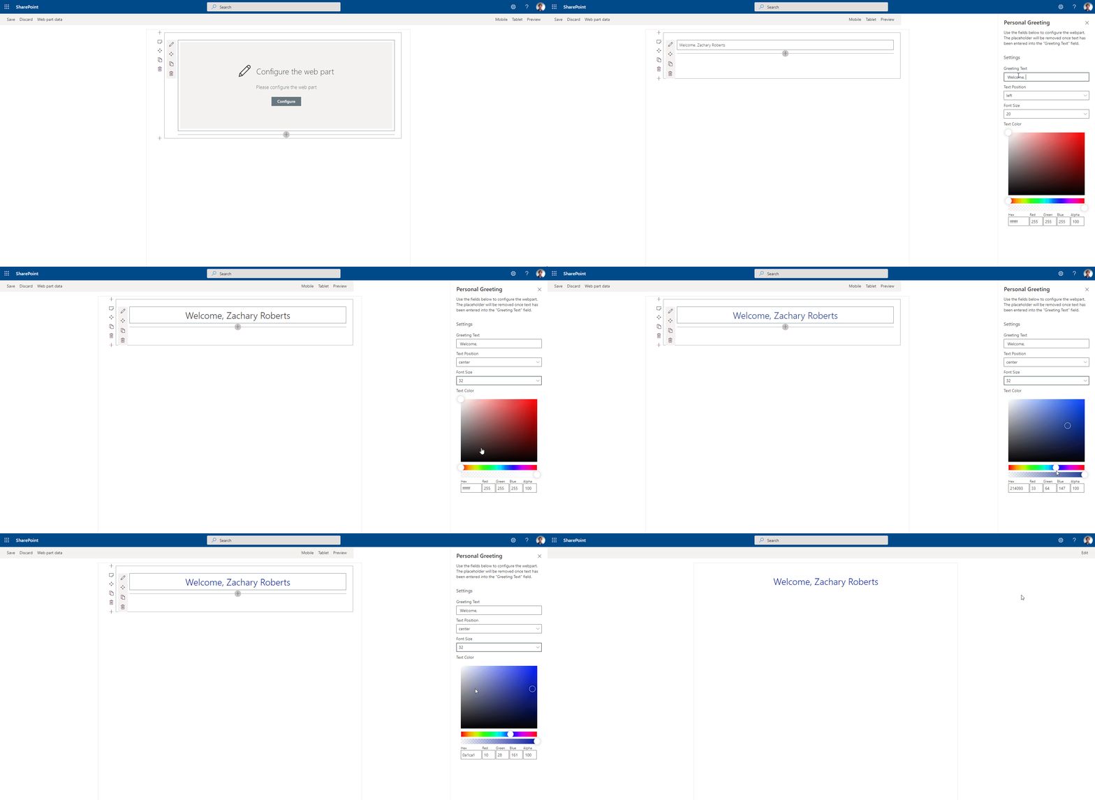
The web part pulls in the current user's name and displays it on the page. The greeting text before the name is customizable through the property pane. Additionally the position of the greeting and color of the text can be adjusted through the property pane as well.
Used SharePoint Framework Version
Applies to
Prerequisites
Solution
| Solution | Author(s) |
|---|---|
| react-personal-greeting | Zach Roberts - SPODev |
Version history
| Version | Date | Comments |
|---|---|---|
| 1.1 | September 24, 2020 | Updated SPFX version and added font-size |
| 1.0 | April 14, 2020 | Initial release |
Disclaimer
THIS CODE IS PROVIDED AS IS WITHOUT WARRANTY OF ANY KIND, EITHER EXPRESS OR IMPLIED, INCLUDING ANY IMPLIED WARRANTIES OF FITNESS FOR A PARTICULAR PURPOSE, MERCHANTABILITY, OR NON-INFRINGEMENT.
Minimal Path to Awesome
- Clone this repository
- in the command line run:
npm installgulp buildgulp bundle --shipgulp package-solution --ship
- add the web part to your tenant app store
- add the app to a SharePoint site and then add the web part to the page
Features
This Web Part illustrates the following concepts on top of the SharePoint Framework:
- Using the SPFx context to gather the current user's display name.
- Adjusting the styles of the component in the web part using the props adjusted through the property pane.
- PnP SPFx Placeholder - This component allows you to have a placeholder visible under certain conditions if your web parts requires some setup.
- PnP SPFx Color Picker - This component adds an awesome color picker to the property pane, great for adjusting colors in your web part.

