Quick Poll
Summary
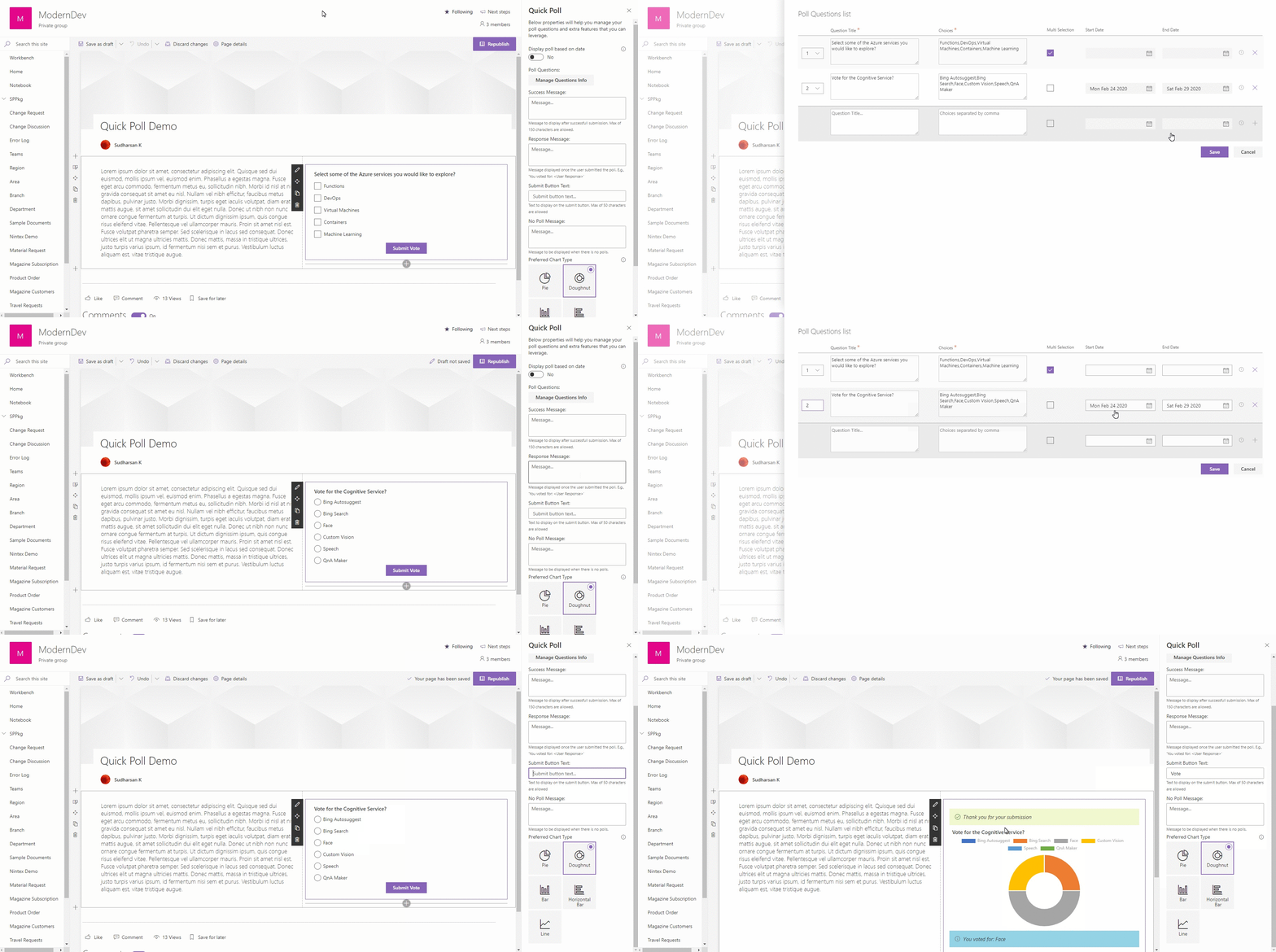
This component is developed for the users who really need to create a Poll within a minute and with less maintenance. QuickPoll list will be created automatically to store the user response.
Following are some of the features of this component.
- Easy to setup with most of the configurations are optional.
- Flexible to use without any critical configuration.
- More than one poll questions can be added.
- Schedule the poll questions in advance using the date parameters.
- Option to choose the poll that has to be visible to the end users.
- Poll response can be viewed via graphical representation as charts.
Properties
-
Display poll based on date - This property will check for the Start Date and End Date on the poll questions to display the correct poll question to the end user. The Start Date and End Date on the poll question will be enabled only when this property is turned on.
-
Poll Questions - Manage the collection of poll questions and choices.
- Question Title - Title of the question.
- Choices - Choices separated by comma.
- Multi Selection - Whether the users are allowed to choose one or multiple.
- Start Date - Date when the end user can start seeing the poll question.
- End Date - Last day of the poll question visible to the end user.
-
Success Message - Message to be displayed to the user after a successful submission. It is optional, if not provided the default message 'Thank you for your submission' will be displayed.
-
Response Message - Message to be displayed to the user with the user response, once the user has submitted. It is optional, if not provided the default message 'You voted for:
User Response' will be displayed below the chart. -
Submit button text - Text to be displayed on the submit button. It is optional, if not provided the default text 'Submit Vote' will be displayed.
-
Preferred Chart Type - Chart type to display the overall response for the question.
Note:
- Poll questions with the same 'Start Date' and 'End Date' will follow the sort order to display the latest question to the end user.
- Once the user started to response to the poll, do not delete the question from the question collection. All the questions are mapped based on the ID auto generated. It cannot be recovered once deleted.
- Make sure the Multi Choice option is chosen wisely, do not change once the user started to response to the poll.
Compatibility
| ⚠️ Important |
|---|
| Every SPFx version is only compatible with specific version(s) of Node.js. In order to be able to build this sample, please ensure that the version of Node on your workstation matches one of the versions listed in this section. This sample will not work on a different version of Node. |
| Refer to https://aka.ms/spfx-matrix for more information on SPFx compatibility. |
Applies to
Contributors
Version history
| Version | Date | Comments |
|---|---|---|
| 1.0.0.1 | Feb 24 2020 | Initial release |
| 2.0.0.0 | Oct 17 2020 | Initial release |
| 2.1.0.0 | June 30, 2021 | Updated simple poll component |
| 2.1.1.0 | March 16, 2022 | Updated to SPFx 1.13.1 |
Minimal path to awesome
- Clone this repository (or download this solution as a .ZIP file then unzip it)
- From your command line, change your current directory to the directory containing this sample (
react-quick-poll, located undersamples) - in the command line run:
npm installgulp bundle --shipgulp package-solution --ship
- Add the
.sppkgfile to the app catalog and add the Quick Poll web part to the page.
This sample can also be opened with VS Code Remote Development. Visit https://aka.ms/spfx-devcontainer for further instructions.
Features
- Used PnP Property Pane Controls to create the property pane controls
- PropertyFieldToggleWithCallout
- PropertyFieldCollectionData
- PropertyFieldChoiceGroupWithCallout
- PropertyPaneTextField (From base property controls)
- Used PnP Reusable React Controls
- Used few styles and controls (Text, MessageBar, ProgressIndicator, PrimaryButton, ChoiceGroup, List, Checkbox) from Office UI Fabric
- Used PnP for communication with SharePoint.
- Used Moment.js for datetime formatting.
Help
We do not support samples, but this community is always willing to help, and we want to improve these samples. We use GitHub to track issues, which makes it easy for community members to volunteer their time and help resolve issues.
If you're having issues building the solution, please run spfx doctor from within the solution folder to diagnose incompatibility issues with your environment.
You can try looking at issues related to this sample to see if anybody else is having the same issues.
You can also try looking at discussions related to this sample and see what the community is saying.
If you encounter any issues while using this sample, create a new issue.
For questions regarding this sample, create a new question.
Finally, if you have an idea for improvement, make a suggestion.
Disclaimer
THIS CODE IS PROVIDED AS IS WITHOUT WARRANTY OF ANY KIND, EITHER EXPRESS OR IMPLIED, INCLUDING ANY IMPLIED WARRANTIES OF FITNESS FOR A PARTICULAR PURPOSE, MERCHANTABILITY, OR NON-INFRINGEMENT.


-Incompatible-red.svg)


