 41e13fce9b
Bumps [moment](https://github.com/moment/moment) from 2.24.0 to 2.29.2.
- [Release notes](https://github.com/moment/moment/releases)
- [Changelog](https://github.com/moment/moment/blob/develop/CHANGELOG.md)
- [Commits](https://github.com/moment/moment/compare/2.24.0...2.29.2)

---
updated-dependencies:
- dependency-name: moment
  dependency-type: indirect
...

Signed-off-by: dependabot[bot] <support@github.com>
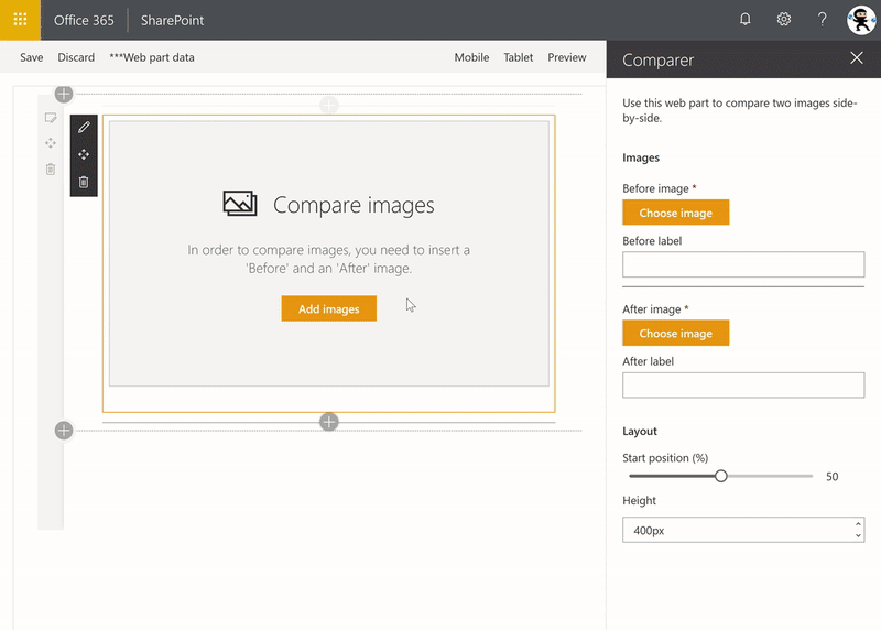
Image Comparer with File Picker
Summary
Allows users to compare Before and After pictures, with a draggable slider. Implements a custom file picker.
Background
The Microsoft UI Fabric team (formerly Office UI Fabric) recently released a web site that allows you to compare the current version of the Office UI Fabric components side by side with their upcoming Fluent versions, using a cool image slider.
I wanted to re-create a version of the slider that would allow a user to compare two images, side by side.
Re-creating the slider was pretty easy (they use react-draggable to handle dragging); I wanted to make it possible for users to select the Before and After pictures to use the SharePoint File Picker dialog.
After a lot of digging around, I decided to re-create my own.
After all, one of the premises of SPFx is that SPFx gives us -- the SharePoint developer community -- a framework to build the same web parts that Microsoft's own developers do. Right?
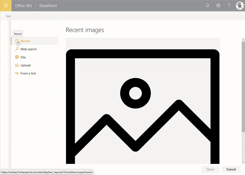
This sample re-creates the SharePoint file picker (or, more accurately, the SharePoint image picker) that is used by out-of-the-box web parts such as the Image and Hero web parts. My goal was to create something that would be re-usable, and would be as close as possible from the out-of-the-box picker. In fact, as I was testing the app, I found myself testing the out-of-the-box picker when I thought I was testing my own file picker.
After building this sample, I can confirm that it is possible to build web parts that look and feel like the out-of-the-box web parts using SPFx.
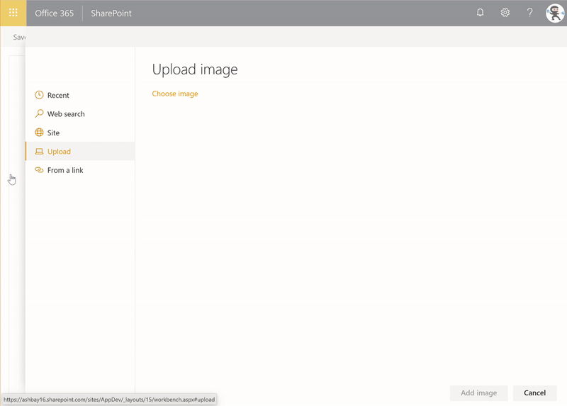
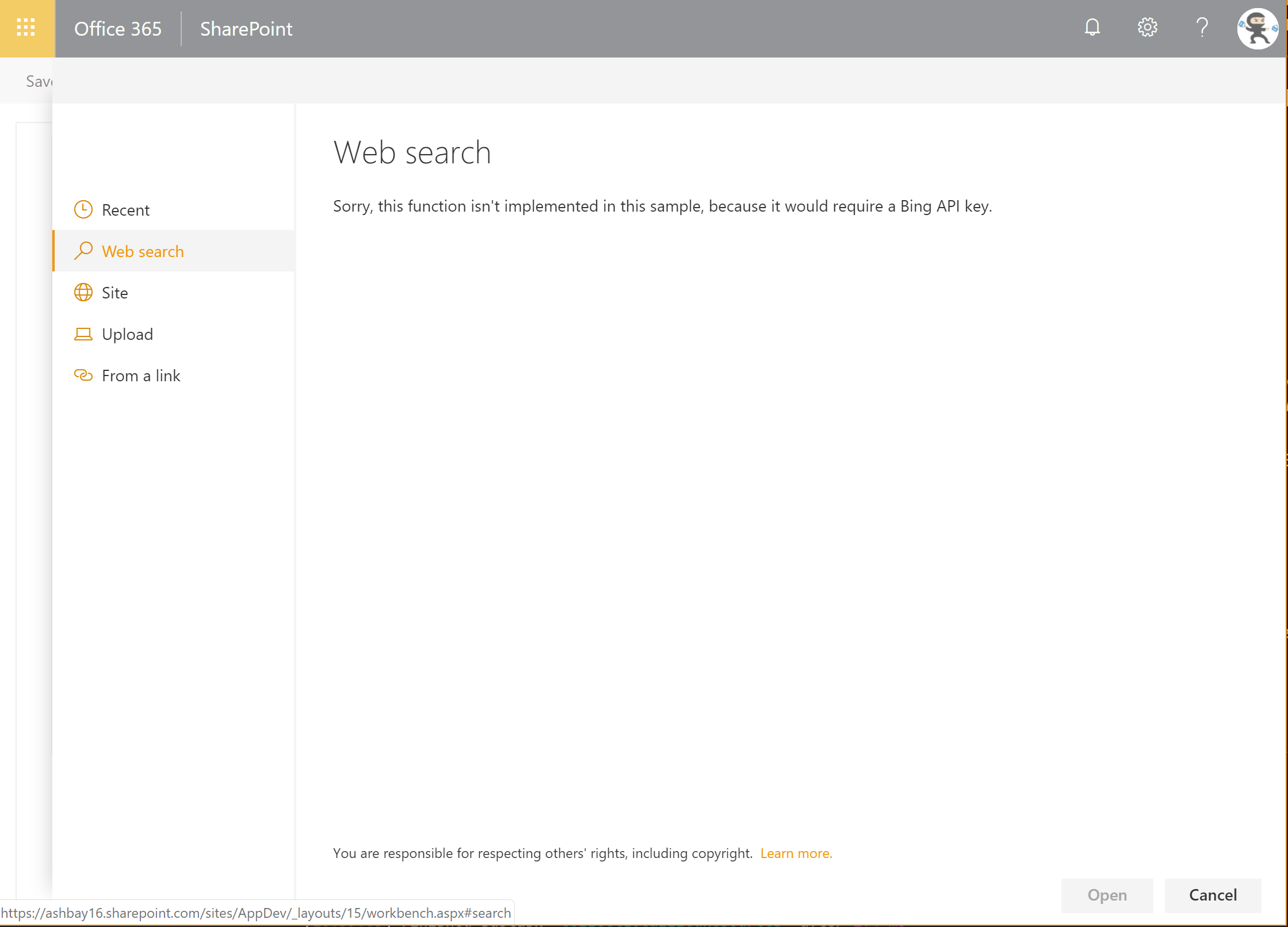
The file picker includes the following tabs:
Recent
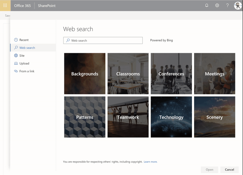
Web search
NOTE: Requires a Bing API key, see below
OneDrive
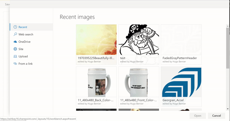
Site
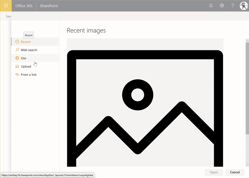
Upload
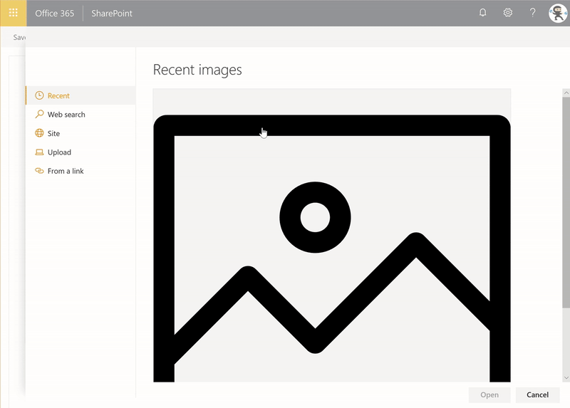
From a link
Compatibility
-Incompatible-red.svg "SharePoint Server 2016 Feature Pack 2 requires SPFx 1.1")
Applies to
Solution
| Solution | Author(s) |
|---|---|
| react-comparer | Hugo Bernier (Tahoe Ninjas, @bernierh) |
Version history
| Version | Date | Comments |
|---|---|---|
| 1.0 | January 27, 2019 | Initial release |
Minimal Path to Awesome
- Clone this repository (or download this solution as a .ZIP file then unzip it)
- In the command line run:
npm igulp serve --nobrowser
- In the web browser navigate to the hosted version of the SharePoint workbench located in the same site as where the Tasks list is, eg. https://contoso.sharepoint.com/sites/team/_layouts/15/workbench.aspx.
This sample can also be opened with VS Code Remote Development. Visit https://aka.ms/spfx-devcontainer for further instructions.
Optional Configuration - Bing Search
The sample PropertyPanelFilePicker is designed to mimic the standard SharePoint file picker dialog. As such, it includes a Web search which uses Bing to return search results.
However, the feature requires a Bing API key in order to work. If you do not have a Bing API key, the PropertyPanelFilePicker will display a message indicating that the Bing API key is missing.
To Configure a Bing API key (Optional)
This sample uses SharePoint Online Tenant Properties to store the API key. The idea is that if you get an API key for your organization to use, you want to store it in one place -- the Tenant Properties -- instead of having to re-enter the API key in every web part that needs it.
To configure your API key, use the following steps:
- If you don't already have a Bing Web Search API key, go to the Bing Web Search API page and request a key.
- To set the API key, you'll need to use the Office 365 CLI. If you haven't installed it yet, you can get it from here.
- Using Office 365 CLI, enter the following command, making sure to change value with your actual Bing API key, and appCatalogUrl with your tenant's app catalog (e.g.: https://contoso.sharepoint.com/sites/apps).
spo storageentity set --appCatalogUrl <appCatalogUrl> --key BingApi --value <value>
- If you want to verify that your API key is stored, use the following command to list all your tenant properties:
spo storageentity list --appCatalogUrl <appCatalogUrl>
If all goes well, you should see an entry called BingApi containing your Bing API key.
To hide the Web search tab
If you want to use this web part without the Web search tab, you can simply disable it from the code. To do so, use the following steps:
- In the solution, open the ComparerWebPart.ts file.
- Look for a line at the top of the file that looks like this:
const DISABLE_WEB_SEARCH_TAB: boolean = false;
- Change the
falsetotrue - Save and rebuild/redeploy the web part.
This constant will be applied to both PropertyPaneFilePicker controls used in the web part.
You can also simply set each PropertyPaneFilePicker's disableWebSearchTab property to true.
Features
- Using Tenant property
- Using of Office UI Fabric React Selection control
- Using of Office UI Fabric React Selection control
- Making CORS calls within an SPFx component
Resources
- Fluent for Fabric
- Build custom controls for the property pane
- Office UI Fabric
- SharePoint Online tenant properties
- @pnp/spfx-controls-react
- @pnp/sp
- React-draggable
- React-block-image
- StackExchange - SPFx calls blocked by CORS policy
Disclaimer
THIS CODE IS PROVIDED AS IS WITHOUT WARRANTY OF ANY KIND, EITHER EXPRESS OR IMPLIED, INCLUDING ANY IMPLIED WARRANTIES OF FITNESS FOR A PARTICULAR PURPOSE, MERCHANTABILITY, OR NON-INFRINGEMENT.