|
|
||
|---|---|---|
| .. | ||
| assets | ||
| config | ||
| dist | ||
| lib | ||
| sharepoint/solution | ||
| src | ||
| teams | ||
| README.md | ||
| gulpfile.js | ||
| package-lock.json | ||
| package.json | ||
| tsconfig.json | ||
| tslint.json | ||
README.md
Dynamic Accordion - FAQ Builder
Summary
- This sample is based on Erik Benke and Mike Zimmerman's Accordion Section FAQ Builder web part. It adds extended support for single FAQs list based on Category and dynamic properties selection.
- Adds a collapsible accordion section to an Office 365 SharePoint page or Teams Tab.
- Ideal for displaying FAQs.
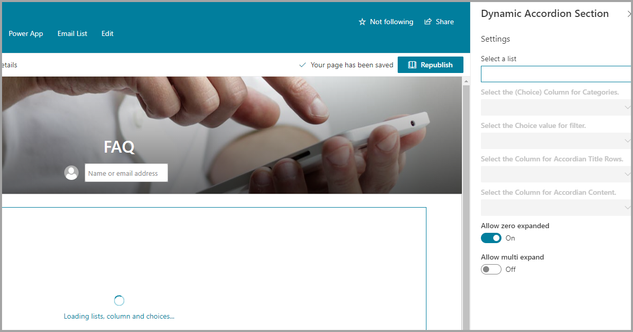
- When adding the web part, you'll be prompted to select a list from a property panel dropdown (target list must be created with FAQ type Question and Answer.).
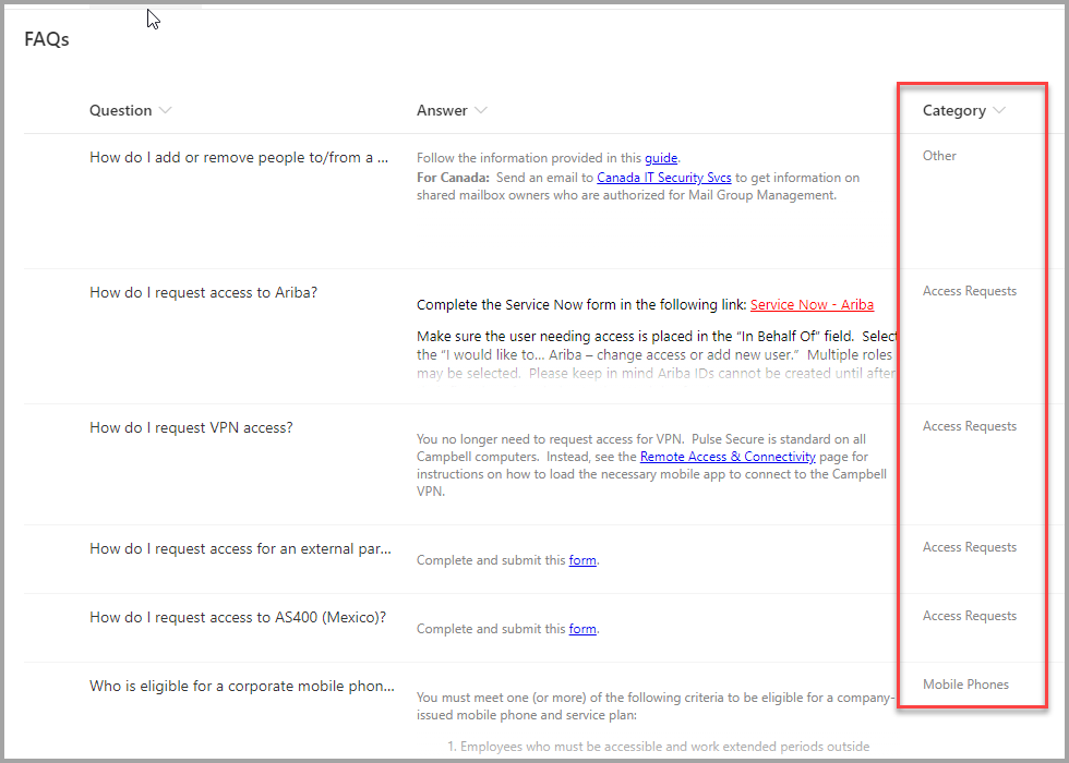
- The web part expects a column called Category of type choice that will be used as the category.
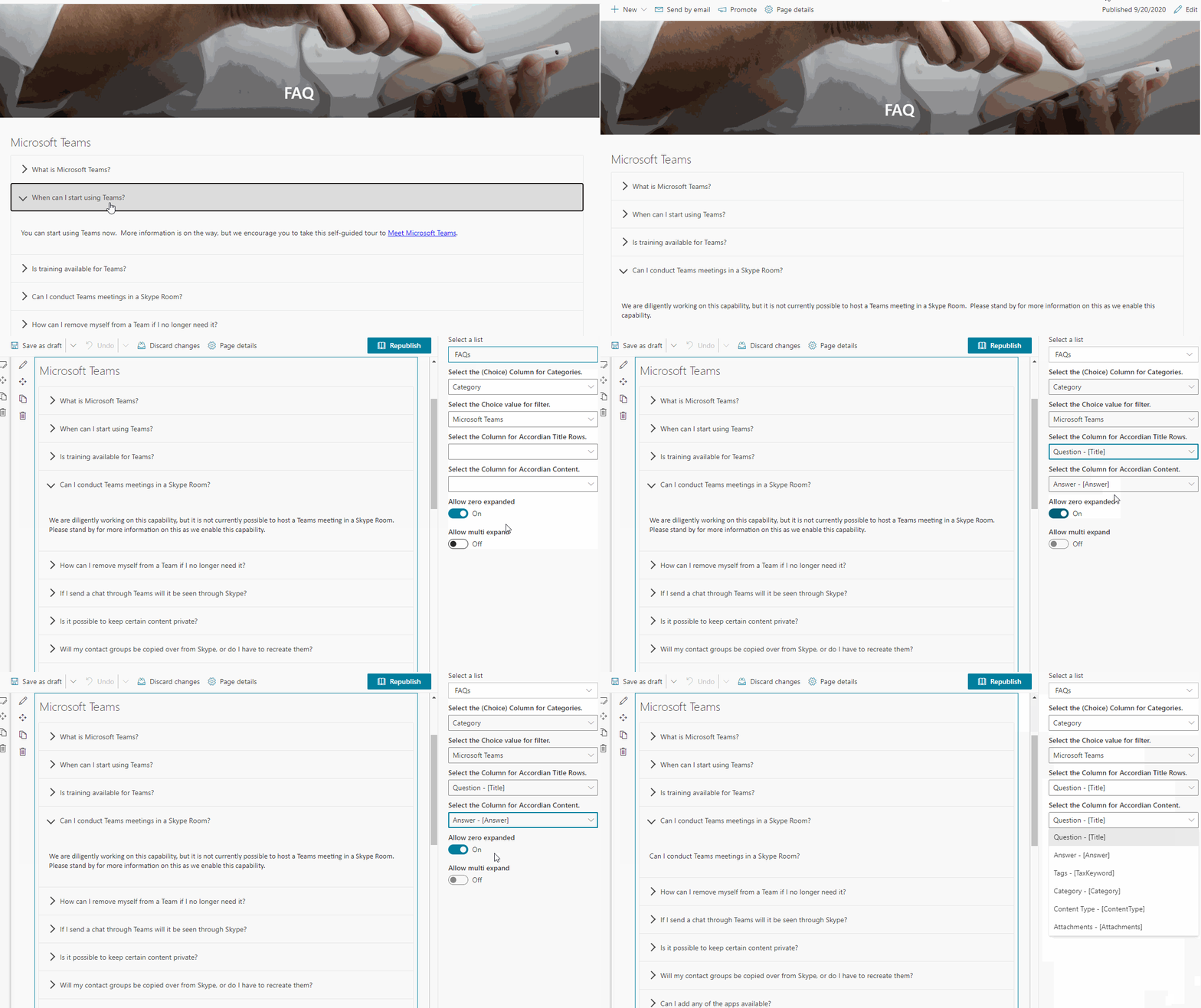
- The web part will automatically load all the properties in two dropdowns. One for Accordion Title and One for Accordion Content that must be html type.
- This will generate an accordion with one section for each item in the list.
- Modifications/deletions/additions to the list items in the target list of an added web part are automatically reflected on the page.
- To deploy to a Teams tab see current Microsoft documentation.
Usage
1) Create or use a list for FAQs. It can have the FAQ format e.g. Title and a Content columns. You can also used the attached STP file if needed.:
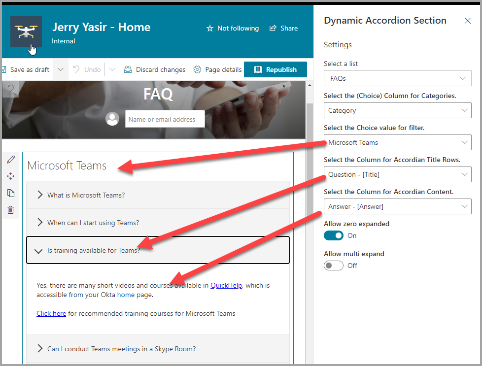
- The value in the Accordion Title property for each item will appear in the heading bars of the Accordion.
- The value in the Accordion Content property for each item will appear in the collapsible content section of the Accordion
- When creating the columns, select "Multiple lines of text". Rich text is now supported within the Content column.
 FAQ list Template for use with the Accordion
FAQ Site Script use with the Accordion
2) Add the Dynamic Accordion Section web part to your page & select your list, category, title and content columns. Click Apply and Publish:
Used SharePoint Framework Version
Applies to
Prerequisites
Please create the list as described above
Solution
| Solution | Author(s) |
|---|---|
| SPFx Collapsible Accordion Section | Erik Benke (@erikjbenke) |
| SPFx Collapsible Accordion Section | Mike Zimmerman |
| Dynamic SPFx Collapsible Accordion Section | Jerry Yasir |
Version history
| Version | Date | Comments |
|---|---|---|
| 1.0 | September 20, 2020 | Reused [Erik Benke] and [Mike Zimmerman] web part |
| 1.1 | September 20, 2020 | Added Support for Dynamic Column selection for reuseability, Dynamic Property Selection for Columns |
Disclaimer
THIS CODE IS PROVIDED AS IS WITHOUT WARRANTY OF ANY KIND, EITHER EXPRESS OR IMPLIED, INCLUDING ANY IMPLIED WARRANTIES OF FITNESS FOR A PARTICULAR PURPOSE, MERCHANTABILITY, OR NON-INFRINGEMENT.
Minimal Path to Awesome
- Clone or download this repository
- Run in command line:
npm installto install the npm dependenciesgulp serveto display in Developer Workbench (recommend using your tenant workbench so you can test with real lists within your site)
- To package and deploy:
- Use
gulp bundle --ship&gulp package-solution --ship - Add the
.sppkgto your SharePoint App Catalog
- Use


