 96c909428b
|
||
|---|---|---|
| .. | ||
| assets | ||
| config | ||
| src | ||
| teams | ||
| .editorconfig | ||
| .gitignore | ||
| .yo-rc.json | ||
| README.md | ||
| gulpfile.js | ||
| package-lock.json | ||
| package.json | ||
| tsconfig.json | ||
| tslint.json | ||
README.md
FAQ Document Card
React FAQ Document Card Web Part
Summary
For detailed instructions on how to build this web part and the needed list please watch: https://www.youtube.com/watch?v=oIr-rgGvUUk
Compatibility
Applies to
Prerequisites
-
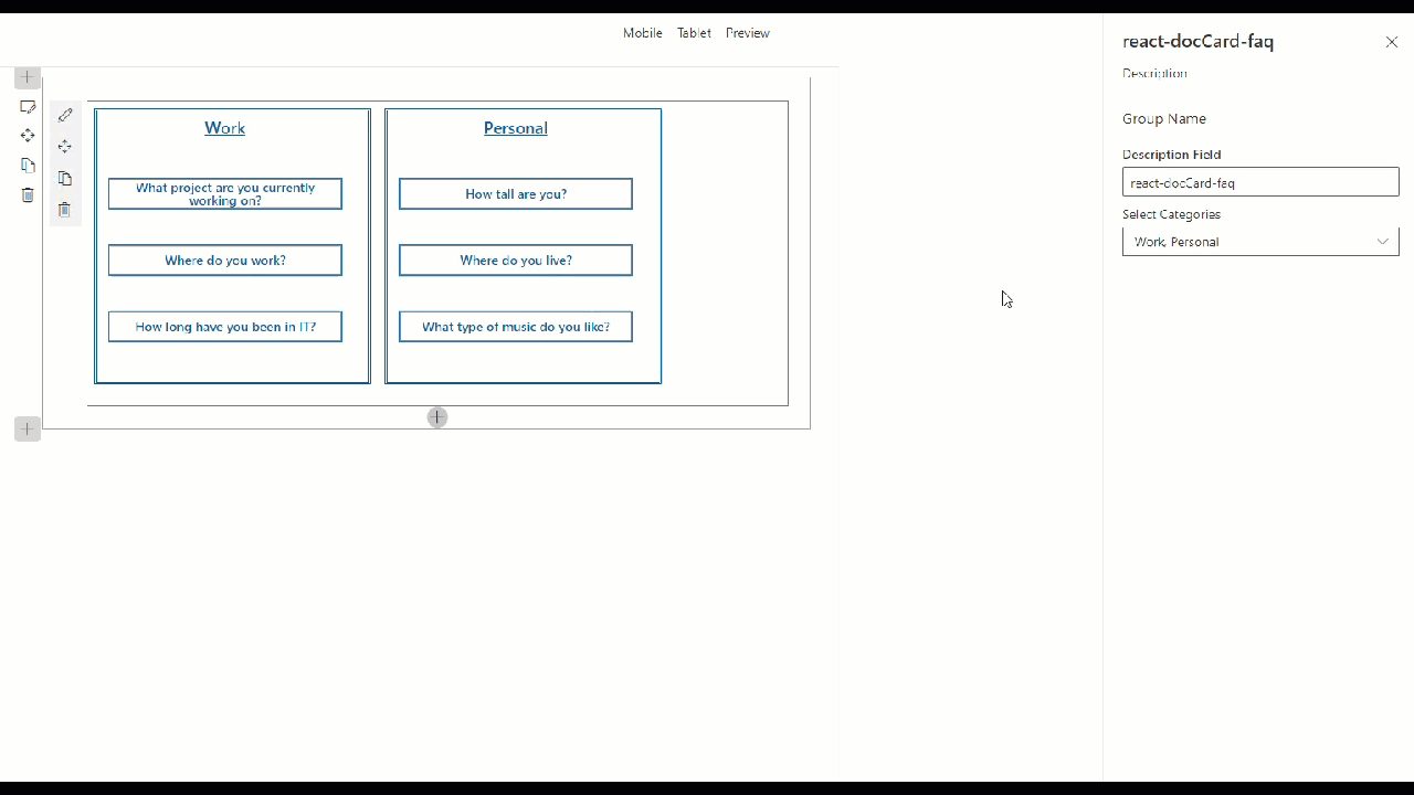
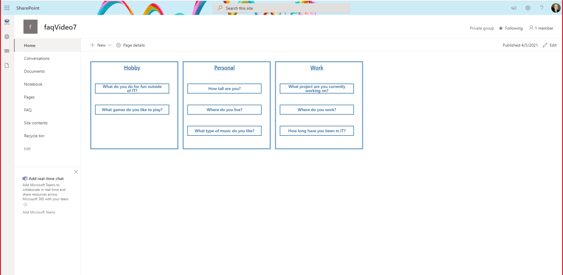
Build a SharePoint Online list named FAQ
-
Rename Title column to Question
-
Add 3 additional columns:
- Multiple lines of text column, toggle Use rich text to yes, name Answer
- Choice column, Options
Work,Personal, andHobby, name Category - Yes/No column, set default to
No, name Featured
-
Add items to your list making sure to set some to
yesin the Featured column -
Navigate to your sites workbench (https://.sharepoint.com/sites//_layouts/15/workbench.aspx)
Solution
| Solution | Author(s) |
|---|---|
| react-doccard-faq | Sam Collins (@samc148) |
Version history
| Version | Date | Comments |
|---|---|---|
| 1.0 | April 5, 2021 | Initial release |
Disclaimer
THIS CODE IS PROVIDED AS IS WITHOUT WARRANTY OF ANY KIND, EITHER EXPRESS OR IMPLIED, INCLUDING ANY IMPLIED WARRANTIES OF FITNESS FOR A PARTICULAR PURPOSE, MERCHANTABILITY, OR NON-INFRINGEMENT.
Minimal Path to Awesome
- Clone this repository
- in the command line run:
npm installgulp serve
Features
DefaultButton, Modal, DetailsList, IColumn, from office-ui-fabric-react
IPropertyPaneDropdownOption from @microsoft/sp-property-pane
RichText, Accessible Accordion from @pnp/spfx-controls-react