Bumps [word-wrap](https://github.com/jonschlinkert/word-wrap) from 1.2.3 to 1.2.4.
- [Release notes](https://github.com/jonschlinkert/word-wrap/releases)
- [Commits](https://github.com/jonschlinkert/word-wrap/compare/1.2.3...1.2.4)

---
updated-dependencies:
- dependency-name: word-wrap
  dependency-type: indirect
...

Signed-off-by: dependabot[bot] <support@github.com>
Adaptive Cards using React Hooks
Summary
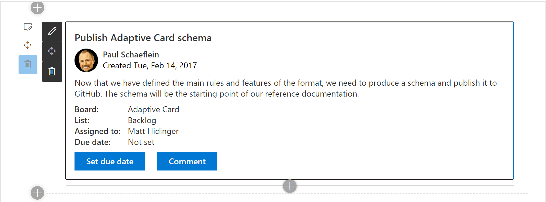
A version of react-adaptivecards using React Hooks.
Compatibility
| ⚠️ Important |
|---|
| Every SPFx version is only compatible with specific version(s) of Node.js. In order to be able to build this sample, please ensure that the version of Node on your workstation matches one of the versions listed in this section. This sample will not work on a different version of Node. |
| Refer to https://aka.ms/spfx-matrix for more information on SPFx compatibility. |
Applies to
Contributors
Version history
| Version | Date | Comments |
|---|---|---|
| 1.0 | April 27, 2020 | Initial release |
| 2.0 | August 25, 2020 | Upgraded to SPFx 1.11 and added support for May 2020 changes to Adaptive Cards |
Minimal Path to Awesome
- Clone this repository
- in the command line run:
npm installgulp serve
This sample can also be opened with VS Code Remote Development. Visit https://aka.ms/spfx-devcontainer for further instructions.
Code structure
| File | Type | Description |
|---|---|---|
| AdaptiveCardViewerWebPart.ts | React Class component (derives from BaseWebPart) | Used to define web part properties and bootstrap the component tree |
| RootComponent.tsx | React Function component | Interrogates web part properties and establishes AppContext and initial state. Monitors CardService state and dispatches updates to viewer state. |
| AppContext.ts | React context provider | Exposes the SPFx web part context, the web part instance and the state dispatch to all components via React.useContext() |
| CardService.ts | React Hook | Abstracts the SP HttpClient |
| CardServiceReducer.ts | React Reducer | Reducer/state for CardService hook |
| AdaptiveCardViewer.tsx | React Function component | Top-level UI component. |
| AdaptiveCardHost.tsx | React Function component | Renders placeholder if template/data are missing. Handles card actions. |
| AdaptiveCard.tsx | React Class component | Responsible for rendering adaptive card and expanding card with data |
Help
We do not support samples, but we this community is always willing to help, and we want to improve these samples. We use GitHub to track issues, which makes it easy for community members to volunteer their time and help resolve issues.
If you're having issues building the solution, please run spfx doctor from within the solution folder to diagnose incompatibility issues with your environment.
If you encounter any issues while using this sample, create a new issue.
For questions regarding this sample, create a new question.
Finally, if you have an idea for improvement, make a suggestion.
Disclaimer
THIS CODE IS PROVIDED AS IS WITHOUT WARRANTY OF ANY KIND, EITHER EXPRESS OR IMPLIED, INCLUDING ANY IMPLIED WARRANTIES OF FITNESS FOR A PARTICULAR PURPOSE, MERCHANTABILITY, OR NON-INFRINGEMENT.


