|
|
||
|---|---|---|
| .. | ||
| .devcontainer | ||
| assets | ||
| config | ||
| release | ||
| src | ||
| teams | ||
| .gitignore | ||
| .yo-rc.json | ||
| README.md | ||
| gulpfile.js | ||
| package-lock.json | ||
| package.json | ||
| tsconfig.json | ||
| tslint.json | ||
README.md
http://aka.ms/m365devprogramhttp://aka.ms/m365devprogramhttp://aka.ms/m365devprogramhttp://aka.ms/m365devprogram# Emoji Ratings
Summary
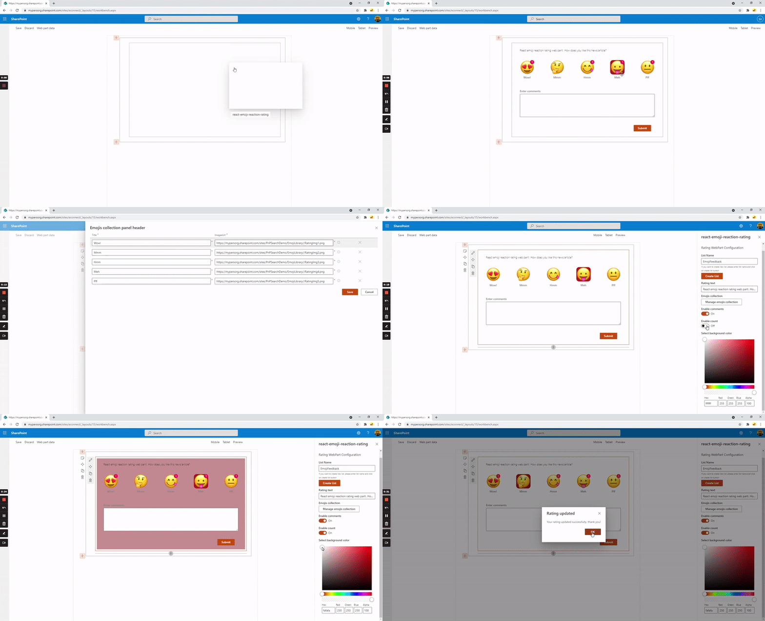
This is sample web part which can be used to take emoji based reaction or feedback for particular news/article/posts. We all know every organizations would be using SharePoint news features for company's internal communications from HR to IT updates and some time annoucements. News created in SharePoint are created as Pages in library. Idea behind this web part is to take employee/user's feedback as emoji reactions on particular news. This web part can also be used on wiki articles or blog posts to take similar reactions. Web part uses concept of 1 to 5 star based rating system(configurable), you can decide low to high based on your preference.
Ideally, we can do some automation using PnP Powershell and PowerAutomate (trigger when item is created ) to add this web part to any every news that is published.
If you wish to directly use the package in your tenant here is link to download.
Features
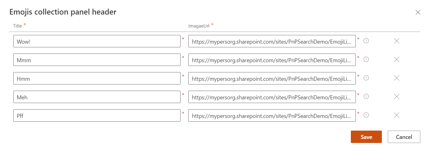
- Configurable header text, rating text, and images
- We can choose to show from minimum one rating to max 5 rating images and text
- Option to show total count of particular rating count as badge
- Option to show and capture comments from user when submitting feedback
- Display current user's rating selection with highlighted background
- Allow user to change rating(update rating)
- Stores ratings in SharePoint List
- Option to create list on the fly and choose list to store the ratings
- Option for admin to choose background color
Technical Notes
- User's rating data would be stored in SP List, below are list of columns and its relevance
Title: To store user's display name (not required though)Page Name: To store page on which rating is given by particular user, this will have absolute URL of pageUser: To store user who has given feedback for particular page/news where web part is addedComment: To store comment provided by user while submitting reaction.- Then there are 5 columns
Rating1,Rating2,Rating3,Rating4,Rating5which will store the rating text configured by admin in web part... Only one of this 5 columns would be populated for single item in list, which is what user has selected as part of giving reaction
I have added default emoji's images which can be used and uploaded to SharePoint library in the assets folder of this solution.
Compatibility
| ⚠️ Important |
|---|
| Every SPFx version is only compatible with specific version(s) of Node.js. In order to be able to build this sample, please ensure that the version of Node on your workstation matches one of the versions listed in this section. This sample will not work on a different version of Node. |
| Refer to https://aka.ms/spfx-matrix for more information on SPFx compatibility. |
Applies to
Get your own free development tenant by subscribing to Microsoft 365 developer program
Prerequisites
- SharePoint Online tenant
- Permission to deploy package to Tenant or SharePoint Site collection app catalog
Contributors
Version history
| Version | Date | Comments |
|---|---|---|
| 1.0 | Sep 04, 2021 | Initial release |
| 2.0 | Nov 22, 2022 | Added support for background color |
Minimal Path to Awesome
- Clone this repository
- Ensure that you are at the solution folder
- in the command-line run:
npm installgulp serve
This sample can also be opened with VS Code Remote Development. Visit https://aka.ms/spfx-devcontainer for further instructions.
References
- Getting started with SharePoint Framework
- Building for Microsoft teams
- Publish SharePoint Framework applications to the Marketplace
- Microsoft 365 Patterns and Practices - Guidance, tooling, samples and open-source controls for your Microsoft 365 development
Help
We do not support samples, but we this community is always willing to help, and we want to improve these samples. We use GitHub to track issues, which makes it easy for community members to volunteer their time and help resolve issues.
If you encounter any issues while using this sample, create a new issue.
For questions regarding this sample, create a new question.
Finally, if you have an idea for improvement, make a suggestion.
Disclaimer
THIS CODE IS PROVIDED AS IS WITHOUT WARRANTY OF ANY KIND, EITHER EXPRESS OR IMPLIED, INCLUDING ANY IMPLIED WARRANTIES OF FITNESS FOR A PARTICULAR PURPOSE, MERCHANTABILITY, OR NON-INFRINGEMENT.


-Incompatible-red.svg)


