|
…
|
||
|---|---|---|
| .. | ||
| .vscode | ||
| assets | ||
| config | ||
| src | ||
| teams | ||
| tools | ||
| .editorconfig | ||
| .gitignore | ||
| .yo-rc.json | ||
| README.md | ||
| gulpfile.js | ||
| package-lock.json | ||
| package.json | ||
| tsconfig.json | ||
| tslint.json | ||
| yarn.lock | ||
README.md
react-personal-greeting
Summary
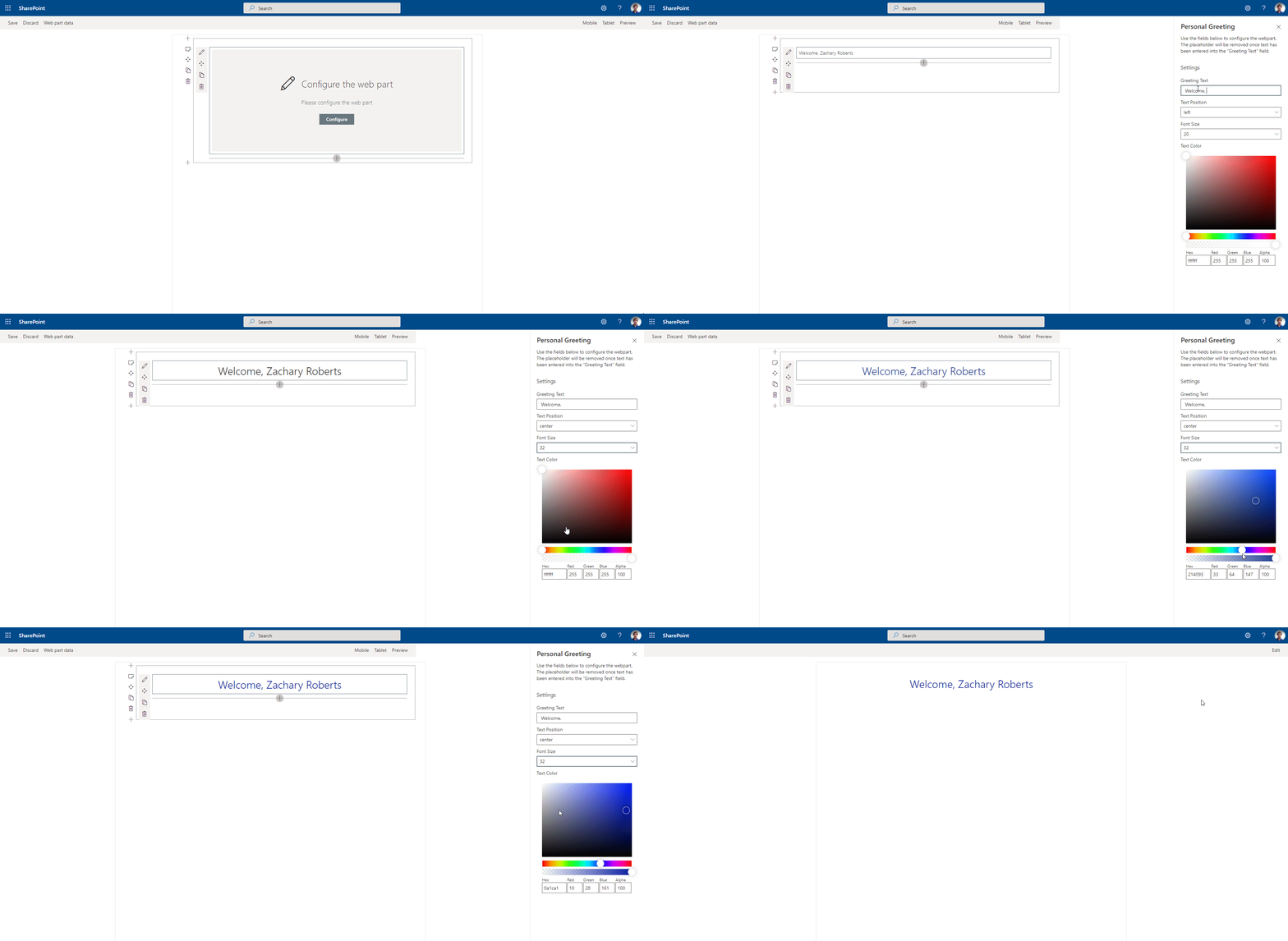
The web part pulls in the current user's name and displays it on the page. The greeting text before the name is customizable through the property pane. Additionally the position of the greeting and color of the text can be adjusted through the property pane as well.
Compatibility
| ⚠️ Important |
|---|
| Every SPFx version is only compatible with specific version(s) of Node.js. In order to be able to build this sample, please ensure that the version of Node on your workstation matches one of the versions listed in this section. This sample will not work on a different version of Node. |
| Refer to https://aka.ms/spfx-matrix for more information on SPFx compatibility. |
Applies to
Prerequisites
Contributors
Version history
| Version | Date | Comments |
|---|---|---|
| 1.1 | September 24, 2020 | Updated SPFX version and added font-size |
| 1.0 | April 14, 2020 | Initial release |
Minimal Path to Awesome
- Clone this repository
- in the command line run:
npm installgulp buildgulp bundle --shipgulp package-solution --ship
- add the web part to your tenant app store
- add the app to a SharePoint site and then add the web part to the page
This sample can also be opened with VS Code Remote Development. Visit https://aka.ms/spfx-devcontainer for further instructions.
Features
This Web Part illustrates the following concepts on top of the SharePoint Framework:
- Using the SPFx context to gather the current user's display name.
- Adjusting the styles of the component in the web part using the props adjusted through the property pane.
- PnP SPFx Placeholder - This component allows you to have a placeholder visible under certain conditions if your web parts requires some setup.
- PnP SPFx Color Picker - This component adds an awesome color picker to the property pane, great for adjusting colors in your web part.
Help
We do not support samples, but we this community is always willing to help, and we want to improve these samples. We use GitHub to track issues, which makes it easy for community members to volunteer their time and help resolve issues.
If you're having issues building the solution, please run spfx doctor from within the solution folder to diagnose incompatibility issues with your environment.
If you encounter any issues while using this sample, create a new issue.
For questions regarding this sample, create a new question.
Finally, if you have an idea for improvement, make a suggestion.
Disclaimer
THIS CODE IS PROVIDED AS IS WITHOUT WARRANTY OF ANY KIND, EITHER EXPRESS OR IMPLIED, INCLUDING ANY IMPLIED WARRANTIES OF FITNESS FOR A PARTICULAR PURPOSE, MERCHANTABILITY, OR NON-INFRINGEMENT.


-Incompatible-red.svg)


