|
|
||
|---|---|---|
| .. | ||
| .devcontainer | ||
| assets | ||
| config | ||
| src | ||
| typings | ||
| .editorconfig | ||
| .gitattributes | ||
| .gitignore | ||
| .npmignore | ||
| .yo-rc.json | ||
| README.md | ||
| gulpfile.js | ||
| package.json | ||
| tsconfig.json | ||
| tslint.json | ||
README.md
| page_type | products | languages | extensions | |||||||||||||
|---|---|---|---|---|---|---|---|---|---|---|---|---|---|---|---|---|
| sample |
|
|
|
Taxonomy Picker (React)
Summary
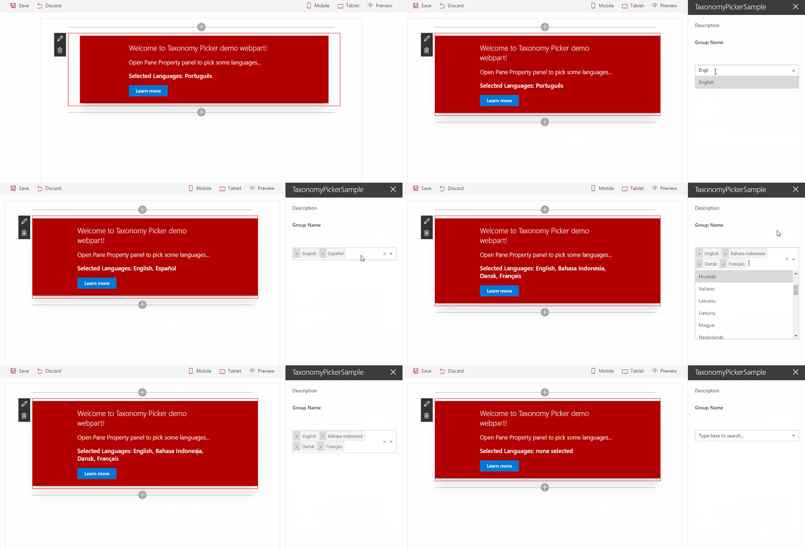
A Taxonomy Picker control built with React based on react-taxonomypicker for use with SharePoint Framework client-side web parts (SPFx).
Compatibility
| ⚠️ Important |
|---|
| Every SPFx version is only compatible with specific version(s) of Node.js. In order to be able to build this sample, please ensure that the version of Node on your workstation matches one of the versions listed in this section. This sample will not work on a different version of Node. |
| Refer to https://aka.ms/spfx-matrix for more information on SPFx compatibility. |
Applies to
Contributors
Version history
| Version | Date | Comments |
|---|---|---|
| 1.0 | March 14, 2017 | Initial release |
Minimal Path to Awesome
- clone this repo
$ npm i$ gulp trust-dev-cert$ gulp serve
This sample can also be opened with VS Code Remote Development. Visit https://aka.ms/spfx-devcontainer for further instructions.
Local Mode
A browser in local mode (localhost) will be opened. https://localhost:4321/temp/workbench.html
SharePoint Mode
If you want to try on a real environment, open: https://your-domain.sharepoint.com/_layouts/15/workbench.aspx
Usage
Go to src/webparts/taxonomyPickerSample/TaxonomyPickerSampleWebPart.ts and configure the control.
Mock Data configuration by using defaultOptions configuration
Access from https://localhost:4321/temp/workbench.html Configuration:
PropertyPaneTaxonomyPicker("Language", {
  key: "Language_Field",
  name: "Language",
  displayName: "Language",
  multi: true,
  defaultOptions: [
    { label: "English", value: "f50249b6-310d-43b6-aaa6-f0cb46d851bf" },
    { label: "Spanish", value: "237ca323-1ed8-4199-a49b-a9f7ce4256bf" },
    { label: "German", value: "44024c7e-f738-4755-90e1-15866327c806" },
    { label: "Italian", value: "65f67491-bdca-491a-84fa-f6fd913f40fa" },
  ],
  onPickerChange: this._updateTaxonomyPicker
})
Real Data configuration by using termSetGuid configuration
Access from https://your-domain.sharepoint.com/_layouts/15/workbench.aspx Configuration:
PropertyPaneTaxonomyPicker("Language", {
  key: "Language_Field",
  name: "Language",
  displayName: "Language",
  multi: true,
  termSetGuid: "<your-term-set-id>",
  termSetName: "Language",
  termSetCountMaxSwapToAsync: 100,
  onPickerChange: this._updateTaxonomyPicker
})
Features
- Use React for using react-taxonomypicker control inside a custom property pane (it can be used in the web part itself too).
- Use TypeScript to create the custom property pane control containing the taxonomy picker control.
- Reacting to web part property changes
- Loading data for use in custom property pane controls asynchronously without blocking the web part
- Retrieve Terms from a Term Set by Term Set GUID.
- Sync / Async modes
- Sync mode is used for medium / small Term Sets and loads asynchronously all Terms and store them in React State and SessionStorage cache.
- Async mode is used for large Term Sets and it doesn't load any data initially, but it loads the Terms upon user input in batches of 10 items.
- Sync / Async mode configurable via termSetCountMaxSwapToAsync property
- The control will fetch the number of terms and decide which mode to use depends on termSetCountMaxSwapToAsync value.
- It Uses and depends on SP.Taxonomy.js (the web part uses a wrapper to load all the SP.*.js dependencies)
- Use Promise (polyfill it if needed IE)
- onPickerChange event handler exposed
- react-select properties exposed (extends them)
- defaultOptions array exposed to enable input mock data when no termSetGuid configured
- More configuration options: react-taxonomypicker
Scenarios supported
- SharePoint Web Part using Script Editor or Content Editor Web Part
- Consume it from ES6 project
- Consume it from TypeScript project
- SharePoint Framework Web Part (SPFx)
Disclaimer
THIS CODE IS PROVIDED AS IS WITHOUT WARRANTY OF ANY KIND, EITHER EXPRESS OR IMPLIED, INCLUDING ANY IMPLIED WARRANTIES OF FITNESS FOR A PARTICULAR PURPOSE, MERCHANTABILITY, OR NON-INFRINGEMENT.


-Compatible-green.svg)


