|
|
||
|---|---|---|
| .. | ||
| assets | ||
| config | ||
| sharepoint/assets | ||
| src | ||
| teams | ||
| .editorconfig | ||
| .gitignore | ||
| .yo-rc.json | ||
| README.md | ||
| gulpfile.js | ||
| package-lock.json | ||
| package.json | ||
| tsconfig.json | ||
| tslint.json | ||
README.md
| page_type | products | languages | extensions | |||||||||||||
|---|---|---|---|---|---|---|---|---|---|---|---|---|---|---|---|---|
| sample |
|
|
|
Image Gallery Built with Adaptive Cards
Summary
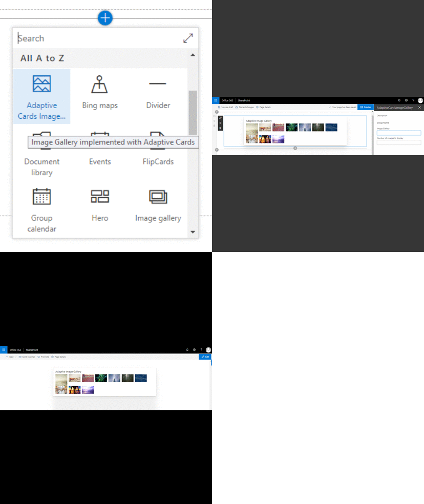
This sample demonstrates the capability of using Adaptive Cards with SharePoint Framework. Adaptive cards are great fit for Bot, however they can be effectively used with SPFx to render the content. This web part helps to display the image gallery from SharePoint list.
When added to SharePoint site, the source list containing images information, number of images to display can be configured from web part properties.
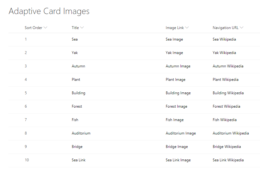
The sample also provisions the list called "Adaptive Card Images" which can be used as an example to start using the web part.

SharePoint Asset
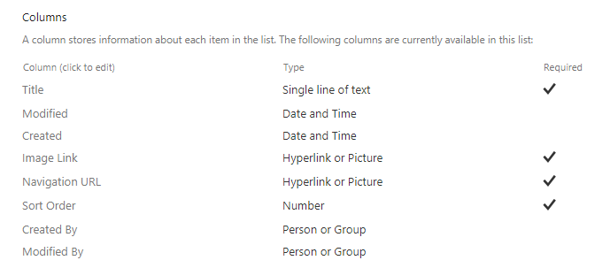
A SharePoint list (named "Adaptive Card Images") is provisioned to store the image information. The schema of the list is as below.

- The "Image Link" column stores the url of image to be displayed in adaptive card.
- The "Navigation URL" column represents the url to navigate by clicking on image in adaptive card.
- The "Sort Order" column represents the order in which images to be displayed in adaptive card.
The solution also provisions sample data to the "Adaptive Card Images" list.

NPM Packages Used
Below NPM packages are used to develop this sample.
- sp-pnp-js (https://www.npmjs.com/package/sp-pnp-js)
- adaptivecards (https://www.npmjs.com/package/adaptivecards)
Used SharePoint Framework Version
Applies to
Solution
| Solution | Author(s) |
|---|---|
| react-adaptive-cards-image-gallery | Nanddeep Nachan (SharePoint Consultant, @NanddeepNachan ) |
| Ravi Kulkarni (SharePoint Consultant) |
Version history
| Version | Date | Comments |
|---|---|---|
| 1.1.0 | June 15, 2020 | Upgrade to SPFx 1.10.0 |
| 1.0.0 | November 28, 2018 | Initial release |
Disclaimer
THIS CODE IS PROVIDED AS IS WITHOUT WARRANTY OF ANY KIND, EITHER EXPRESS OR IMPLIED, INCLUDING ANY IMPLIED WARRANTIES OF FITNESS FOR A PARTICULAR PURPOSE, MERCHANTABILITY, OR NON-INFRINGEMENT.
Prerequisites
- SharePoint Online tenant
- Site Collection created under the /sites/ or /
Minimal Path to Awesome
- Clone this repository.
- On the command prompt, navigate to the web part folder and execute:
npm igulp bundle --shipgulp package-solution --ship- The package can be found at
\react-adaptive-cards-image-gallery\sharepoint\solution\react-adaptive-cards-image-gallery.sppkg - Deploy the package to the app catalog.
- Install the client-side solution to your SharePoint site.
- Add web part to your SharePoint page named "Adaptive Cards Image Gallery".
Features
This sample web part shows how adaptive cards can be used effectively with SharePoint Framework to render an image gallery with data stored in a SharePoint list.
- Integrating adaptive cards
- Rendering image gallery
- SharePoint assets provisioning
- Creating extensible services
- Using @sp-pnp-js
- Using @adaptivecards

