|
|
||
|---|---|---|
| .. | ||
| .devcontainer | ||
| assets | ||
| config | ||
| src | ||
| teams | ||
| .editorconfig | ||
| .gitignore | ||
| .yo-rc.json | ||
| README.md | ||
| gulpfile.js | ||
| package-lock.json | ||
| package.json | ||
| tsconfig.json | ||
| tslint.json | ||
README.md
Summary
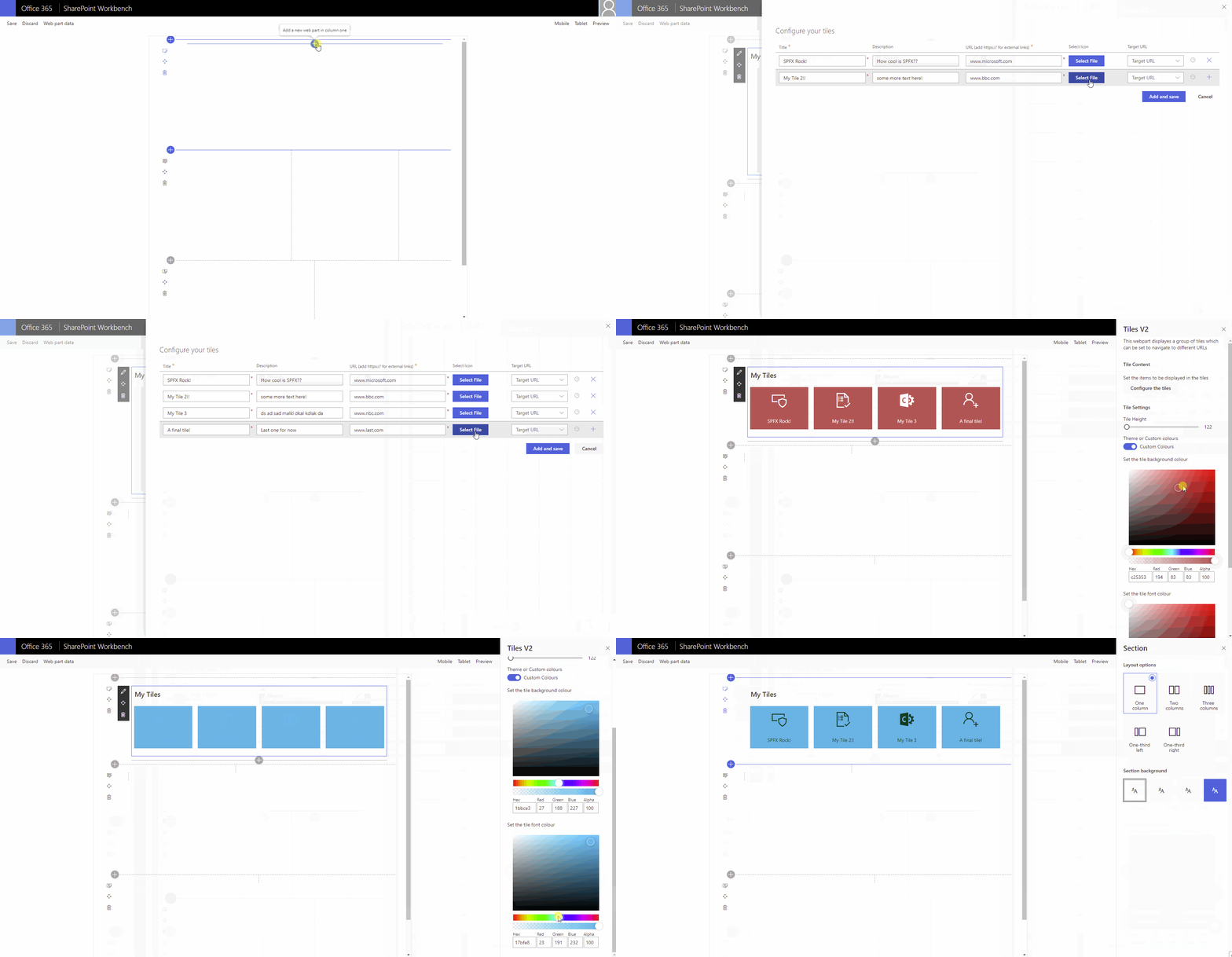
This solution creates a customizable Tiles Web part, it uses a stored collection from the PnP PropertyFieldCollectionData control and allows the user to choose the color scheme (theme or custom) and to set the size of the tiles. By default the tiles use a fluid flex layout to use the available screen area.
This is a rebuild of the awesome project created by @hugoabernier [https://github.com/pnp/sp-dev-fx-webparts/tree/main/samples/react-tiles] so the credit goes to him!
Compatibility
| ⚠️ Important |
|---|
| Every SPFx version is only compatible with specific version(s) of Node.js. In order to be able to build this sample, please ensure that the version of Node on your workstation matches one of the versions listed in this section. This sample will not work on a different version of Node. |
| Refer to https://aka.ms/spfx-matrix for more information on SPFx compatibility. |
Applies to
Get your own free development tenant by subscribing to Microsoft 365 developer program
Contributors
- Omar El-Anis @ SP Bytes www.spbytes.com
Version history
| Version | Date | Comments |
|---|---|---|
| 1.0 | July 14, 2021 | Initial release |
| 1.1 | October 14, 2021 | Added sorting, static tile width and unique tile color - fthorild |
| 1.1.1 | March 25, 2022 | Added current icon within property pane |
| 1.1.2 | March 28, 2022 | Update @pnp/spfx-controls-react to handle icon name contains search |
Minimal path to awesome
- Clone this repository (or download this solution as a .ZIP file then unzip it)
- From your command line, change your current directory to the directory containing this sample (
react-tiles-v2, located undersamples) - in the command-line run:
npm installgulp serve
This sample can also be opened with VS Code Remote Development. Visit https://aka.ms/spfx-devcontainer for further instructions.
Features
Description of the extension that expands upon high-level summary above.
This extension illustrates the following concepts:
- Store data (including icons) in a collection from property panel
- Allow usage of site theme or custom colors
- Set size of tile content based on slider bar
- Load the data onto the page to display a tile web part
References
- Getting started with SharePoint Framework
- Building for Microsoft teams
- Use Microsoft Graph in your solution
- Publish SharePoint Framework applications to the Marketplace
- Microsoft 365 Patterns and Practices - Guidance, tooling, samples and open-source controls for your Microsoft 365 development
Help
We do not support samples, but we this community is always willing to help, and we want to improve these samples. We use GitHub to track issues, which makes it easy for community members to volunteer their time and help resolve issues.
If you're having issues building the solution, please run spfx doctor from within the solution folder to diagnose incompatibility issues with your environment.
You can try looking at issues related to this sample to see if anybody else is having the same issues.
You can also try looking at discussions related to this sample and see what the community is saying.
If you encounter any issues while using this sample, create a new issue.
For questions regarding this sample, create a new question.
Finally, if you have an idea for improvement, make a suggestion.
Disclaimer
THIS CODE IS PROVIDED AS IS WITHOUT WARRANTY OF ANY KIND, EITHER EXPRESS OR IMPLIED, INCLUDING ANY IMPLIED WARRANTIES OF FITNESS FOR A PARTICULAR PURPOSE, MERCHANTABILITY, OR NON-INFRINGEMENT.


-Incompatible-red.svg)


