|
|
||
|---|---|---|
| .. | ||
| assets | ||
| config | ||
| src | ||
| teams | ||
| .editorconfig | ||
| .gitignore | ||
| .yo-rc.json | ||
| README.md | ||
| gulpfile.js | ||
| package-lock.json | ||
| package.json | ||
| tsconfig.json | ||
| tslint.json | ||
README.md
FAQ Document Card
React FAQ Document Card Web Part
Summary
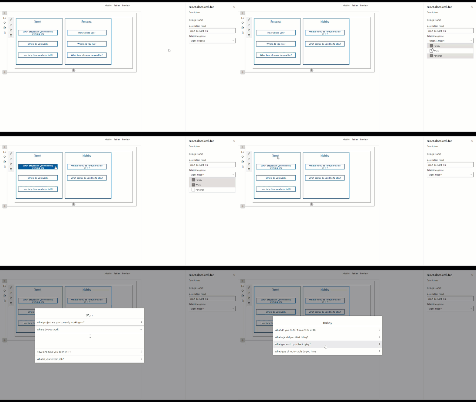
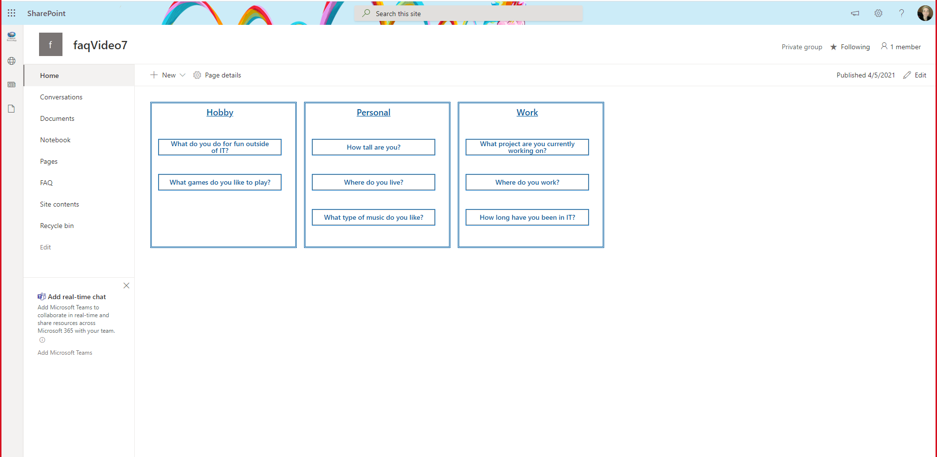
For detailed instructions on how to build this web part and the needed list please watch: https://www.youtube.com/watch?v=oIr-rgGvUUk
Compatibility
Applies to
Prerequisites
-
Build a SharePoint Online list named FAQ
-
Rename Title column to Question
-
Add 3 additional columns:
- Multiple lines of text column, toggle Use rich text to yes, name Answer
- Choice column, Options
Work,Personal, andHobby, name Category - Yes/No column, set default to
No, name Featured
-
Add items to your list making sure to set some to
yesin the Featured column -
Navigate to your sites workbench (https://.sharepoint.com/sites//_layouts/15/workbench.aspx)
Solution
| Solution | Author(s) |
|---|---|
| react-doccard-faq | Sam Collins (@samc148) |
Version history
| Version | Date | Comments |
|---|---|---|
| 1.0 | April 5, 2021 | Initial release |
Minimal Path to Awesome
- Clone this repository
- in the command line run:
npm installgulp serve
Features
DefaultButton, Modal, DetailsList, IColumn, from office-ui-fabric-react
IPropertyPaneDropdownOption from @microsoft/sp-property-pane
RichText, Accessible Accordion from @pnp/spfx-controls-react
Help
We do not support samples, but we this community is always willing to help, and we want to improve these samples. We use GitHub to track issues, which makes it easy for community members to volunteer their time and help resolve issues.
If you're having issues building the solution, please run spfx doctor from within the solution folder to diagnose incompatibility issues with your environment.
You can try looking at issues related to this sample to see if anybody else is having the same issues.
You can also try looking at discussions related to this sample and see what the community is saying.
If you encounter any issues while using this sample, create a new issue.
For questions regarding this sample, create a new question.
Finally, if you have an idea for improvement, make a suggestion.
Disclaimer
THIS CODE IS PROVIDED AS IS WITHOUT WARRANTY OF ANY KIND, EITHER EXPRESS OR IMPLIED, INCLUDING ANY IMPLIED WARRANTIES OF FITNESS FOR A PARTICULAR PURPOSE, MERCHANTABILITY, OR NON-INFRINGEMENT.


-Incompatible-red.svg)

