|
|
||
|---|---|---|
| .. | ||
| .devcontainer | ||
| assets | ||
| config | ||
| src | ||
| teams | ||
| .eslintrc.js | ||
| .gitignore | ||
| .npmignore | ||
| .yo-rc.json | ||
| README.md | ||
| gulpfile.js | ||
| package-lock.json | ||
| package.json | ||
| tsconfig.json | ||
README.md
Quick Links
Summary
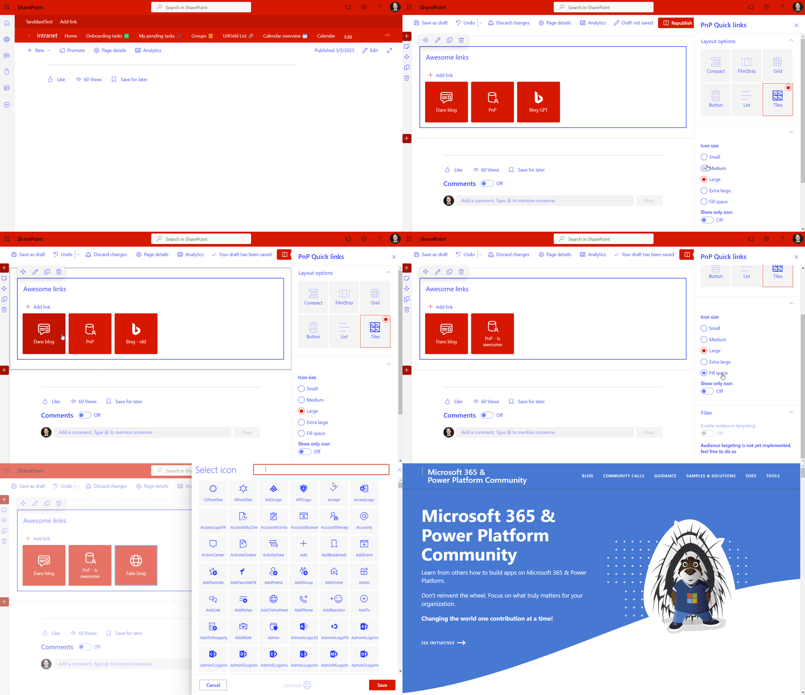
A demonstration of building a web part with a dynamic property pane, drag n' drop edit capabilities - I've built the Tiles feature of the default Quick Links web part, but made room for the option to implement the other 5 layouts.
Compatibility
| ⚠️ Important |
|---|
| Every SPFx version is only compatible with specific version(s) of Node.js. In order to be able to build this sample, please ensure that the version of Node on your workstation matches one of the versions listed in this section. This sample will not work on a different version of Node. |
| Refer to https://aka.ms/spfx-matrix for more information on SPFx compatibility. |
This sample is optimally compatible with the following environment configuration:
For more information about SPFx compatibility, please refer to https://aka.ms/spfx-matrix
Applies to
Get your own free development tenant by subscribing to Microsoft 365 developer program
Contributors
- Dan Toft (@Tanddant) |
Version history
| Version | Date | Comments |
|---|---|---|
| 1.0 | March 05, 2023 | Initial release |
Minimal path to awesome
- Clone this repository (or download this solution as a .ZIP file then unzip it)
- From your command line, change your current directory to the directory containing this sample (
react-quick-links, located undersamples) - in the command line run:
npm installgulp serve
This sample can also be opened with VS Code Remote Development. Visit https://aka.ms/spfx-devcontainer for further instructions.
Features
This web part demonstrates a couple of nice skillsets for an SPFx developer, the idea was spawned after I heard someone suggest that the default quick links would be open sources - as it doesn't look like that's going to happen I decided to build part of it myself.
This demonstrates:
- Dynamic property pane that changes based on user input in the web part
- Fluent Drag 'n drop using 'react-sortable-hoc'
- Using PnP Reusable Controls (Icon picker and WebPartTitle)
- Styling Fluent UI components (please don't look at the actual CSS, but the principals of how to do it)
- Grouping of property pane properties
There are still loads of ideas that I would love to see implemented, but right now I don't have the time, so feel free to add contribute with the features as needed
| Feature | Done |
|---|---|
| Drag 'n drop | ✅ |
| Dynamic property pane | ✅ |
| Demonstrate PnP reusable controls | ✅ |
| Styling Fluent UI | ✅ |
| Audience targeting | ❌ |
| Several layouts | ❌ |
| SPFx 1.16/1.17 Top Action to choose layout | ❌ |
Help
We do not support samples, but this community is always willing to help, and we want to improve these samples. We use GitHub to track issues, which makes it easy for community members to volunteer their time and help resolve issues.
If you're having issues building the solution, please run spfx doctor from within the solution folder to diagnose incompatibility issues with your environment.
You can try looking at issues related to this sample to see if anybody else is having the same issues.
You can also try looking at discussions related to this sample and see what the community is saying.
If you encounter any issues using this sample, create a new issue.
For questions regarding this sample, create a new question.
Finally, if you have an idea for improvement, make a suggestion.
Disclaimer
THIS CODE IS PROVIDED AS IS WITHOUT WARRANTY OF ANY KIND, EITHER EXPRESS OR IMPLIED, INCLUDING ANY IMPLIED WARRANTIES OF FITNESS FOR A PARTICULAR PURPOSE, MERCHANTABILITY, OR NON-INFRINGEMENT.


-Incompatible-red.svg)


