|
|
||
|---|---|---|
| .. | ||
| assets | ||
| config | ||
| src | ||
| teams | ||
| .editorconfig | ||
| .gitignore | ||
| .yo-rc.json | ||
| README.md | ||
| gulpfile.js | ||
| package-lock.json | ||
| package.json | ||
| tsconfig.json | ||
| tslint.json | ||
README.md
Accordion Section -- FAQ Builder
Summary
- Adds a collapsible accordion section to an Office 365 SharePoint page or Teams Tab.
- Ideal for creating FAQs.
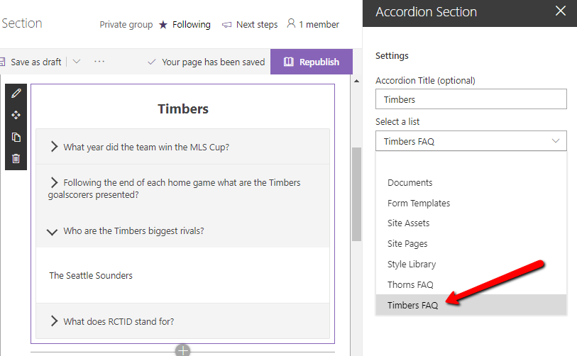
- When adding the web part, you'll be prompted to select a list from a property panel dropdown (target list must have a Title column and Content column). This will generate an accordion with one section for each item in the list.
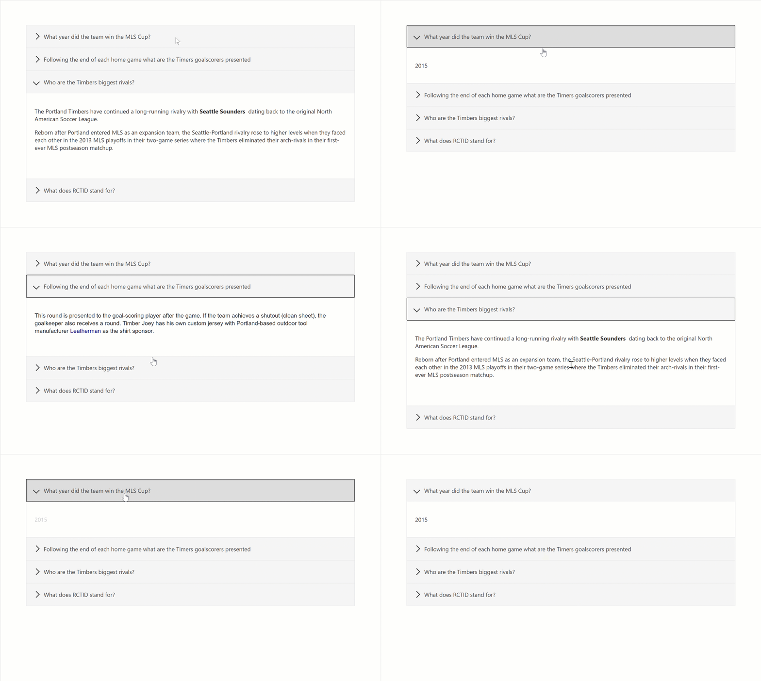
- Modifications/deletions/additions to the list items in the target list of an added web part are automatically reflected on the page.
- To deploy to a Teams tab see current Microsoft documentation.
Usage
1) Create or use a list with a Title and a Content column:
- The value in the Title column for each item will appear in the heading bars of the Accordion.
- The value in the Content column for each item will appear in the collapsible content section of the Accordion
- When creating the columns, select "Multiple lines of text". Rich text is now supported within the Content column.
2) Add the Accordion Section web part to your page & select your list:
Compatibility
Applies to
Prerequisites
Please create the list as described above
Solution
| Solution | Author(s) |
|---|---|
| SPFx Collapsible Accordion Section | Erik Benke (@erikjbenke) |
| SPFx Collapsible Accordion Section | Mike Zimmerman |
| SPFx Collapsible Accordion Section | Ravi Chandra |
| SPFx Collapsible Accordion Section | Jack Vinitsky |
Version history
| Version | Date | Comments |
|---|---|---|
| 1.0 | August 14, 2019 | Initial release |
| 1.1 | September 19, 2019 | Minor updates, adding to GitHub |
| 1.2 | April 15, 2020 | Added Polyfills for IE11 compatibility |
| 1.3 | July 10, 2020 | Adding Rich Text support for Content panels |
| 1.4 | July 10, 2020 | Upgraded to SPFx 1.10. |
| 1.5 | September 1, 2020 | Adds ability to click on expanded section headers to collapse accordions |
| 1.6 | September 2, 2020 | Added Web Part Title, and ability to expand multiple sections |
| 1.7 | January 5, 2021 | Fixed web part title style to be consistent with first-party web parts; updated other dependencies |
Disclaimer
THIS CODE IS PROVIDED AS IS WITHOUT WARRANTY OF ANY KIND, EITHER EXPRESS OR IMPLIED, INCLUDING ANY IMPLIED WARRANTIES OF FITNESS FOR A PARTICULAR PURPOSE, MERCHANTABILITY, OR NON-INFRINGEMENT.
Minimal Path to Awesome
- Clone or download this repository
- Run in command line:
npm installto install the npm dependenciesgulp serveto display in Developer Workbench (recommend using your tenant workbench so you can test with real lists within your site)
- To package and deploy:
- Use
gulp bundle --ship&gulp package-solution --ship - Add the
.sppkgto your SharePoint App Catalog
- Use


%20%7C%20Hosted-yellow.svg)