 86013372c0
|
||
|---|---|---|
| .. | ||
| .devcontainer | ||
| assets | ||
| config | ||
| release | ||
| src | ||
| teams | ||
| .gitignore | ||
| .yo-rc.json | ||
| README.md | ||
| gulpfile.js | ||
| package-lock.json | ||
| package.json | ||
| tsconfig.json | ||
| tslint.json | ||
README.md
React Fluent UI Theme Variant
Summary
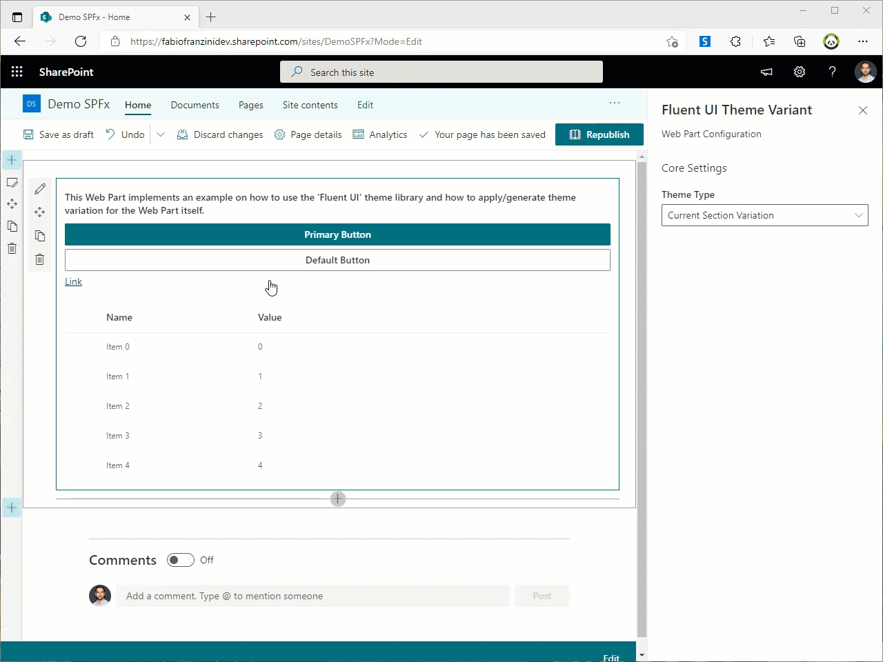
This web part provides an example of how to apply a custom theme or a variation of the current SharePoint theme directly to the web part. In this way it is possible to implement the same mechanism that is currently implemented by default by the SharePoint page sections
Compatibility
Applies to
Solution
| Solution | Author(s) |
|---|---|
| react-fluentui-theme-variant | Fabio Franzini (@franzinifabio), fabiofranzini.com |
Version history
| Version | Date | Comments |
|---|---|---|
| 1.0 | August 9, 2021 | Initial release |
Minimal Path to Awesome
- Clone this repository
- in the command line run:
npm installgulp serve
This sample can also be opened with VS Code Remote Development. Visit https://aka.ms/spfx-devcontainer for further instructions.
Features
This example was born with the idea of overcoming the present default limit regarding the colors of the sections of the SharePoint pages.
Specifically, by default, it is only possible to change the color (also called Section Background Shading) of the sections but not of the individual Web Parts.
In this implementation it is instead possible to vary the "Background Shading" of the single Web Part in 3 ways:
- Use the colors applied to the section where the Web Part is present
- Select the color variations based on the theme applied at the Site level.
- Apply variations set to the json of a custom theme, created through the Fluent UI theme designer.
In all these cases, the component variation works automatically as much as the Fluent UI react controls are used, otherwise the variation will only work on the background and some HTML elements.
Help
We do not support samples, but we this community is always willing to help, and we want to improve these samples. We use GitHub to track issues, which makes it easy for community members to volunteer their time and help resolve issues.
If you encounter any issues while using this sample, create a new issue.
For questions regarding this sample, create a new question.
Finally, if you have an idea for improvement, make a suggestion.
Disclaimer
THIS CODE IS PROVIDED AS IS WITHOUT WARRANTY OF ANY KIND, EITHER EXPRESS OR IMPLIED, INCLUDING ANY IMPLIED WARRANTIES OF FITNESS FOR A PARTICULAR PURPOSE, MERCHANTABILITY, OR NON-INFRINGEMENT.