Bumps [webpack-dev-middleware](https://github.com/webpack/webpack-dev-middleware) from 5.3.3 to 5.3.4. - [Release notes](https://github.com/webpack/webpack-dev-middleware/releases) - [Changelog](https://github.com/webpack/webpack-dev-middleware/blob/v5.3.4/CHANGELOG.md) - [Commits](https://github.com/webpack/webpack-dev-middleware/compare/v5.3.3...v5.3.4) --- updated-dependencies: - dependency-name: webpack-dev-middleware dependency-type: indirect ... Signed-off-by: dependabot[bot] <support@github.com> |
||
|---|---|---|
| .. | ||
| .devcontainer | ||
| assets | ||
| config | ||
| src | ||
| teams | ||
| typings | ||
| .editorconfig | ||
| .eslintrc.js | ||
| .gitattributes | ||
| .gitignore | ||
| .npmignore | ||
| .yo-rc.json | ||
| README.md | ||
| gulpfile.js | ||
| package-lock.json | ||
| package.json | ||
| tsconfig.json | ||
README.md
Script editor web part for modern pages
This version works only for SharePoint Online. If you want a version for SharePoint on-premises go to react-script-editor-onprem.
It's important you read and understand the notes on deployment.
Summary
Coming from old classic SharePoint pages you might have existing script solutions you want to re-use on a modern page without having to repackage it as a new SharePoint Framework web part. This web part is similar to the classic Script Editor Web Part, and allows you do drop arbitrary script or html on a modern page.
Notice. All client-side web parts are deployed or enabled to be available in site level by tenant administrator using tenant app catalog. If there are concerns on enabling script options in a tenant, this web part or a approach should not be approved by tenant administrators.
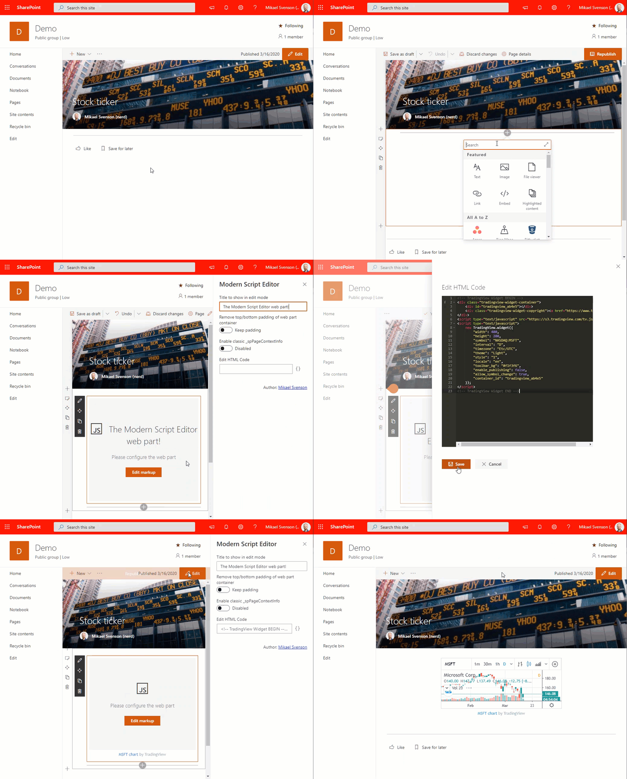
As an example add the following scripts to the web part in order to show stock ticker info on your page. First tv.js is loaded, and then the script block is executed to show the ticker information.
<!-- TradingView Widget BEGIN -->
<div class="tradingview-widget-container">
  <div id="tradingview_e7aa0"></div>
  <div class="tradingview-widget-copyright"><a href="https://www.tradingview.com/symbols/NASDAQ-AAPL/" rel="noopener" target="_blank"><span class="blue-text">AAPL Chart</span></a> by TradingView</div>
  <script type="text/javascript" src="https://s3.tradingview.com/tv.js"></script>
  <script type="text/javascript">
  new TradingView.widget(
  {
  "width": 980,
  "height": 610,
  "symbol": "NASDAQ:AAPL",
  "interval": "D",
  "timezone": "Etc/UTC",
  "theme": "light",
  "style": "1",
  "locale": "en",
  "toolbar_bg": "#f1f3f6",
  "enable_publishing": false,
  "allow_symbol_change": true,
  "container_id": "tradingview_e7aa0"
}
  );
  </script>
</div>
<!-- TradingView Widget END -->
The web part works by loading each script in a <script src> tag sequentially in the order they are specified, then any other <script> block is executed.
If all you want is to add markup on the page, you can do that as well. Adding the following html would show a headline and a list.
<h2>My header</h2>
<ul>
    <li>One
    <li>Two
    <li>Three
</ul>
You may add CSS via style tags or link tags.
<!-- Latest compiled and minified CSS -->
<link rel="stylesheet" href="https://maxcdn.bootstrapcdn.com/bootstrap/3.3.7/css/bootstrap.min.css" integrity="sha384-BVYiiSIFeK1dGmJRAkycuHAHRg32OmUcww7on3RYdg4Va+PmSTsz/K68vbdEjh4u" crossorigin="anonymous">
<style>
    #container h1 {
        color: red;
    }
</style>
<div id="container">
    <h1>Headline</h1>
</div>
<div class="row">
    <div class="col-md-8">.col-md-8</div>
    <div class="col-md-4">.col-md-4</div>
</div>
<div class="row">
    <div class="col-md-4">.col-md-4</div>
    <div class="col-md-4">.col-md-4</div>
    <div class="col-md-4">.col-md-4</div>
</div>
Support for Office UI Fabric styles
By adding the class name ms-Fabric to your top element, you can use use fabric CSS classes directly in the web part. See Fabric Core for more information on Fabric classes.
Sample
<div class="ms-Fabric">
    <span class="ms-font-su ms-fontColor-themePrimary">
        Big text in primary theme color
    </span>
</div>
Support for classic _spPageContextInfo
If your scripts rely on the classic_spPageContextInfo, you can enable that in the web part property pane.
Support for Teams tabs
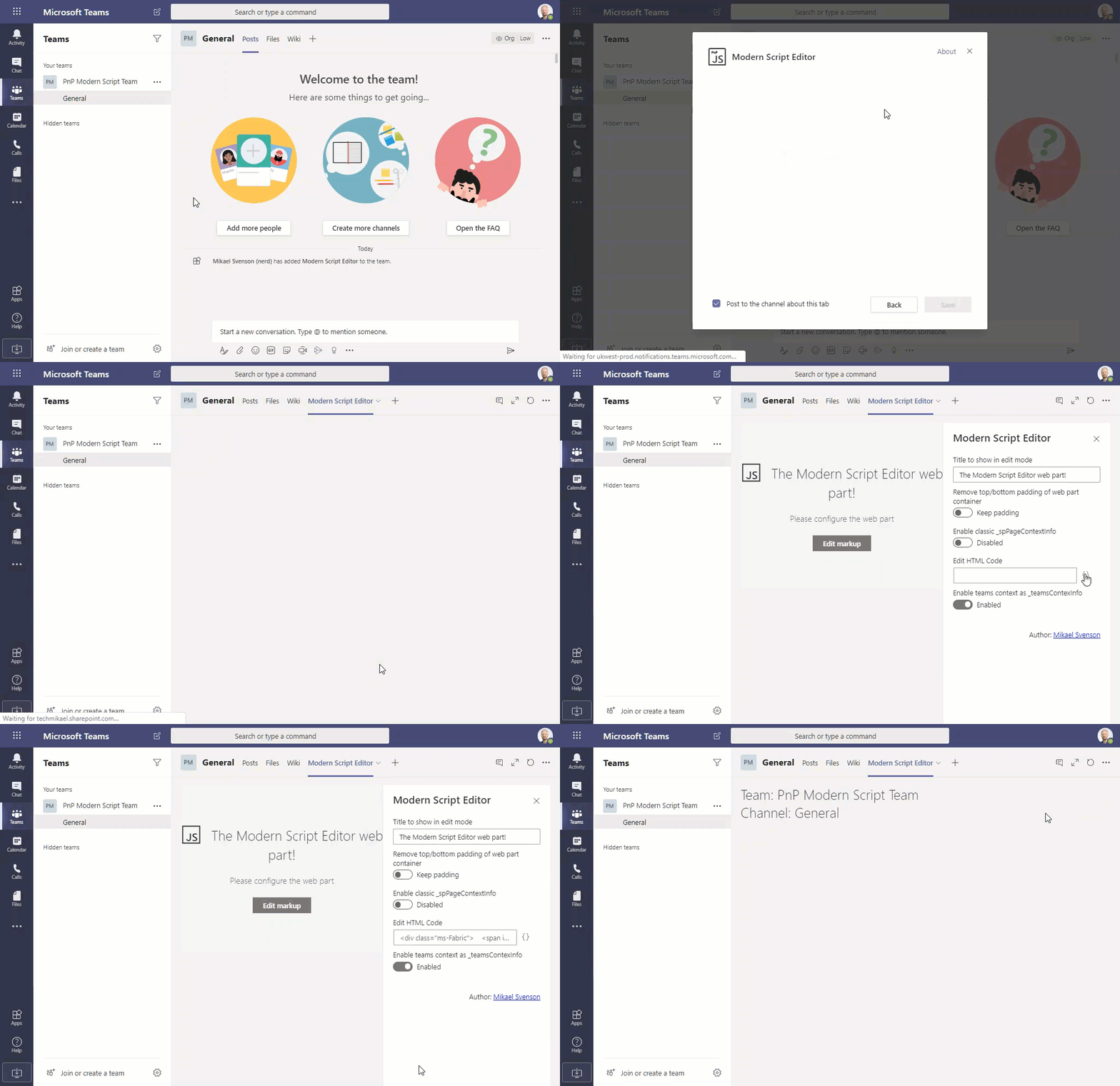
If you want to use the solution as a Teams tab, perform the changes to deploy to non-script sites and tenant wide deployment.
Next see the Teams tab tutorial for steps needed to deploy the solution as a Teams tab.
You can get access to the Teams context information via the global variable _teamsContexInfo. The available properties are documented at Teams context interface.
Sample
<div class="ms-Fabric">
    <span id="ScriptIt" class="ms-font-xxl ms-fontColor-neutralPrimary">
    </span>
</div>
<script>
var element = document.getElementById("ScriptIt");
element.innerHTML = "Team: " + _teamsContexInfo.teamName + "<br\>Channel: " + _teamsContexInfo.channelName;
</script>
Deploy to non-script sites / modern team sites
By default this web part is not allowed on no-script sites, as it allows execution of arbitrary script. This is by design as from a security and governance perspective you might not want arbitrary script added to your pages. This is typically something you want control over.
If you however want to allow the web part for non-script sites like Office 365 Group modern team sites you have to edit ScriptEditorWebPart.manifest.json with the following change:
"requiresCustomScript": false
Deploy tenant wide
By default you have to install this web part per site collection where you want it available. If you want it enabled by default on all sites you have to edit package-solution.json with the following change:
"skipFeatureDeployment": true
In order to make it available to absolutely all sites you need apply the Deploy to non-script sites / modern team site change as well.
Compatibility
| ⚠️ Important |
|---|
| Every SPFx version is optimally compatible with specific versions of Node.js. In order to be able to build this sample, you need to ensure that the version of Node on your workstation matches one of the versions listed in this section. This sample will not work on a different version of Node. |
| Refer to https://aka.ms/spfx-matrix for more information on SPFx compatibility. |
This sample is optimally compatible with the following environment configuration:
Applies to
Contributors
Version history
| Version | Date | Comments |
|---|---|---|
| 1.0 | March 10th, 2017 | Initial release |
| 1.0.0.1 | August 8th, 2017 | Updated SPFx version and CSS loading |
| 1.0.0.2 | October 4th, 2017 | Updated SPFx version, bundle Office UI Fabric and CSS in web part |
| 1.0.0.3 | January 10th, 2018 | Updated SPFx version, added remove padding property and refactoring |
| 1.0.0.4 | February 14th, 2018 | Added title property for edit mode and documentation for enabling the web part on Group sites / tenant wide |
| 1.0.0.5 | March 8th, 2018 | Added support for loading scripts which are AMD/UMD modules. Added support for classic _spPageContextInfo. Refactoring. |
| 1.0.0.6 | March 26th, 2018 | Fixed so that AMD modules don't detect define, and load as non-modules. |
| 1.0.0.7 | May 23rd, 2018 | Added supportsFullBleed to manifest. |
| 1.0.0.8 | May 23rd, 2018 | Updated SPFx to v1.5.1, made editor load dynamically to reduce runtime bundle size, fixed white space issue. |
| 1.0.0.9 | Aug 22, 2018 | Improved bundle size |
| 1.0.0.10 | Jan 16th, 2019 | Fix for removing of web part padding |
| 1.0.0.11 | March 18th, 2019 | Fix for re-loading of script on smart navigation |
| 1.0.0.12 | April 15th, 2019 | Re-fix for pad removal of web part |
| 1.0.0.13 | July 1th, 2019 | Downgrade to SPFx v1.4.1 to support SP2019 |
| 1.0.0.14 | Oct 13th, 2019 | Added resolve to fix pnpm issue. Updated author info. |
| 1.0.0.15 | Mar 16th, 2020 | Upgrade to SPFx v1.10.0. Add support for Teams tab. Renamed package file. |
| 1.0.0.16 | April 1st, 2020 | Improved how script tags are handled and cleaned up on smart page navigation. |
| 1.0.17.0 | January 29th, 2021 | Changed versioning to 3 parts. Updated npm packages, restructured documentation, minor change to webpack analyzer setup. |
| 1.0.18.0 | June 14, 2022 | Upgrade to SPFx v1.13.1 |
| 1.0.19.0 | August 31, 2022 | Added support for section background color |
| 1.0.20.0 | October 10, 2022 | Added sample html/script with self-executing function |
| 1.0.21.0 | March 11, 2023 | Bump dependencies to allow react-script-editor to build under SPFx 1.16.1 |
| 1.0.22.0 | April 24, 2023 | Added support for script in external template |
| 1.0.23.0 | September 7, 2023 | Upgrade to SPFx 1.17.4 |
| 1.0.24.0 | March 8, 2024 | Upgrade to SPFx 1.18.2 |
Minimal Path to Awesome
Testing
- Clone this repository
- In the command line run:
npm installgulp serve
Deploy
gulp cleangulp bundle --shipgulp package-solution --ship- Upload
.sppkgfile fromsharepoint\solutionto your tenant App Catalog- E.g.: https://<tenant>.sharepoint.com/sites/AppCatalog/AppCatalog
- Add the web part to a site collection, and test it on a page
Features
This web part illustrates the following concepts on top of the SharePoint Framework:
- Re-use existing JavaScript solutions on a modern page
- Office UI Fabric
- React
Help
We do not support samples, but we this community is always willing to help, and we want to improve these samples. We use GitHub to track issues, which makes it easy for community members to volunteer their time and help resolve issues.
If you're having issues building the solution, please run spfx doctor from within the solution folder to diagnose incompatibility issues with your environment.
You can try looking at issues related to this sample to see if anybody else is having the same issues.
You can also try looking at discussions related to this sample and see what the community is saying.
If you encounter any issues while using this sample, create a new issue.
For questions regarding this sample, create a new question.
Finally, if you have an idea for improvement, make a suggestion.
Disclaimer
THIS CODE IS PROVIDED AS IS WITHOUT WARRANTY OF ANY KIND, EITHER EXPRESS OR IMPLIED, INCLUDING ANY IMPLIED WARRANTIES OF FITNESS FOR A PARTICULAR PURPOSE, MERCHANTABILITY, OR NON-INFRINGEMENT.


-Incompatible-red.svg)


