|
|
||
|---|---|---|
| .. | ||
| config | ||
| src | ||
| teams | ||
| teams_spSecurity | ||
| typings | ||
| .editorconfig | ||
| .gitattributes | ||
| .gitignore | ||
| .npmignore | ||
| .yo-rc.json | ||
| README.md | ||
| gulpfile.js | ||
| package-lock.json | ||
| package.json | ||
| tsconfig.json | ||
| tslint.json | ||
README.md
| page_type | products | languages | extensions | |||||||||||||
|---|---|---|---|---|---|---|---|---|---|---|---|---|---|---|---|---|
| sample |
|
|
|
SPFX React Grid
Summary
React-securitygrid is an SPFX webpart that uses React and Office-UI-Fabric to render a grid showing which users have access to which lists/libraries/folders/files on a Web as shown here:
Empty libraries are displayed with a black folder icon, those with items are displayed with a white folder. The user can expand a list or library by clicking on the desired row. (If the library or folder has more than 5000 items an error will be displayed ) For deeply nested folders the Title column can be resized by drag and drop. The display shows a the appropriate icon circle if the user has the selected permission to the given list, library, file or folder. (NOTE:The grid does not currently take into account access give via membership in an active directory group-- coming soon!). IMPORTANT: The user must have permissions to access lists and enumerate permissions in order to view the grid.
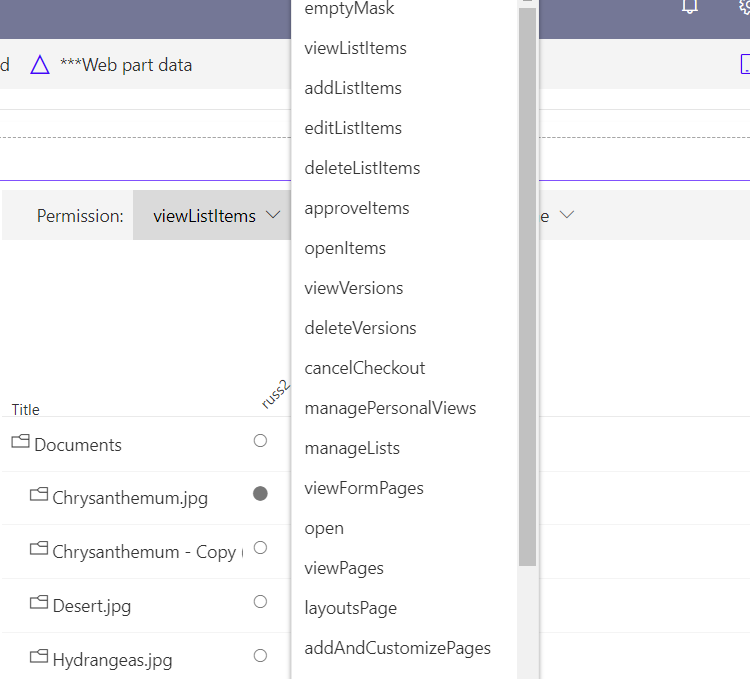
The user can change the permission being tested by clicking the Permission in the command bar and selecting a new Permission:
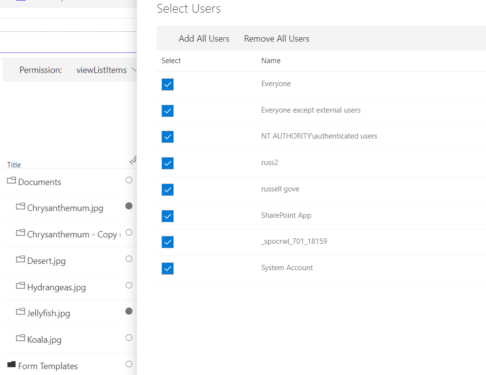
The user can change which users are being shown in the grid by selecting the users button in the command bar and selecting a desired users:
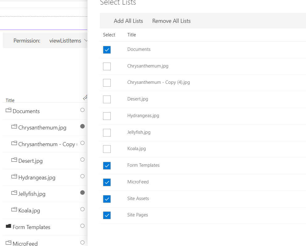
The user can change which lists are being shown in the grid by selecting the lists button in the command bar and selecting a desired lists:
The user can change alternate between displaying user names and emails selecting the Show Email/Show Name button in the command bar and selecting the desired option:
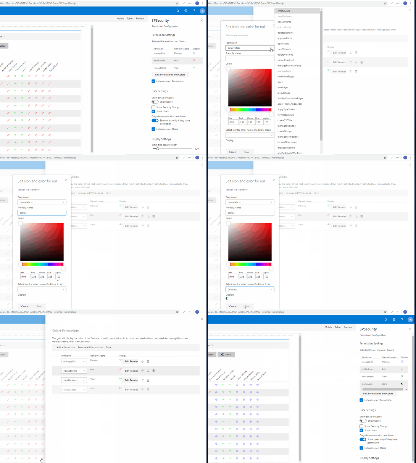
The the first configuration panel of the webpart is shown below:
Permission Settings
The Permission Settings allow you to select which permissions to show in the grid and to select the Icon and color used to display the selected permission.
User Settings
The Show Email or Name Toggle determines whether the name or email is displayed by default.
The Show Security Groups checkbox determines whether SharePoint Security groups are included in the grid.
The Show Users checkbox determines whether Users are included in the grid.
The Only show users with permissions toggle determines whether the grid should display all users with access to the web, or only users with the selected permission
 The Let Users Select users checkbox determines whether Users can filter the selected users in the grid.
Display Settings
The Initial Title column width determines the initial width of the Title column(it can be resized).
The second configuration panel allows the owner to configure the List Settings
List Settings
The Show Hidden Lists checkbox determines whether Hidden lists are displayed. The Show System Lists checkbox determines whether System Lists (Catalogs) are included in the grid. The Show Users checkbox determines whether Users are included in the grid. The Let Users Select lists checkbox determines whether Users can filter the selected lists in the grid.
Select Lists
The Include/Exclude Selected lists Toggle determines whether the lists selected are to be included or excluded.
The admin can select lists and libraries below to have them included/excluded from the grid
Notes
This is a port of an Angular 1.3 SharePoint hosted App at https://github.com/russgove/SPSecurity.
Used SharePoint Framework Version
Applies to
Prerequisites
React, Office-UI-Fabric, sp-pnp-js, lodash
Solution
| Solution | Author(s) |
|---|---|
| react-securitygrid | Russell Gove |
Version history
| Version | Date | Comments |
|---|---|---|
| 1.0.0.3 | October 28, 2020 | Update to office-ui-fabric-react 7.148.1, fixing icons and indentation for sub-folders |
| 1.0.0.2 | April 5, 2021 | Updates to SPFx 1.10; Allow display of multiple permissions |
| 1.0.0.1 | April 25, 2018 | Update to SPFx 1.4.1 |
| 1.0.0.0 | December 31, 2016 | Initial version |
Disclaimer
THIS CODE IS PROVIDED AS IS WITHOUT WARRANTY OF ANY KIND, EITHER EXPRESS OR IMPLIED, INCLUDING ANY IMPLIED WARRANTIES OF FITNESS FOR A PARTICULAR PURPOSE, MERCHANTABILITY, OR NON-INFRINGEMENT.
Minimal Path to Awesome
- Clone this repository
- in the command line run:
npm installgulp serve


