mirror of
https://github.com/pnp/sp-dev-fx-webparts.git
synced 2025-02-18 19:07:12 +00:00
| page_type | products | languages | extensions | |||||||||||||
|---|---|---|---|---|---|---|---|---|---|---|---|---|---|---|---|---|
| sample |
|
|
|
Webpart with React and Mobx
Summary
Sample webpart implementation that uses Mobx to keep track of its state.
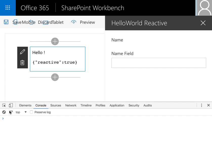
Reactive
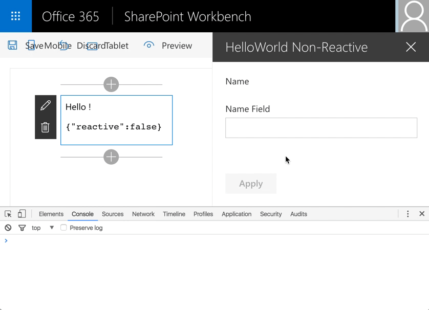
Non-Reactive
Used SharePoint Framework Version
Applies to
Solution
| Solution | Author(s) |
|---|---|
| react-mobx | Kevin Mees kev.mees@gmail.com (Experts Inside GmbH, @kmees) |
Version history
| Version | Date | Comments |
|---|---|---|
| 1.0 | November 4, 2016 | Initial release |
Disclaimer
THIS CODE IS PROVIDED AS IS WITHOUT WARRANTY OF ANY KIND, EITHER EXPRESS OR IMPLIED, INCLUDING ANY IMPLIED WARRANTIES OF FITNESS FOR A PARTICULAR PURPOSE, MERCHANTABILITY, OR NON-INFRINGEMENT.
Minimal Path to Awesome
$ git clone https://github.com/SharePoint/sp-dev-fx-webparts
$ cd sp-dev-fx-webparts/samples/react-mobx
$ npm install
$ gulp serve
Features
- Presentational (dumb) components live in
./components - Container (smart) components live in
./container - Mobx stores are defined in
./storewith a sample webpart store that keeps track of the webpart properties.