3.0 KiB
3.0 KiB
Side Panel
Summary
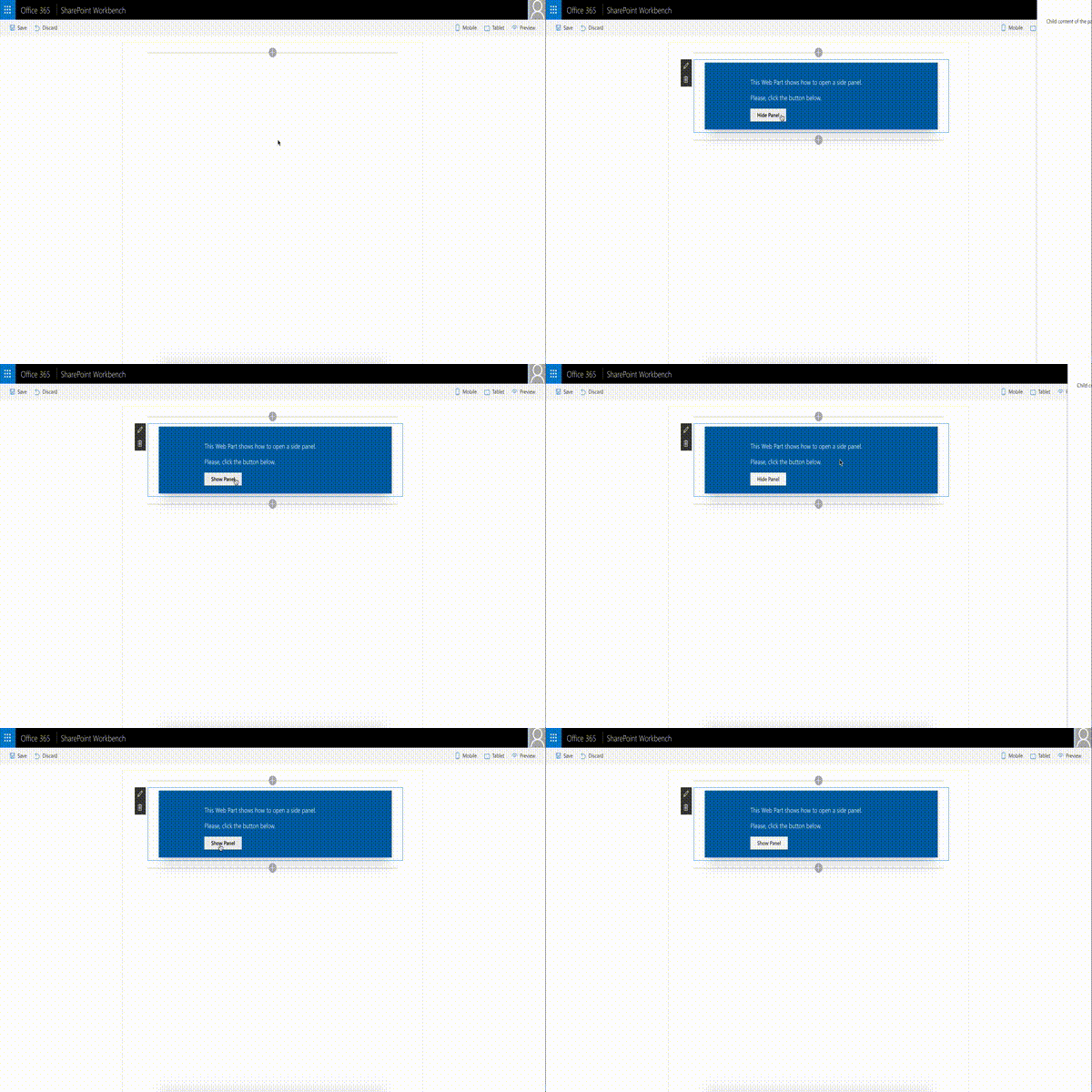
The web part illustrates creation and usage of Side Panel (Sidebar) control.
Compatibility
| ⚠️ Important |
|---|
| Every SPFx version is only compatible with specific version(s) of Node.js. In order to be able to build this sample, please ensure that the version of Node on your workstation matches one of the versions listed in this section. This sample will not work on a different version of Node. |
| Refer to https://aka.ms/spfx-matrix for more information on SPFx compatibility. |
For more information about SPFx compatibility, please refer to https://aka.ms/spfx-matrix
Applies to
Contributors
- Alex Terentiev (Sharepointalist Inc., AJIXuMuK)
Version history
| Version | Date | Comments |
|---|---|---|
| 1.0 | May 11, 2017 | Initial release |
Disclaimer
THIS CODE IS PROVIDED AS IS WITHOUT WARRANTY OF ANY KIND, EITHER EXPRESS OR IMPLIED, INCLUDING ANY IMPLIED WARRANTIES OF FITNESS FOR A PARTICULAR PURPOSE, MERCHANTABILITY, OR NON-INFRINGEMENT.
Features
Sample features:
- ability to add controls outside web part markup (thanks to Layout component)
- usage of Office UI Fabric React (Layout, ImageButton)
- CSS transition animations
Control features:
- left or right positioning
- usage of this.props.children for content
Resources
Building the code
git clone the repo
npm i
npm i -g gulp
gulp
This package produces the following:
- lib/* - intermediate-stage commonjs build artifacts
- dist/* - the bundled script, along with other resources
- deploy/* - all resources which should be uploaded to a CDN.


-Compatible-green.svg)


