2.6 KiB
2.6 KiB
| page_type | products | languages | extensions | |||||||||||||
|---|---|---|---|---|---|---|---|---|---|---|---|---|---|---|---|---|
| sample |
|
|
|
Side Panel
Summary
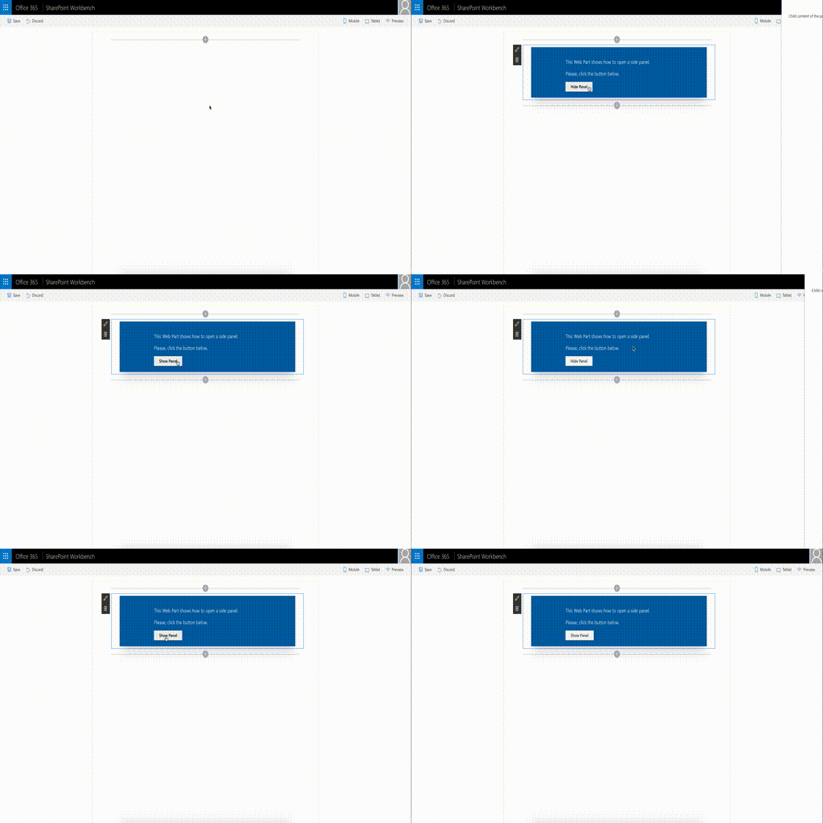
The web part illustrates creation and usage of Side Panel (Sidebar) control.
Compatibility
Applies to
Solution
| Solution | Author(s) |
|---|---|
| react-side-panel | Alex Terentiev (Sharepointalist Inc., AJIXuMuK) |
Version history
| Version | Date | Comments |
|---|---|---|
| 1.0 | May 11, 2017 | Initial release |
Disclaimer
THIS CODE IS PROVIDED AS IS WITHOUT WARRANTY OF ANY KIND, EITHER EXPRESS OR IMPLIED, INCLUDING ANY IMPLIED WARRANTIES OF FITNESS FOR A PARTICULAR PURPOSE, MERCHANTABILITY, OR NON-INFRINGEMENT.
Features
Sample features:
- ability to add controls outside web part markup (thanks to Layout component)
- usage of Office UI Fabric React (Layout, ImageButton)
- CSS transition animations
Control features:
- left or right positioning
- usage of this.props.children for content
Resources
Building the code
git clone the repo
npm i
npm i -g gulp
gulp
This package produces the following:
- lib/* - intermediate-stage commonjs build artifacts
- dist/* - the bundled script, along with other resources
- deploy/* - all resources which should be uploaded to a CDN.


-Compatible-green.svg)

