3.0 KiB
Compatibility
This sample is designed to be used in the following enviroments:
page_type: sample products:
- office-sp languages:
- javascript
- typescript
extensions:
contentType: samples
technologies:
- SharePoint Framework platforms:
- react createdDate: 5/1/2017 12:00:00 AM
SharePoint Themes
Summary
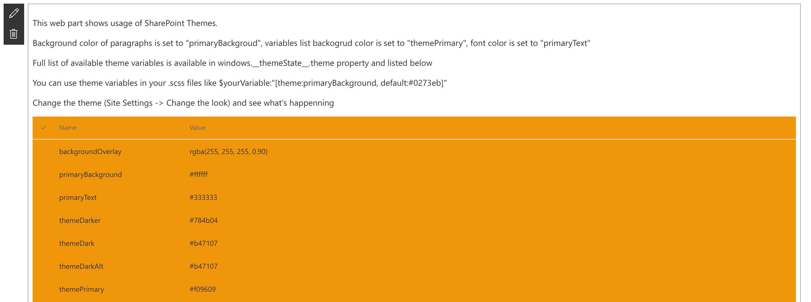
The Themes web part illustrates how to use SharePoint Theme variables in custom web parts.
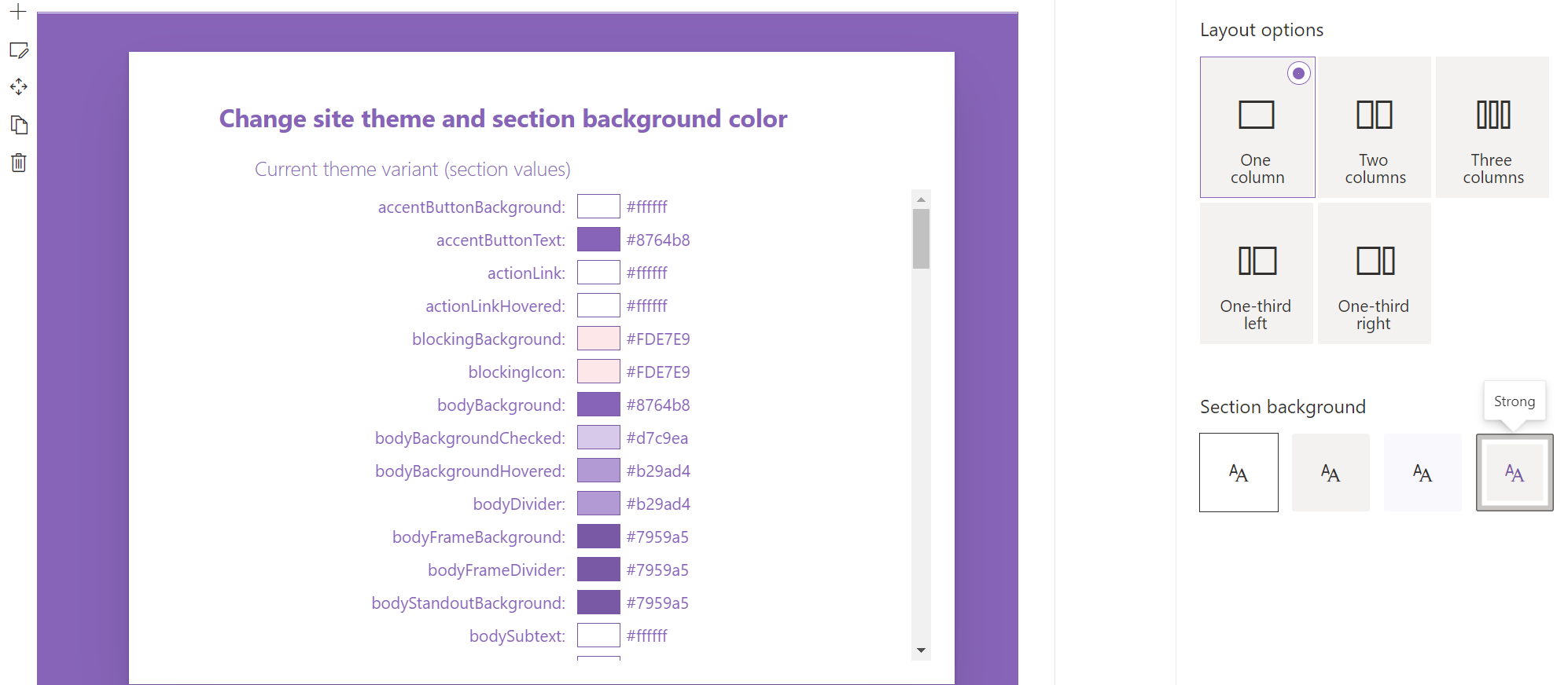
The Section Theme web part illustrates how to use theme variant variables to style web parts based on selected site theme and section background colors.
Compatibility
For more information about SPFx compatibility, please refer to https://aka.ms/spfx-matrix
Applies to
| Solution | Author(s) |
|---|---|
| react-themes | Alex Terentiev (Sharepointalist Inc.AJIXuMuK) |
| react-themes | Artur Kukharevich (akukharevich) |
| react-themes | Don Kirkham (@DonKirkham) |
Version history
| Version | Date | Comments |
|---|---|---|
| 1.0 | April 27, 2017 | Initial release |
| 1.1 | May 8, 2017 | themePrimary variable example added |
| 1.2 | Nov 6, 2020 | Upgrade to 1.11.0 (Don Kirkham) |
| 1.3 | Nov 16, 2020 | Section awareness web part added (Don Kirkham) |
Disclaimer
THIS CODE IS PROVIDED AS IS WITHOUT WARRANTY OF ANY KIND, EITHER EXPRESS OR IMPLIED, INCLUDING ANY IMPLIED WARRANTIES OF FITNESS FOR A PARTICULAR PURPOSE, MERCHANTABILITY, OR NON-INFRINGEMENT.
Features
This project contains two client-side web parts built on the SharePoint Framework illustrating multiple techniques showing how to use SharePoint themes variables and variant variables to style custom web parts
Path to Awesomeness
git clone the repo
npm i
npm i -g gulp
gulp


-Incompatible-red.svg)


