6.4 KiB
Enhanced Button
Summary
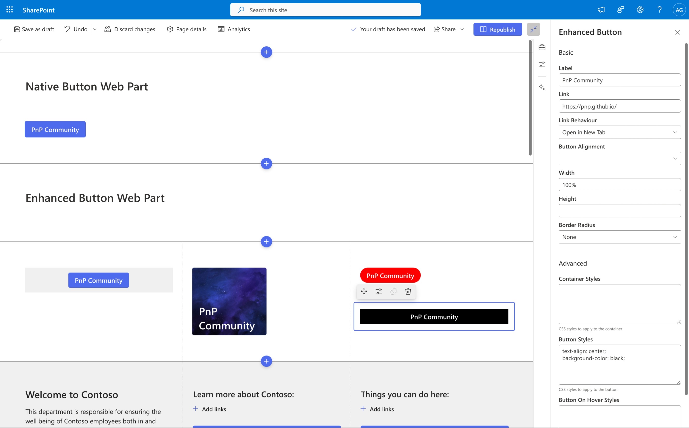
The Enhanced Button Web Part is a custom SharePoint web part that extends the functionality of the native button web part. It provides additional configuration options to create more customizable and flexible buttons within your SharePoint pages.
Compatibility
| ⚠️ Important |
|---|
| Every SPFx version is optimally compatible with specific versions of Node.js. In order to be able to build this sample, you need to ensure that the version of Node on your workstation matches one of the versions listed in this section. This sample will not work on a different version of Node. |
| Refer to https://aka.ms/spfx-matrix for more information on SPFx compatibility. |
This sample is optimally compatible with the following environment configuration:
Applies to
Get your own free development tenant by subscribing to Microsoft 365 developer program
Contributors
Version history
| Version | Date | Comments |
|---|---|---|
| 1.0 | September 01, 2024 | Initial release |
Minimal path to awesome
- Clone this repository (or download this solution as a .ZIP file then unzip it)
- From your command line, change your current directory to the directory containing this sample (
react-enhanced-button, located undersamples) - in the command line run:
npm installgulp serveornpm run serve
This sample can also be opened with VS Code Remote Development. Visit https://aka.ms/spfx-devcontainer for further instructions.
Features
This web part offers the following enhanced configuration options:
Basic configuration options:
- Label: Customize the button text
- Link: Specify the URL to link to
- Link Behaviour: Configure how the button link opens (e.g., same tab, new tab)
- Button Alignment: Align the button horizontally (left, center, right)
- Width: Customize the button width
- Height: Adjust the button height
- Border Radius: Set the corner roundness of the button
Advanced configuration options:
- Container Styles: Apply custom styles to the button container using raw CSS value
- Button Styles: Customize the button's appearance using raw CSS value
- Button Hover Styles: Define styles for when users hover over the button using raw CSS value
Help
We do not support samples, but this community is always willing to help, and we want to improve these samples. We use GitHub to track issues, which makes it easy for community members to volunteer their time and help resolve issues.
If you're having issues building the solution, please run spfx doctor from within the solution folder to diagnose incompatibility issues with your environment.
You can try looking at issues related to this sample to see if anybody else is having the same issues.
You can also try looking at discussions related to this sample and see what the community is saying.
If you encounter any issues using this sample, create a new issue.
For questions regarding this sample, create a new question.
Finally, if you have an idea for improvement, make a suggestion.
Disclaimer
THIS CODE IS PROVIDED AS IS WITHOUT WARRANTY OF ANY KIND, EITHER EXPRESS OR IMPLIED, INCLUDING ANY IMPLIED WARRANTIES OF FITNESS FOR A PARTICULAR PURPOSE, MERCHANTABILITY, OR NON-INFRINGEMENT.


-Incompatible-red.svg)


