2.2 KiB
Custom property pane controls built in React
Summary
Sample custom property pane controls built in React for use with SharePoint Framework client-side web parts.
Asynchronous drop-down
Drop-down that loads its options asynchronously.
This control supports promises and chaining for cascading drop-downs where value from one field determines values in other drop-down fields.
Applies to
Solution
| Solution | Author(s) |
|---|---|
| react-custompropertypanecontrols | Waldek Mastykarz (MVP, Rencore, @waldekm) |
Version history
| Version | Date | Comments |
|---|---|---|
| 1.0.0 | October 17, 2016 | Initial release |
Disclaimer
THIS CODE IS PROVIDED AS IS WITHOUT WARRANTY OF ANY KIND, EITHER EXPRESS OR IMPLIED, INCLUDING ANY IMPLIED WARRANTIES OF FITNESS FOR A PARTICULAR PURPOSE, MERCHANTABILITY, OR NON-INFRINGEMENT.
Minimal Path to Awesome
- clone this repo
$ npm i$ gulp serve nobrowser
Asynchronous drop-down
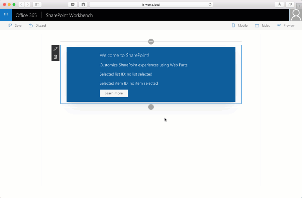
By default the control uses mock data. If you want to test the control with SharePoint, change the commented sections in the DropdownWithRemoteDataWebPart.ts file inside the loadLists and loadItems functions and deploy the sample web part to your SharePoint developer tenant.
Features
Sample web parts in this solution illustrate the following concepts on top of the SharePoint Framework:
- using React for building custom property pane controls for use with SharePoint Framework client-side web parts
- building custom property pane controls using TypeScript
- updating web part properties from custom property pane controls
- linking multiple custom property pane controls together
- loading data for use in custom property pane controls asynchronously without blocking the web part
- forcing React components to repaint using an external trigger