5.5 KiB
| page_type | products | languages | extensions | |||||||||||||
|---|---|---|---|---|---|---|---|---|---|---|---|---|---|---|---|---|
| sample |
|
|
|
Taxonomy Picker (React)
Summary
A Taxonomy Picker control built with React based on react-taxonomypicker for use with SharePoint Framework client-side web parts (SPFx).
Compatibility
Applies to
Solution
| Solution | Author(s) |
|---|---|
| spfx-react-taxonomypicker | Jose Quinto (@jquintozamora , blog.josequinto.com) |
Version history
| Version | Date | Comments |
|---|---|---|
| 1.0 | March 14, 2017 | Initial release |
Disclaimer
THIS CODE IS PROVIDED AS IS WITHOUT WARRANTY OF ANY KIND, EITHER EXPRESS OR IMPLIED, INCLUDING ANY IMPLIED WARRANTIES OF FITNESS FOR A PARTICULAR PURPOSE, MERCHANTABILITY, OR NON-INFRINGEMENT.
Minimal Path to Awesome
- clone this repo
$ npm i$ gulp trust-dev-cert$ gulp serve
Local Mode
A browser in local mode (localhost) will be opened. https://localhost:4321/temp/workbench.html
SharePoint Mode
If you want to try on a real environment, open: https://your-domain.sharepoint.com/_layouts/15/workbench.aspx
Usage
Go to src/webparts/taxonomyPickerSample/TaxonomyPickerSampleWebPart.ts and configure the control.
Mock Data configuration by using defaultOptions configuration
Access from https://localhost:4321/temp/workbench.html Configuration:
PropertyPaneTaxonomyPicker("Language", {
  key: "Language_Field",
  name: "Language",
  displayName: "Language",
  multi: true,
  defaultOptions: [
    { label: "English", value: "f50249b6-310d-43b6-aaa6-f0cb46d851bf" },
    { label: "Spanish", value: "237ca323-1ed8-4199-a49b-a9f7ce4256bf" },
    { label: "German", value: "44024c7e-f738-4755-90e1-15866327c806" },
    { label: "Italian", value: "65f67491-bdca-491a-84fa-f6fd913f40fa" },
  ],
  onPickerChange: this._updateTaxonomyPicker
})
Real Data configuration by using termSetGuid configuration
Access from https://your-domain.sharepoint.com/_layouts/15/workbench.aspx Configuration:
PropertyPaneTaxonomyPicker("Language", {
  key: "Language_Field",
  name: "Language",
  displayName: "Language",
  multi: true,
  termSetGuid: "<your-term-set-id>",
  termSetName: "Language",
  termSetCountMaxSwapToAsync: 100,
  onPickerChange: this._updateTaxonomyPicker
})
Features
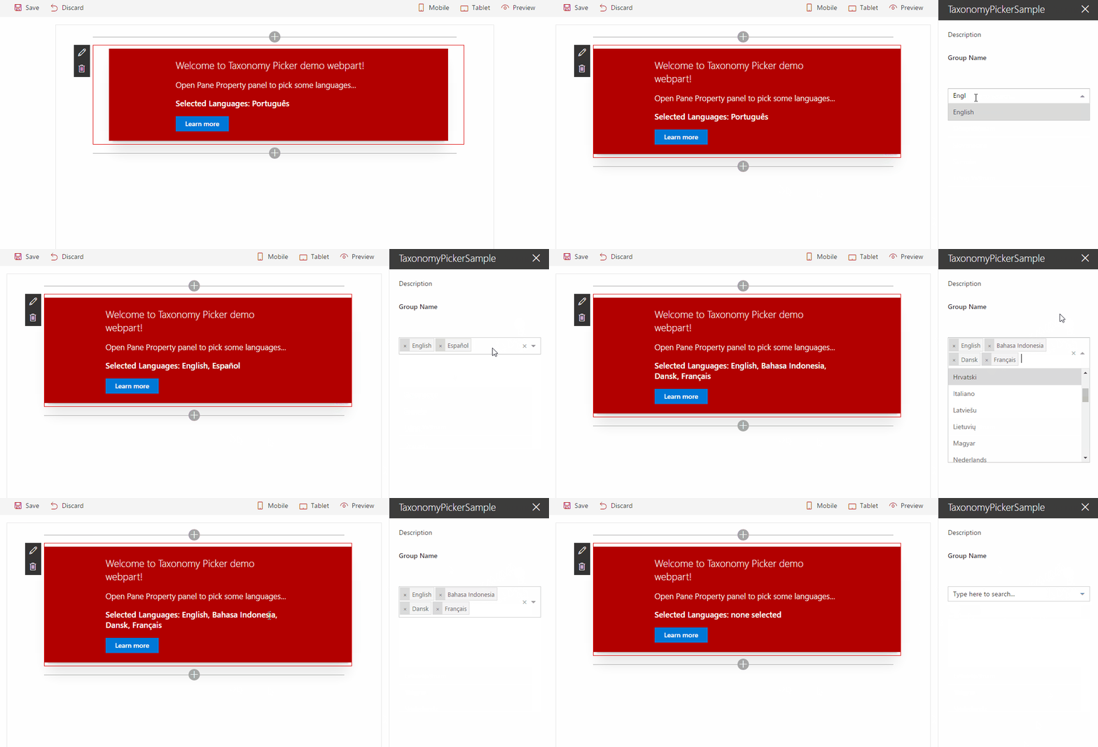
- Use React for using react-taxonomypicker control inside a custom property pane (it can be used in the web part itself too).
- Use TypeScript to create the custom property pane control containing the taxonomy picker control.
- Reacting to web part property changes
- Loading data for use in custom property pane controls asynchronously without blocking the web part
- Retrieve Terms from a Term Set by Term Set GUID.
- Sync / Async modes
- Sync mode is used for medium / small Term Sets and loads asynchronously all Terms and store them in React State and SessionStorage cache.
- Async mode is used for large Term Sets and it doesn't load any data initially, but it loads the Terms upon user input in batches of 10 items.
- Sync / Async mode configurable via termSetCountMaxSwapToAsync property
- The control will fetch the number of terms and decide which mode to use depends on termSetCountMaxSwapToAsync value.
- It Uses and depends on SP.Taxonomy.js (the web part uses a wrapper to load all the SP.*.js dependencies)
- Use Promise (polyfill it if needed IE)
- onPickerChange event handler exposed
- react-select properties exposed (extends them)
- defaultOptions array exposed to enable input mock data when no termSetGuid configured
- More configuration options: react-taxonomypicker
Scenarios supported
- SharePoint Web Part using Script Editor or Content Editor Web Part
- Consume it from ES6 project
- Consume it from TypeScript project
- SharePoint Framework Web Part (SPFx)


-Compatible-green.svg)

