6.5 KiB
| page_type | products | languages | extensions | |||||||||||||
|---|---|---|---|---|---|---|---|---|---|---|---|---|---|---|---|---|
| sample |
|
|
|
Modern Charts
Summary
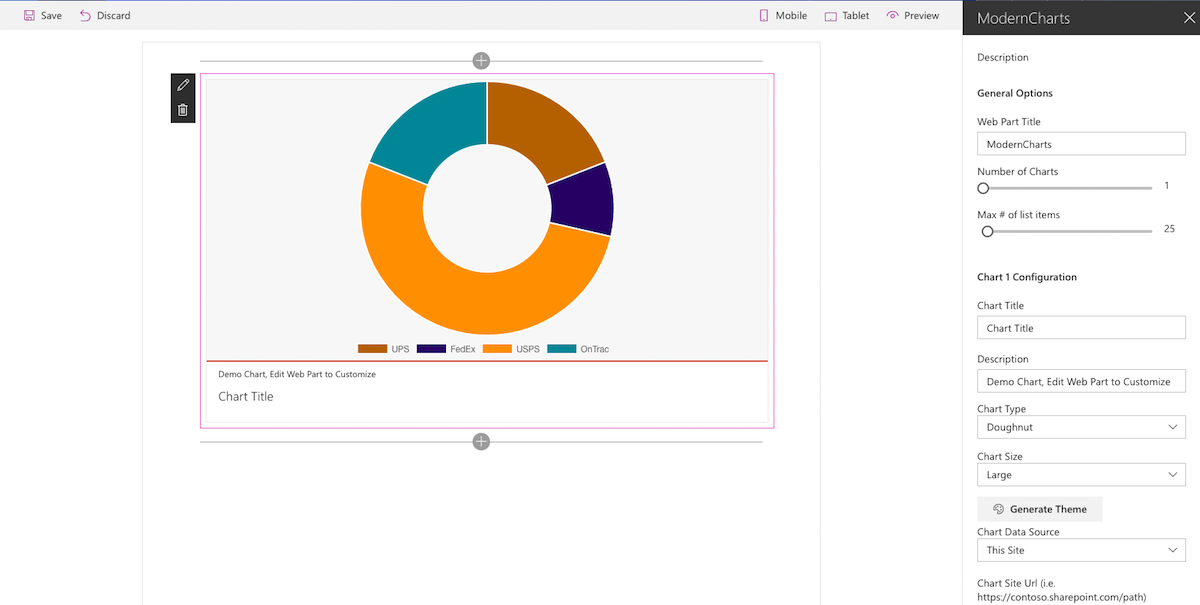
This web part uses the Chart.js library to visualize SharePoint list data.
Built in Chart Types: -Bar -Horizontal Bar -Doughnut -Line -Pie -Polar -Radar
Each chart is uniquely themed with the built-in color theme generator (color-scheme), continue generating a theme until you find one to your liking.
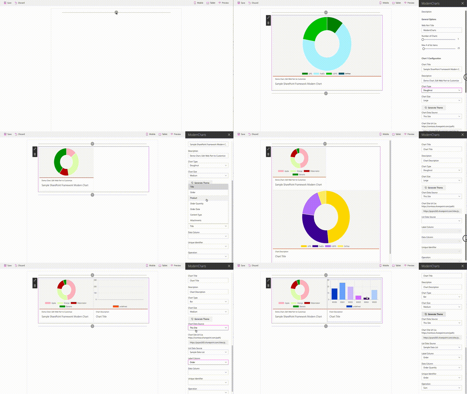
New charts are populated with Sample data, select a site (or define a custom path with the Other option), a list data source, label column, data column and which column indicates a unique value in your list. See the demo below for an example.
Current Data Functions: -Average -Count -Sum
Media
Compatibility
| ⚠️ Important |
|---|
| Every SPFx version is only compatible with specific version(s) of Node.js. In order to be able to build this sample, please ensure that the version of Node on your workstation matches one of the versions listed in this section. This sample will not work on a different version of Node. |
| Refer to https://aka.ms/spfx-matrix for more information on SPFx compatibility. |
Applies to
Solution
| Solution | Author(s) |
|---|---|
| react-modern-charts | Jeremy Coleman (MCP, PC Professional, Inc.) |
| react-modern-charts | Peter Paul Kirschner (@petkir_at) |
| react-modern-charts | Abderahman Moujahid |
Version history
| Version | Date | Comments |
|---|---|---|
| 1.0.0.4 | October 19, 2021 | Fix values of managed metadata fields |
| 1.0.0.3 | July 30, 2020 | Support for Managed Metadata Field(Single) as Label |
| 1.0.0.2 | February 09, 2020 | Upgrade to SPFx 1.10.0 |
| 1.0.0.1 | April 25, 2018 | Update to SPFx 1.4.1 |
| 1.0.0.0 | February 11, 2017 | Initial release |
Prerequisites
- SharePoint Online tenant with Office Graph content-enabled
Minimal Path to Awesome
- clone this repo
npm igulp serve- if deploying to Office 365, update the CDN path in write-manifests.json
This sample can also be opened with VS Code Remote Development. Visit https://aka.ms/spfx-devcontainer for further instructions.
Features
Sample Web Parts in this solution illustrate the following concepts on top of the SharePoint Framework:
- using React for building SharePoint Framework Client-Side Web Parts
- using Office UI Fabric React components for building user experience consistent with SharePoint and Office
- communicating with SharePoint using its REST API
- passing Web Part properties to React components
- building dynamic web part properties
Help
We do not support samples, but we this community is always willing to help, and we want to improve these samples. We use GitHub to track issues, which makes it easy for community members to volunteer their time and help resolve issues.
If you're having issues building the solution, please run spfx doctor from within the solution folder to diagnose incompatibility issues with your environment.
You can try looking at issues related to this sample to see if anybody else is having the same issues.
You can also try looking at discussions related to this sample and see what the community is saying.
If you encounter any issues while using this sample, create a new issue.
For questions regarding this sample, create a new question.
Finally, if you have an idea for improvement, make a suggestion.
Disclaimer
THIS CODE IS PROVIDED AS IS WITHOUT WARRANTY OF ANY KIND, EITHER EXPRESS OR IMPLIED, INCLUDING ANY IMPLIED WARRANTIES OF FITNESS FOR A PARTICULAR PURPOSE, MERCHANTABILITY, OR NON-INFRINGEMENT.


-Incompatible-red.svg)


